
INSTRUCTIONS: Read the following material COMPLETELY.
If you are now reading this material, you should have
finished the first chapter in the unit on "Learning About Design". In that
chapter, you learned about the basic elements of design. Those components are used to
create basic graphic images for designs. "Design Principles" are the basic rules
for designing and composing layouts for pages or artistic illustrations. Many people are
born with an artistic talent that allows them to create pleasing images without as much
effort as other people. However, we are not all that lucky! Other people must learn how to
create pleasing compositions by understanding how the relationship of objects on a page
can be placed and manipulated.
What are the basic "Design Principles"?
The basic design principles are "Balance", "Contrast", "Unity", "Harmony", "Rhythm", and "Proportion". Each is significant in its own right. Any graphic design should be put together utilizing these principles. First, the design student must learn the unique characteristics of each principle. They are outlined below:
Balance
This design principle operates under the principle that any design element has visual
weight. That means that a white circle looks
"lighter" than a black circle. Most people would perceive the black circle as
being heavier since it is black and "bold". This may sound insignificant, but it
is very important.
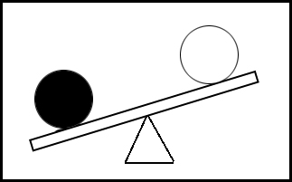
The black circle in the illustration will look
"heavier" than the white circle.
Therefore, darker objects will usually draw more attention on a page, than
white objects.
There are two types of balance, "formal balance" and "informal
balance". Formal balance is usually considered more traditional and
conservative. It would be used in a wedding invitation or an ad for a conservative
business, like an attorney.
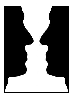
In this illustration, if an imaginary line is drawn down
the center of this page, there is the same
type of image on each side of the line. That means that the "visual weight" is
the same on both sides.
The term that means "same on both sides, is "symmetry". Therefore we
say that a formal design
is "symmetrical". This is called "formal balance". It is
usually static with not much movement.
In informal balance, objects are
placed on the page in a livelier, more modern fashion. However, There must still be a
feeling of equally placed visual weight.

In informal balance, if you draw an imaginary line down
the middle, the design does not
look the same on both sides. Just because the ad is not formally balanced,
doesn't mean that it is not balanced. It means that the visual weight is
distributed evenly around the page without having a "mirrored" or
"symmetrical" look. This type of layout is used to create a more modern
look, with more eye movement around the ad.
Contrast
When there is a need to make things stand out on a page, a designer uses
"CONTRAST". For instance, the word "CONTRAST" is standing out in this
paragraph because it is in capital letters. Anything we do to a page design to make
something stand out is called an example of contrast. If you were to define
contrast in one word, it would be DIFFERENT. Contrast
is anything different than the words on the page. Some examples would include:
• Illustrations
• Photographs
• Using Colors
• Underlines
• Rules (Graphic Lines)
• Borders
• Different typestyles
• Different type sizes
• Different type weights
• Slanting type and graphics
• Using shapes of different sizes
The list could go on and on! Your use of contrast is only limited by your creativity. However, it must be done tastefully, or else it starts to look "junked up"!
Rhythm
Although you don't realize it, your eyes do not stay in one area when you view a
design, page or package. Your eye "scans" the page in a bunch of rapid
movements. If you were reading a newspaper article, your eyes may move to the headline,
then a photograph, a caption, and a subhead, before you even begin reading the article.
Although you may take this for granted, good designers have used proper rhythm to design
the article to catch your eye (and interest) and get you to read the article.
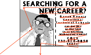
This illustration uses a red line to
show how a person's eyes might scan this ad.
The person usually looks first at the illustration. It is used as an
attention-getter.
Then the large, bold type in the headline will attract the eye. Our normal
left-to-right
reading scan will then take over. A smart designer uses this information to lay out
a
page or design to keep the reader's eye focused on the information, while getting
the
reader to read the advertisement content. At the bottom, the reader's eye moves off
to another part of the page.
Unity and Harmony
These two design principles are extremely similar. Some don't even
consider them as two different principles. "Harmony", just like in a singing
group, is important. It is the principle that tells designers to make sure items in the
design blend into a common theme, just like all the voices blending in a song. It is
really one of the simplest design principles to understand. If you are going to design an
ad for a "Winter Ski Sale", you would select images and text (called
"copy") that has to do with skiing. You might select an illustration of a person
on skis and also use a typestyle for your headline that looks "chilled" or
"icy".

Notice the harmony
that is used in the design of this ad. The ad is advertising a
sale of snow skis. We see an illustration of a skier in the ad. We see a typestyle
that shows a chilled or icy effect. There are snow covered mountains. The letters
are sloped for contrast, and to increase the effect of a skiing theme, like the
slope
of a mountainside. ALL OF THESE PUT TOGETHER CREATE THE
FEELING OF HARMONY!
Look at the same ad with different components.

Here's the same sale ad with the
typestyle and illustration changed. It does not have
good harmony. Even if this is "Bob" of BOB'S, most people won't know
that.
The typestyle is a "Broadway" style. It doesn't fit into the whole theme.
Use your head and common sense. If you are designing an ad for
skis and ski boots, 9 times out of 10, people want to see skis and ski boots in it.
Quite a difference, don't you think?
Unity is especially important when we are talking about the use of typestyles. There may be hundreds of variations and styles of type in a computer graphics program. The student must resist the temptation of "trying out" as many typestyles as possible in a design. This leads to a confused and sloppy layout.

Typestyle unity is critical to
designing success. Resist the urge to use too
many typestyles. They may get confusing and difficult to read. NEVER,
NEVER, NEVER SET "SCRIPT" IN ALL CAPITALS!!!! Look at the headline.
It is difficult to read and if we didn't already know what it said,
we might not be able to figure it out. NEVER set "Old English"
or "Calligraphy" fonts in all capitals, either. Typestyle unity makes for
easier reading.
The golden rule of unity is to TRY
TO NEVER USE MORE THAN TWO TYPESTYLES IN A DESIGN!
Proportion
It may be applied to the size of items in relation to the the page size. In other
words, beginning designers may try to "squeeze in"
items at the bottom of the page. This leads to a design with type that is hard to read. We
call this type "out of proportion".

The example above shows a business
card design that exhibits poor proportion.
The headline is much too large. The address and phone number are too small
and difficult to read. The illustration is also too large.
Graphics and type need to be carefully considered when sizing them on a page. For some reason, students will find this difficult. If you have trouble, use a "priority" system. This is done by deciding on the importance of your items first. Then, decide your sizing, based on the importance of the item to the design.
This design shows an improved design
with better proportion throughout.
The elements are more in proportion, and therefore easier to read. On a
business card, the phone number is important. The number is now easier to read.
Those are the five (or six ) design principles. You must remember them and be able to identify the characteristics of each. It is important to understand that these are rules or guidelines to follow. HOWEVER, sometimes an effective design is seen that breaks one of the rules. So, sometimes you've gotta break the rules.
TO GO BACK TO THE TOP OF THE PAGE, CLICK HERE.