|
|
.
|
|
Background and Color Tips
|
|
.
|
 A two color website is no fun and will not catch the eye of visitors. These tips will help you find the best and safest colors for your website. A two color website is no fun and will not catch the eye of visitors. These tips will help you find the best and safest colors for your website.
 One choice of backgrounds is a bright multicolor wall paper. But the many colors make it hard to see the text. One choice of backgrounds is a bright multicolor wall paper. But the many colors make it hard to see the text.
 You could, to fix this, make a side border of many colors and the majority of the background a solid color. then simply adjust the margins by using a <table> or a simple margin change in the <body> command. You could, to fix this, make a side border of many colors and the majority of the background a solid color. then simply adjust the margins by using a <table> or a simple margin change in the <body> command.
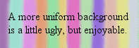 Or you could try lessen the brightness and make it a more uniform color. You can do this by decreacing the contrast in any good image program. Or you could try lessen the brightness and make it a more uniform color. You can do this by decreacing the contrast in any good image program.
 Here's another. This black and white background makes it nearly impossible to see text on and it will hurt your eyes. Here's another. This black and white background makes it nearly impossible to see text on and it will hurt your eyes.
 Colorizing the black looks better, but if you look at it too long you will despise the image. Colorizing the black looks better, but if you look at it too long you will despise the image.
 This last one uses two shades of blue that compliment each other. These are darker colors so this background works best with a light text. This last one uses two shades of blue that compliment each other. These are darker colors so this background works best with a light text.
The main idea of backgrounds is to set and idea and compliment the page but not be distracting, dizzying, or overly goddy. Text colors should contrast the background, not blend, and in as few colors as possible while making your point.
|
.
|
|
Home
|
|