Initial Thoughts
Before I tackled the question of colours, I thought about what should be placed on the flag. I found the following poll from January 1995 on Ausflag's website, answering the question, "What symbol or symbols do you think are most appropriate for the Australian flag?"
| Symbol | Respondents | Symbol | Respondents |
| Southern Cross | 41% | Emu | 3% |
| Kangaroo | 18% | Uluru | 1% |
| Union Jack | 17% | Map of Australia | 1% |
| Aboriginal Flag | 5% | Other Symbols | 20% |
| Coat of Arms | 3% | Don't Know | 17% |
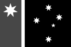
We can conclude that the public are, on the whole, fairly conservative in their attitudes regarding the flag - 58% of respondents mentioned symbols that are on the present flag. It has been argued that as those who chose the Union Jack probably don't want to change the flag, we should discard their views completely. On the contrary; the new flag will have to be acceptable to Australians in general once the plebiscite is over, whether the Australians in question voted for or against a change. Therefore, it would be advisable to retain the Southern Cross in its entirety and to include something that resembles the Union Flag, while not implying a colonial significance. Given the conservative attitude, it would probably be advisable to retain the Federation Star also - and this emblem is distinctively Australian, after all. I came up with the following design (ignoring the issue of colour):
The stripe at the hoist (width 30% of the fly) with the fimbriation (5% of the fly) recalls the Cross of St. George in the Union Flag. The Federation Star is in the canton, the position of honour - a flag that places Australia ahead of its parts. The Southern Cross is centered inn the remaining 65% of the fly. However, this design can be interpreted in several other ways, as I shall argue in the next section. In the interest of aesthetics, I decided to use the proportions of 2:3 for all of the flags.