Very recently, I was invited to teach a class at an event given by the fine shire of Falcon's Keep. "Well," thinks I, "that'll be a grand thing to do!" So I accepted, little realizing that Real Life (tm) would step in and make my preparations just a bit on the difficult side.
Nonetheless, I managed to get a class together. The following
information is the basis of that
class; I initially planned to have this article written to pass
out at the time. Unable to reach that
goal, I now present it to you, that all may share whatever worthy
information it contains.
SECTION THE FIRST: I always like to remind beginning scribes of certain things at the start of classes, and these things are worth repeating here.
First: Be aware that the typical style of an SCA scroll is not historically correct. Generally speaking, the scroll that goes with the award is modeled on book illumination. In the period we study, individuals who were given the right to bear arms received a sealed document (i.e., marked with a seal) indicating their new status in life. These were legal papers that, while often somewhat embellished, were not at all done in the same style or with as formal a hand as the books made for wealthy patrons that we often use as our examples.
Second: the most useful tool that you will ever have in your
scribal work is a good visual
reference. A little story:
This, then, is the advise of a professional artist with the power
to make or break an illustrator's
career: Don't ever think that you should work from your head.
Even the very best artists
understand and use the power of reference.
PART THE SECOND: During the Renaissance, the Italians deliberately moved away from the Gothic styles of the day, seeking to emulate the classic styles of the past they had so come to admire. The humanists took to reading the classic texts of ancient Greece and Rome, and somewhere along the way, they began to imitate the style of writing and page decoration found in some of those books. Unbeknownst to them, one very popular style--in fact the style that would eventually almost completely replace the "Gothic" styles of writing--was not, in fact, of Classical origin.
Instead, it was the hand created for and used by the Carolingian empire (circa 800 C.E., well after the fall of Rome!). While it is a fun bit of irony that the Italians would replace one style of the middle ages with another style of the middle ages, it is nonetheless true that the substitution was so effective that, even today, most books and writing in the western world continue to be based on the hand developed by the scribes of Charlemagne.
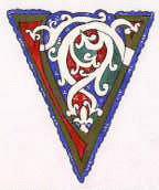
Our purpose now, however, is to create a piece of art based on the style that the Italians appropriated. "Goldvine" is the Carolingian/Ottonian original; "Whitevine" is the Italian modification. The styles are so similar that one can learn them both at the same time. Here is the short list of the differences: goldvine has gold vines whereas whitevine has white vines (well, duh, eh?), white vine has a further embellishment of small dots, goldvine is outlined in red whereas whitevine is outlined in black. That is pretty much it.
The color palette for this style:
First, let's make a goldvine letter.
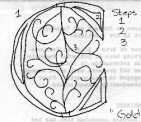
1. Draw a Versal or Uncial letter.
2. Insert cavities into the letter.
3. Sketch in the vines.
4. Weave the vines.
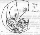
5. Outline the letter & clean up the drawing.

6. Paint the letter and the vines gold (easy way) or gild the
letters and vines (a process requiring
an
article unto itself).
7. In the spaces, apply your blue, red, and green paints.
Generally, the center sections are painted
red and the
remaining sections are painted blue or green as you fancy. The
letter is the boundary of the
painting.
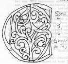
8. When the above is dry, paint a thin red line along the gold
work; this outline will clean up you
work and
re-establish the vine weave pattern.
YOU ARE DONE!
Time to completion: � to 1 hour.
Now, let's make the Whitevine letter.
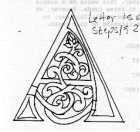
1. Repeat steps 1, 3, 4, and 5, as above. Do note, however, that
darn near no examples of
Whitevine around an
Uncial letter exist. You are better off with a Versal (Roman)
letter.
2. Paint the letter gold or white; I usually chose to make the
letter gold to provide contrast. Paint
the vines white.
3. Paint the background of the letter as in step 7, above. Do
note a difference here: the Whitevine
letter occurs
upon a blue field. Therefore, paint a thin amount of blue around
the whole thing.
4. Embellish the color blocks on the interior of the letter
thusly: on the blue and red block, paint 3
small white
dots in a triangular pattern (estencle, for you heralds out
there). On the green patches, paint the
three dots gold.
5. Outline everything in black.
YOU ARE DONE!
Time: 45 minutes to 1.5 hours.
The time estimates are fairly conservative and reflect a middling amount of familiarity with your materials. In any event, take your time, and enjoy your work. Illumination is fun, and everyone, with patience, can enjoy it.
A couple of notes. Clever folks may notice that the instructions for whitevine appear to be missing a step in the first instruction--"insert cavities." In the interest of being up front and correct, I must point out that most of the examples I've seen of whitevine letters do not have cavities. The letters are usually solid gold, occasionally solid white. When I paint the initials as stand alone letters, I like to add the red sections to the letter; this suits my aesthetics, but others may prefer to forgo this. Additionally, whitevine letters generally do not have their vines attached to the letter, whereas goldvines do; there is also greater variation in the "flowers" at the end of white vines versus goldvines. In the interest of absolute correctness, I am pointing these things out. While the letters are pleasing, whether you attend these small differences or not, I encourage you to also do some study in the following references.
Annotated Bibliography
The following books will assist you in painting in the above
styles.
Alexander, J.J. THE DECORATED LETTER. George Braziller, Inc:New
York, 1978. ISBN:
0-8076-0895-5 (paperback)
Plates # 10-14 feature various incarnations of goldvine letters,
of lesser and greater quality. This is
one of the
few books that features more than one example in color. A very
useful visual reference for any
scribe.
--------------, editor. THE PAINTED PAGE: ITALIAN RENAISSANCE
BOOK
ILLUMINATION 1450-1550.
Prestel-Verlag:Munich & New York, 1994. ISBN: 3-7913-1385-1
This is a superb book--and quite costly. As the title implies, it
contains a plethora of exceptional
examples of
the work of the last phases of Italian manuscript painting. There
are Whitevine examples scattered
throughout:
catalogue (rather than introductory) plates 9, 10, 12, 30, 34,
50, 58, 62.
This is an excellent
source for whitevine examples; 6 black & white plates and 20
color plates of whitevine work.
Bologna, Giulia. ILLUMINATED MANUSCRIPTS: THE BOOK BEFORE
GUTENBERG.
Cresent:New York, 1998 (1995 edition).
No ISBN given.
This is a nice survey of manuscripts from their first western
origins to the advent of printing.
Another survey that
every scribe should really have. Contains three color plates
notable for this article: page 82, a very
fine goldvine
uncial style "d"; page 95, a very interesting "o" that combines
both the goldvine and Celtic styles;
and page 133, a
whitevine border and initial.
Calkins, Robert. ILLUMINATED BOOKS OF THE MIDDLE AGES. Cornell
UP: Ithica, NY,
1983. ISBN: 0-8014-9377-3
An unusual survey, Calkins traces the development of illumination
by focusing on particular
manuscripts rather
than by single pages of various manuscripts. Chapter 4 covers
"The Pericopes of Henry II", an
Ottonian work that
contains several goldvine examples.
Grafton, Carol Belanger. ILLUMINATED INITIALS IN FULL COLOR.
Dover:New York,
1995. ISBN: 0-486-28501-4.
Generally speaking, I am always loath to recommend books that get
their graphics from the
chromolithography of the
late 1800's; the limitations of the coloring process results in a
number of inaccuracies, and the
Victorian artist's
tendency to redraw things to suit the aesthetic of the day
generally compounds the problem.
However, the gold- and
whitevine initials in this book don't have any serious flaws
(although there is a tendency to display
the goldvine
letters on a parti-color background--ugh), and there is something
to be said for a book that
contains more examples
than any of the other books in this bibliography and costs a mere
$10.
Mutherich, M. & J. Gaehde. CAROLINGIAN PAINTING. Geo. Braziller,
Inc:New York, 1976.
ISBN: 1-8076-0852-1
Surprisingly, this book doesn't really have much goldvine. There
are a few small initials, barely
decorated, on
plate 42. However, plate 42 contains a lot of free-standing
goldvine and a couple goldvine
sections containing the
dots that the Italians would later make a part of their whitevine
style. Worth a look.
Noad, T. & P. Seligman. THE ILLUMINATED ALPHABET: AN
INSPIRATIONAL
INTRODUCTION TO CREATING DECORATIVE CALLIGRAPHY.
Running Press:Philadelphia & London, 1994. ISBN 1-56138-458-5
This book is one of my favorite books to recommend. It's a
how-to-illuminate, and an excellent
resource for any scribe,
most especially one who is isolated and needs some instruction.
Project #4 is the goldvine "v"
from Henry II's
Pericopes, and project #9 is a whitevine initial.
Have fun!
Search Amazon.com for the above titles!
This page hosted by Geocities.
 Berkovits, Ilona. ILLUMINATED MANUSCRIPTS FROM THE LIBRARY OF
MATTHIAS CORVINUS. Corvina:Budapest, 1964. No ISBN given.
Berkovits, Ilona. ILLUMINATED MANUSCRIPTS FROM THE LIBRARY OF
MATTHIAS CORVINUS. Corvina:Budapest, 1964. No ISBN given. ![]()
![]()
 Use your browser's back
function or
Use your browser's back
function or Top Index Bibliography
Articles Gallery 1
Gallery 2
Gallery 3
Top Index Bibliography
Articles Gallery 1
Gallery 2
Gallery 3
![]()
Copyright 1998, 1999, Elise (Elyse) C. Boucher