 |
InDigest Press AvantFonts
difficult ugly illegible |
| Background |
| My interest in this area was really piqued due to a chance encounter with issue #18 of Emigre Magazine in an art museum's book store several years ago. My earliest fonts were done with the primitive type export function of Corel Draw 3.0. Then I splurged on a copy of Fontographer, which I still think is not up to its potential. Anyway, these fonts are not fancy things with kerning, lots of extended characters, etc. But some people seem to like 'em anyway. |
| Format |
|
All fonts were made on and for the PC, in TrueType format. Mac users will need to run them through a conversion utility. I have no idea how or if these utilities work, so you're on your own. |
| Free Fonts |
| When I was actively doing fonts, I always had a free font available here, and changed what font it was every so often. Don't get your hopes up about any more rotations! |
| Update |
|
One of the high points of my little font making time was when someone at Penthouse (yes, that Penthouse) bough a copy of Royal Pain and used it on an adult comics website they had (and may still have). I am currently not actively involved in making fonts, trading fonts, or promoting my fonts. In fact, I'm not sure I even have the files for all of these anymore. But life goes on. |
Click on a thumbnail to see the entire characterset of any typeface.
3 Faces |
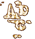
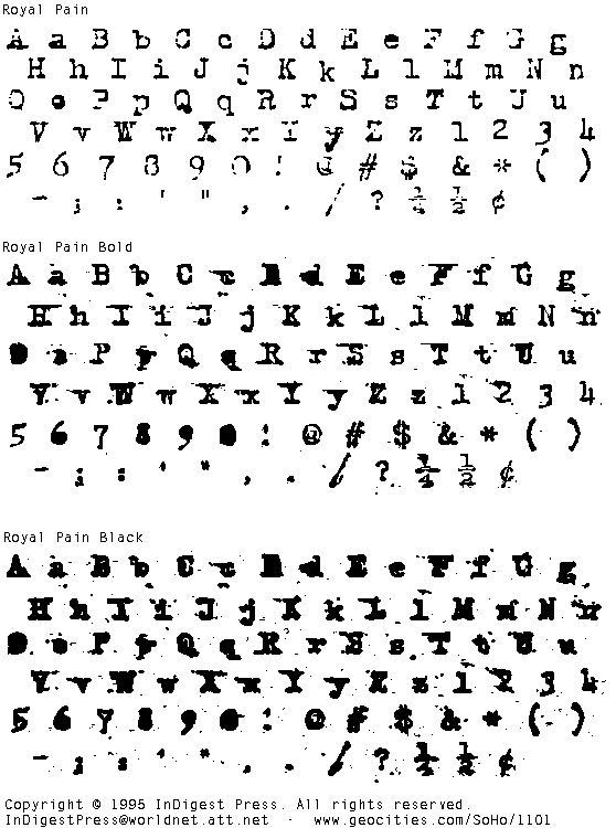
Royal PainThe Royal Pain family consists of : Royal Pain Normal, Royal Pain Bold, and Royal Pain Black. All are based on letterforms taken from an old Royal brand typewriter purchased for 50˘ at a garage sale. Only characters actually on the typewriter are in this font. For example, the numeral "1" is actually the lowercase letter "l". The exclaimation point is actually a combination of the single quote and the period.Our most popular font, Royal Pain works well as a text font. Get interesting results by mixing Royal Pain Bold randomly into a block of Royal Pain Normal. |

3 Faces |
StatStat is a family of three typefaces: Stat, StatBar Surge Suppression, and StatBar Spikes. These are "conceptual" faces were developed with the idea of creating a font whose letterforms conform to rigid guidelines so that it might be read by a hypothetical machine, with less priority given to making it legible to you & me. The two "bar" faces contain more guidelines to aid the machine but are more difficult to read for mere humans. They are also shown slightly larger in the sample graphic and with more space separating the characters (which normally connect to each other within a word). |
1 Face |
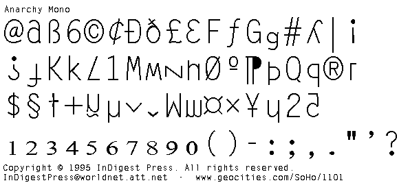
Anarchy MonoAnarchy Mono takes a dull monospaced font and moves the positions of the letters and symbols around. For example, the numeral "6" is used instead of a lowercase "b", the "@" symbol is used for the lowercase "a", etc. Nothing is in it's place! Pandemonium! |

not available |
Cannibal TimesCannibal Times is made of the dismembered remains of Times New Roman. This typeface is still under construction. |

1 Face |
JumpCutJumpCut is most useful (ie: legible) at large point sizes. A chunk shaped like the corresponding lower case letter has been removed from each upper case letter. A chunk shaped like the corresponding upper case letter has been removed from each lower case letter. Numerals and symbols subjected to various appropriate punishments. A typographic dysfunctional family? |

2 Faces |
BlurrdBlurrd is a family of two widths of a slightly blurred looking sans-serif typeface. An early experiment using the primitive CorelDraw 3.0 font export filter. Nothing too fancy! Used as a text font in InDigest magazine #1. |

2 Faces |
GlitchThe Glitch family are supposed to resemble a low res dot matrix printer font. In Glitch0 everything is fine and dandy. In Glitch1 things are a bit SNAFUed. Someday I plan to fix up Glitch1 so the stray dots are more visible at smaller point sizes. I also plan to add Glitch2, Glitch3, ... GlitchN, each a bit more damaged than the previous.
Sure, go ahead and take it, but we'd really appreciate it if you send us an issue if you use it in yr zine, or provide a link back here if you use it on yr web page! 30K zip file. |

| |
GeoCities  SoHo SoHo |