Review Configuration
|

|
After having been on the net for so long and seen/reviewed/commented/praised/stomped/you-get-the-drift so many sites, I have deduced there's 4 types of layouts.
- Type-1(tm) - the unorganized type. It can be completely linear (what most people did when it was still HTML 2.0) or it can be completely unlinear (ie. a complete mess - what most people who use WYSIWYG HTML Editors come up with).
- Type-2(tm) - the highly packed type. You get these from most companies who try to cram as much content as they can on one page complete with a lot of tiny words and a lot of graphics (eg. your ISP's homepage).
- Type-3(tm) - the loosely structured yet very artistic type. These are the ones which doesn't have much content on a single page, but all those white space doesn't look out of place neither. They seem as if they were meant to be there and has a tendency to write everything in lowercase and replacing words with graphics.
- Type-4(tm) - one that doesn't fit into any of the above. These sites are extremely rare and feature an original layout that you won't find a second to anywhere on the web. You can even say these sites have their own floor plans!
Splash/Welcome Page
Warped Pastel? I see what you mean from the logo ^^ Ah, good that you state that you use iframes, but I think you should also mention that only Internet Explorer 5.0 or above as iframe support :P
|
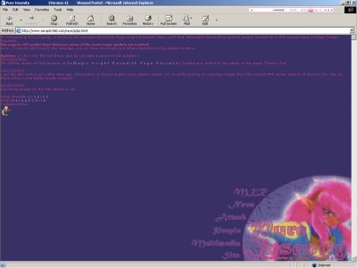
Main Page Nice logo and navigation system at the bottom, but I must say the rather linear text on top lets it down. Although the stuff here isn't that important (it's just updates and a general introduction), you might consider using a font size that's a bit larger, sometimes such small font (using size 1) can be a bit hard to read. Why did you change the style sheets so that moving the cursor over links shows the vertical resize cursor? Wouldn't the normal finger cursor that everyone recognizes as a link would do fine? Anyway, the color scheme used here (pink and purple) fits pretty well together as one is light while the other is dark, making even the somewhat tiny text show clearly.
Everything's correct here besides that Clef only knew the other countries are here to invade Cefiro, nobody knew for sure that they intended on being Cefiro's Pillar after the Knights confronted each of them. |
|
Also, if the second series description is such a major spoiler, why not hide it away from the initial screen? There's a lot of people who get worked up when you show them spoilers but didn't give enough advance warning. A very easy way to do it is change the spoiler text to the same color as the background (like what you've done in some other sections), meaning they must highlight the text to see it.
Nova Section
This section is split into 3 sections, Story, General and Why?
StoryPretty ok, but you might want to mention that Nova couldn't find Hikaru because Hikaru went back to Tokyo.
General
Actually, there's another one (although less apparent) character called Mira - the little girl Hikaru saves in season 1 and comes back with other kids in season 2. It'll make more sense that Itou Miki did the JAPANESE voices of both Nova and Umi's mom.
Why?
Personal opinions about why the webmistress likes Nova. Just my 2 cents about the story making Nova seem good, from all the CLAMP stuff I've seen/read, there was never a really evil guy, they all have their reasons and motives behind him/her which makes things look reasonable at a certain point of view. Just thought you might want to know :P

|
| Before highlighting... (From Story Page) |
Attack Section
Description of the weapons, magic, Mashin and "minions" Nova gets to play with, pretty straightforward and correct.

|
| After highlighting... (From Story Page) |
People Section
This one is again split into Hikaru, Lantis and Debonair.
HikaruNothing I can see wrong here...
Lantis
Umm, why is it just "Car" under Name info? Anyway, the car name that Lantis' name comes from is the Mazda Lantis.
Debonair
Was Debonair's castle called "Debonair Castle"? I don't think it ever had a name :P
Multimedia Section
Contains your standard Image Gallery (with real thumbnails and a separate HTML file for each image - which is nice although not really useful), sound clips and fan related stuff (fan art and fan fic). There's supposed to be a songs section too, but it's not done yet. Nothing I can complain about here.
Site Section
Links in and out stuff, contact and a to-be-made guestbook. Pretty standard stuff, nothing out of the ordinary here...
Overall Impression
Although the information presented here isn't humongous (well, Nova did only show up in the second season you know), it's pretty impressive that most of the stuff here is correct. The layout works pretty well, although more work on the text formating would definitely make it look better. Another plus is this site still works in Netscape even if it uses iframes.
|
|
||||||||||||
|
|
||||||||||||
| 0 | Crap | 5 | Average | 6 | Above Average | 7 | Good | 8 | Very Good | 9 | Excellent | 10 |
|
|
||||||||||||
|
|
|
|
|
| Bottom Line | Score |
| Nova fans rejoice, another quality character shrine for you. | 8.0 |