Comments:
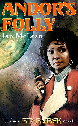
Entry E I don't like for the simple reason that "Star Trek" isn't featured prominently enough on the cover (i.e. being at the top and bigger than it is). And I never really thought that Uhura alone on a cover really attracted many people. Even "giant head Spock" would help here.
Uhura is seldom on a cover and if she is, she's always young. I like seeing her look like she's put in some parsecs! Overall look is well balanced and well drawn.
I like the way this looks - kinda like an old spy novel. I also like how it uses the "new" TOS/TNG design with the title at the top and the series at the bottom.
Uhura with a phaser - what could be better than that?
I like Uhura, and the art is okay. But this is incredibly cheesy; it looks like a ST cover of yesteryear that I'd find in second hand bookstores. I wouldn't buy it.
This is a tie between Entry D and Entry E. Uhura doesn't get nearly enough cover time, and the combination of her holding a phaser (implication of impeding butt-kicking) and the old-timey look of the cover is cool.
Lame.
Entries D and E would tie for bottom for me. I don't know, they just really don't strike me as being... right. Entry E looks like a Sherlock Holmes or Nero de Wolfe cover from the 50s, or maybe a horror B-movie poster.
Very good but not as good as C. Nice pic of Uhura.
Andorian Planetary Council:
I like the typeface used. In fact, Entry E would be my second choice for cover art as well. It has a very "classic" sci fi feel about it.
Entry A and E are too typical and give no hint of the story.
The retro design grew on me. While it doesn't have a critical element (i.e. an Andorian) it does have a clean layout and the elements are integrated professionally - doesn't look like it was Photoshopped together. I ranked this above D because the colors and design elements caught my eye as soon as I loaded the page. It was the cover I noticed first. From a publishing standpoint, this element is critical. The Andor connection is weak (you could change the title on this cover and it could apply to another world. It could just as easily be "Bajor's Folly"). Still, I think the attention grabbing color scheme and design gives it merit.
Ian's comments:
This is a stunning cover. I really love it - and so would Nichelle Nichols and all Uhura fans, I'm sure. But then, it could easily be a cover for any movie-era ST book (or comic!) that featured Uhura prominently. That can be an advantage and a disavantage. A great cover for the designer to keep in a portfolio when shopping around for work, but perhaps one destined to go into a file until another cover artist runs late. Or as a "pin-up" in the back of a comic where the lettercol runs short.
Back to main menu of competition page.
Star Trek © Paramount Pictures Corp. This webpage is for the promotion of a free competition only and is not intended to infringe on the rights of Paramount Pictures Corp. or Pocket Books.
Page revised September 2003
URL: http://www.oocities.org/therinofandor/index.html
Email Therin and Ian at: lindsay96@ozemail.com.au