These a my thoughts about the covers of David's albums. I ignored the Best of.. and Love Songs, because these are just collections. I also excluded Double Vision since this is no pure album of his, and also Taking Off for I believe that David had no influence on the design of the cover of his first album.
 The albums David released in the 70s, Sanborn, Heart To Heart and Promise Me The Moon, all feature
a big photo of David on the cover with his name in capital letters and that's all I have to remark about that.
Not very innovative, but useful to compare with photos from the present ;-)
The albums David released in the 70s, Sanborn, Heart To Heart and Promise Me The Moon, all feature
a big photo of David on the cover with his name in capital letters and that's all I have to remark about that.
Not very innovative, but useful to compare with photos from the present ;-)
The beginning of a new decade changed the design of the covers drastically: the titles of the albums became bigger, photos of David were banned to the backcover or totally dropped. Instead the covers were more aritistic. Hideway e.g.
 features a atmospheric photo that is somehow linked to the title of the lp. The front and
backcover of Voyeur were even more abstract. Though colorful it still looks plain and
despite the geometric shapes, the picture gives the impression of being "alive". The letters are
integrated into the whole and not superimposed, so the cover gives a harmonical gerneral impression.
features a atmospheric photo that is somehow linked to the title of the lp. The front and
backcover of Voyeur were even more abstract. Though colorful it still looks plain and
despite the geometric shapes, the picture gives the impression of being "alive". The letters are
integrated into the whole and not superimposed, so the cover gives a harmonical gerneral impression.
In contrast to Voyeur, the cover of As We Speak looks almost graphic and provokingly simple: 5 colours and simple shapes; as if no time was wasted on the design, but all spend on the content.
Backstreet breakes with the abstract phase of design. It is entailed with Hideway in so far as both illustrate the album's name. Backstreet is a collage with much to see. It also includes the a (very tiny) picture of David.
 In the middle of the 80s,
close up shot had their comeback. Straight To The Heart, is almost a shock after all those
artistic, decent covers of the past. I know it's a mean thing to say, but for me Straight To The Heart is the "playboy" cover.
In the middle of the 80s,
close up shot had their comeback. Straight To The Heart, is almost a shock after all those
artistic, decent covers of the past. I know it's a mean thing to say, but for me Straight To The Heart is the "playboy" cover.
The following albums Change Of The Heart and Close Up were made in a more unobtrusive way, though they cannot do without the eye-catching type SANBORN.
A new decade, a new look.
Another Hand leaps into an age of changes: the front side of that album looks like old covers were torn a part and new arraged; you can discover a alienated portrait of David.
 Upfront does not feature the man
himself on the cover photo, but a symbol of David, again alienated to match the funky content.
This cd also includes a booklet with more such photos.
Upfront does not feature the man
himself on the cover photo, but a symbol of David, again alienated to match the funky content.
This cd also includes a booklet with more such photos. On Pearls, David interprets standart and classics, so what would be more approquiate than a classical close up of David. This may seem like a step back to the 70s/80s - and partly it is - but again the photo is alienated and focusses more on the shades of blue.
The cover of Hearsay was designed with comic/popart elements, making the picture seem lively like the music is. A big, but really lovely and artistic picture of David is printed on the backcover.
Finally, on the front of Songs From The Night Before, David - though on the cover - is out of focus. The photographer wannted to convey a certain atmosphere and David is integrated into the picture and part of the overall impression.
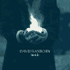 It is almost the same
with Inside, but this photo leaves more room for your own imagination. The viewer of course focusses on the flame, still - as he holds it in his hands - we automatically think of David. Since we do not see his face, the impression one has looking at the cover differs from person to person. That is the art of making someone believe he saw something. What do you imagine David's facial expression to be like?
Thoughtful, smiling, painful? Does he look at the camera or at the flame or maybe in another direction ?
It is almost the same
with Inside, but this photo leaves more room for your own imagination. The viewer of course focusses on the flame, still - as he holds it in his hands - we automatically think of David. Since we do not see his face, the impression one has looking at the cover differs from person to person. That is the art of making someone believe he saw something. What do you imagine David's facial expression to be like?
Thoughtful, smiling, painful? Does he look at the camera or at the flame or maybe in another direction ?
This picture is smashing, but I could not decide which cover is truely the best.
BACK