![]()
|
|
|
|
This page contains a dynamic collection of propagation information gathered from many different sources. Near-Real-Time MUF MapThe following image is a recent high-resolution map of Maximum Usable Frequencies (MUFs) for 3,000 kilometer radio signal paths. It is also a map showing the current location of the auroral ovals, the sunrise/sunset terminator and the regions of the world where the sun is 12 degrees below the horizon (which estimates the gray-line corridor where HF propagation is usually enhanced). (This map is updated every 5 minutes.)
This image courtesy of Solar Terrestrial Dispatch To know, how to use this map, click on the image The yellow Sun symbol near the equator indicates the location where the Sun is directly overhead. Gray Line The regions of the world where the Sun is exactly rising or setting is known as the Grayline and is shown as the solid gray-colored line that is closest to the Sun symbol. The area between the two lines is known as the grayline and has special significance to radio communicators. Signals which travel inside the grayline region often experience significant improvements in propagation because of the loss of ionization in the D-region as the Sun sets. However, because the higher F-regions of the ionosphere remain strongly ionized for longer periods of time, signals with higher frequencies are able to travel to greater distances with less attenuation when they are within the grayline Solar X-ray Flux This chart shows X-ray flux levels as measured by the GOES-8 and GOES-10 satellites. The GOES-8 measurements (shown in red) are used to issue "solar alerts" when X-ray flux levels exceed certain levels. Spikes on the chart correspond to solar flares. Flares are considered "significant" when flux levels rise above the "M" level (as shown on the right side of the chart). These large flares can often wipe out the bands almost immediately and it can take minutes to hours for the bands to recover. If the bands seem to go dead all of a sudden, it is always a good idea to check this chart to see if a large flare has occurred recently. Information from the Space Environment Center, Boulder, CO,
Dynamically updating plots:
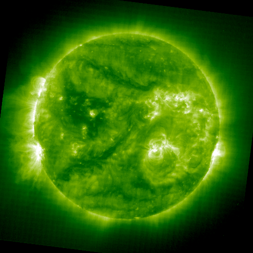
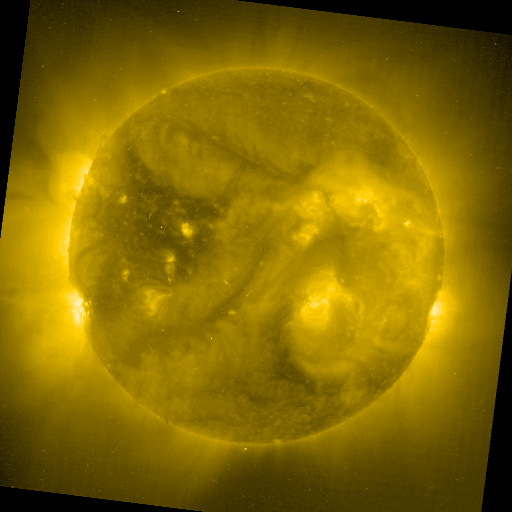
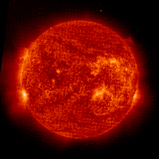
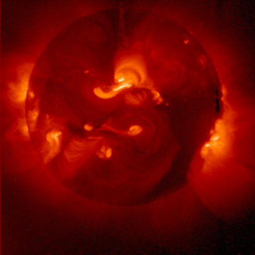
Current Solar Images The images below are current views of the sun shown at different wavelengths of light as taken by SOHO and the Yohkoh soft-Xray telescope. Generally, more bright regions on the disk indicates more solar activity, which usually leads to higher solar flux levels (which usually leads to better propagation!). Click on any thumbnail to view a larger image.
Sometimes you may see "CCD Bakeout" instead of the solar disc images. This occurs when NASA does routine maintenance and calibration on the cameras. For a more technical explaination, read NASA's CCD Bakeout explaination.
|
|
|