As I mentioned before, the Soul Calibur Master title belt is my favorite design. And because I like this design more than any other I've worked on, I've never been fully satisfied with it. Since this was my very first title belt design, I was still learning the ropes and experimenting with concepts. At the time I had only a vague idea on how I was going to assemble a title belt, so I was pretty conservative with my design ideas. But once I had the process down to a science I really let loose, and my subsequent belt designs reflect this progression. And, since I was never fully satisfied with the Soul Calibur Master belt design, I decided to update it and apply some of the experience I've gained.
Fortunately the basic concept of the Soul Calibur Master belt design did not have to be overhauled; it just needed to be improved. The original design had flourishes on the main plate that I removed because they distracted from the major design elements. This always bothered me, and it wasn't until the completion of the Tools Engineering Superstar belt that I had an idea on how to make it work for the Soul Calibur Master belt design. Rather than have random splotches or geometric designs in the background, I thought of using Japanese Kanji characters. Not just random characters, but actual Kanji ideograms for words like yuukan (bravery), meiyo (honor) and hokori (pride). Since I don't speak or read Japanese, this was, needless to say, a lot of work. But there were a good many sources on the Net, and I was able to assemble a decent list of words.
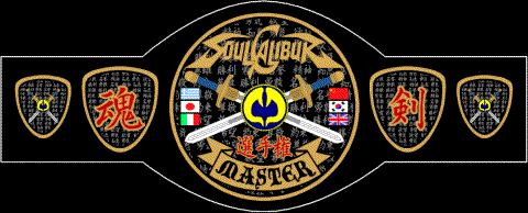
Once I had the Kanji "wallpaper" on the main plate design, I sat back, looked it over and thought about how it affected the other design elements. After a little testing I concluded that the only elements the Kanji characters distracted attention from were the "MASTER" titling and the sword wielding ding-bats. To re-emphasize the titling, I decided to put the word "MASTER" in a ribbon, a trick I learned from the WWF SmackDown Champion design that allows the titling to better hug the bottom part of the plate. As for the ding-bats, they had to go (no big deal, cuz I only had them in there to eat up space, anyway) and I replaced them with the flags of the countries of the game characters, kinda like the way I used them in the Tekken 3 belt designs. This worked out real well and improved the over all balance of the design.
For the side plates, I decided to remove the images of Taki and Nightmare, primarily because the images weren't as good as I wanted them to be. I didn't know what to put in their places, until my research into Japanese words produced two Kanji ideograms that fit the bill perfectly; tamashii (soul or spirit) and ken (sword). "Soul Sword" sounded very appropriate for the Soul Calibur Master belt design. Moreover, I found the Kanji characters for these two words to be very cool looking!
All in all, I was very happy with the updated Soul Calibur Master belt design. And, surprisingly, I was able to make it look Japanese this time, something I wasn't able to do with the two Tekken 3 designs. Another good thing is it will be easier to adapt this design for a Soul Blade Master title belt, if I ever decided to dig that project out of its grave and work on it again.
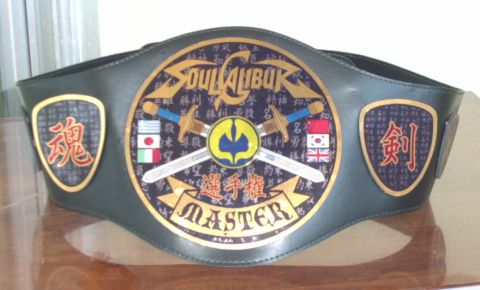
Here are some images of the finished belt: