|
Collected by Elizabeth Janson Home Page |
|
|
My introduction page 'Using Text effectively', shows how Text may be organised using 'margin', 'lineHeight', 'textAlign', 'textIndent', 'textDecoration' and 'textTransform'. One of the most important features of style sheets is that they specify how a document is to be presented on different media: on the screen, on paper, with a speech synthesizer, with a braille device, etc. This subject is introduced in my page 'Media to provide access for special users'. CSS2 and Visual formattingCSS provides 'positioning' to replace tables. Style sheets introduce the ability to place elements anywhere on a page, but in practice, the current browsers don't support this positioning all that well. Visual formatting works on block and inline boxes. Block-level elements are those elements of the source document that are formatted visually as blocks (e.g., paragraphs).Inline formatting contextIn an inline formatting context, boxes are laid out horizontally, one after the other, beginning at the top of a containing block.The P generates a block box, with several inline boxes inside it. The box for "emphasized" is an inline box generated by the inline element (EM), but the other boxes ("Some" and "text") are inline boxes generated by their parent block-level element (P). The latter are called anonymous inline boxes, because they don't have an associated inline-level element. Anonymous inline boxes occur in a document like this: <P style="background-color:skyblue"> Some <EM style="background-color:palegreen"> emphasized</em> text</P> Some emphasized text This is an example of anonymous block boxes, with an EM box, which is 'static' - the box is a normal box, laid out according to the normal flow. The 'left' and 'top' properties do not apply. Such anonymous inline boxes inherit inheritable properties from their block parent box. Non-inherited properties have their initial value. In the example, the color of the anonymous initial boxes is inherited from the P, but the background is transparent. Here is a more colourful example of inline box construction. The following paragraph (created by the HTML block-level element P) contains three anonymous text elements interspersed with the elements EM and STRONG:
<P style="background-color: plum">
<span style="background-color: khaki;">
	Several more </span>
<EM style="padding: 2px; margin: 1em;
	color: red; background-color: palegreen;
        border: thin dashed blue;
        line-height: 3em;">
	emphasized <BR>words</EM> appear
<STRONG>in this</STRONG> sentence, dear.</P>
Anonymous: Several more EM: emphasized Comparison of normal flow, floats, and relative positioning<P style="background-color:khaki">Beginning of body contents.
<SPAN id="outer"> Start of outer contents.
<SPAN id="inner"> Inner contents.
</SPAN>
End of outer contents.</SPAN>
End of body contents.
</P>Normal flow#outer { color: red; background-color:pink" }#inner { color: blue; background-color:lightblue; padding: 10px" } Beginning of body contents. Start of outer contents. 1 Inner contents. End of outer contents. End of body contents. Relative positioningOnce a box has been laid out according to the normal flow, it may be shifted relative to this position. This is called relative positioning.
#outer { position: relative; top: -12px; color: red } Beginning of body contents. Start of outer contents. 2 Inner contents. End of outer contents. End of body contents. Floating a boxNow consider the effect of floating the inner element's text to the right by means of the following rule:#inner { float: right; width: 130px; color: blue; padding: 10px } Beginning of body contents. Start of outer contents. Inner contents, need more words. End of outer contents, need more words, need more words, need more words. End of body contents. Notice how 'position: relative; top: -12px;' enabled the pink box to obscure the opening words, also the blue box is over-lapping this paragraph. Remove 'position: relative; top: -12px;' and use green to show the sibling element added after the span containing the inner element. Move the 'inner box' to be the first box encountered - so it is placed higher in the block. Beginning of body contents, need more words, need more words. Inner contents, need more words. Start of outer contents, need more words, need more words, need more words. Sibling contents, need more words. End of outer contents, need more words. End of body contents.
Showing effect of 'clear' On a small scale and now using 'clear: right' with the green sibling element. The initial release of IE 4, supplied with many computers, will crash the computer completely if clear is used. On a small scale and now using 'clear: right' with the green sibling element. The initial release of IE 4, supplied with many computers, will crash the computer completely if clear is used. Beginning of body contents, need more words, need more words. Inner contents, need more words. Start of outer contents, need more words, need more words, need more words. Sibling contents, need more words. End of outer contents, need more words. End of body contents. Relative positioning, on a larger scaleOffsetting the blue box (B1) in this way has no effect on the pink box that follows: B2 is given a position as if B1 were not offset and B2 is not re-positioned after B1's offset is applied. This implies that relative positioning may cause boxes to overlap, and certainly distorted the text, as my example shows. Beginning of body contents. Start of outer contents. Text flows normally up to the inner box, Inner contents. 'float:right' causes the inner box to float to the right and the document's remaining text to flow into the vacated space:However, if the 'clear' property on the sibling element which is pulled out of the flow and floated to the right margin (its 'width' has been assigned explicitly). Line boxes to the left of the float are shortened, and the document's remaining text flows into them. However, if the 'clear' property on the sibling element is set to 'right' (i.e., the generated sibling box will not accept a position next to floating boxes to its right), the sibling content begins to flow below the float: End of outer contents. End of body contents. floatA float is a box with explicit width, that is shifted to the left or right on the current line. The most interesting characteristic of a float (or "floated" or "floating" box) is that content may flow along its side (or be prohibited from doing so by the 'clear' property, which may only be specified for block-level elements (including floats). Any floated box becomes a block box that is shifted to the left or right until its outer edge touches the containing block edge or the outer edge of another float. The top of the floated box is aligned with the top of the current line box (or bottom of the preceding block box if no line box exists). If there isn't enough horizontal room on the current line for the float, it is shifted downward, line by line, until a line has room for it. Since a float is not in the flow, non-positioned block boxes created before and after the float box flow vertically as if the float didn't exist. However, line boxes created next to the float are shortened to make room for the floated box. Any content in the current line before a floated box is reflowed in the first available line on the other side of the float. Several floats may be adjacent, and this model also applies to adjacent
floats in the same line.
IMG.icon { float: left;  margin-left: 0; }

<P STYLE="border:solid blue">
<IMG SRC="float2p.gif" width=320
height=315 alt="example" style="float:left;
margin: 2em; border:thin solid green">
</p><p STYLE="border:solid orange">
<IMG src=test.gif width=91 height=123
alt="This image will illustrate floats"
style="float: left; margin-left: 0;">
A float is a box that is shifted to the left or right on the current line.
Using a rule such as 'P { clear: left }' would prevent the second paragraph being involved. Here are some of the precise rules that govern the behavior of floats: |
 The most interesting characteristic of a float (or "floated" or "floating" box) is that content may flow along its side (or be prohibited from doing so by the 'clear' property).
 Content flows down the right side of a left-floated box and down the left side of a right-floated box. The following is an introduction to float positioning and content flow; the exact rules governing float behavior are given in the description of the 'float' property.
A floated box must have an explicit width.
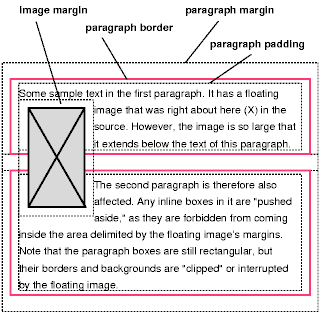
This illustration shows what happens when a float overlaps borders of elements in the normal flow (the notes are also in two paragraphs). A floating image obscures borders of block boxes it overlaps.
Content flows down the right side of a left-floated box and down the left side of a right-floated box. The following is an introduction to float positioning and content flow; the exact rules governing float behavior are given in the description of the 'float' property.
A floated box must have an explicit width.
This illustration shows what happens when a float overlaps borders of elements in the normal flow (the notes are also in two paragraphs). A floating image obscures borders of block boxes it overlaps.
|
Email CSS begins here |
|
This page is part of Elizabeth Janson's web site
http://www.oocities.org/elizatk/index.html
Tetbury residents in the Eighteenth Century my Australian Family History and Barrie, our Family Poet. |