
Short Term Quantitative Analysis for the Average Investor
By Eric Swanson
Abstract
This paper will discuss if there are merits for the average investor to have an investing strategy of quantitative analysis, dollar cost averaging, or a buy and hold strategy. This paper looks at some of the many tools of quantitative analysis and tries to use them for financial gain in accordance with real constraints such as commissions and taxes. To ensure that real gains can be made by anyone, the data was taken from Yahoo Finance Website. The indicators that are employed can also be utilized by users of the Yahoo Finance Website. This ensures that if there are gains to be made, anyone would have the tools to do it. This paper only looks at the short term from Jan 1, 2003 to Jun 4, 2003. For the six months that are represented, the average returns and percent differences are calculated for the three styles of investing. It was found that in relation to the three investing strategies that dollar cost averaging returned the best average returns and less risk of fluctuation in the returns.
Introduction
The term “Quantitative Analysis” is generally assumed to be the thinking man’s way to investing. Many believe that those that can understand and apply the techniques of Quantitative Analysis will be able to achieve financial success through continually buying low and selling high at the time. However, this is not the case at all. Quantitative Analysis is founded by the belief that stocks ultimately are ruled by underlying formulas or trends.[1] If one can decipher those trends, then one will be able to predict the best to time buy and sell. The evidence this paper will show that a quantitative analysis investing strategy is not worth the time and risk that is involved in calculating the “right” signals. A simple dollar cost averaging model can make more money than analyzing charts and averages.
Quantitative analysis has long been a curious venture of practioners and academia. The first well known quantitative analysts was Charles Dow, of the fame that inspired the Dow Jones Average.[2] During his time, he felt that by using a couple calculated moving averages one could master the stock market and have large returns. His averages inspired many other analysts to seek better and more robust models to forecast the market. Yet in the early 20’s no one was able to achieve the gains that he was able to make.[3] As soon as one person published a model that created excellent returns, the returns were diminished and improvable. Market efficiency was the problem with continued success with a model, because when the market is considered efficient then all new knowledge or inputs to the market are quickly assimilated.[4] There is no way for one person to reap gains from the market, because all gains are quickly balanced by loses. Benjamin Graham, a legend in stock picking, commented on this phenomenon by saying, “Hence thoughtful chartists admit that continued success is dependent upon keeping the successful method known to only a few people.”[5] Therefore, since no long run profits were realized, quantitative analysis slowly diminished in popularity.
The introduction and the wide appeal of the computers made the hope for gains through quantitative analysis more popular. Computers are assumed to be able to quickly and accurately calculate the randomness of the market and be able to prove the inefficiency of the market.[6] However, many authors believe that computers cannot prove the market inefficient. As far back as the 20th century quantitative analysis was exhaustively tested on both markets and found that past movements in the stock market can not predict the future movements.[7] The only gains that are realized are those gains for the brokers through commissions.[8] Quantitative analysis cannot consistently predict the market and therefore achieve great returns due to the market being efficient in countering all new knowledge and inputs.
In comparison to the time intensive quantitative analysis approach one could use a simpler model of investing. Dollar cost averaging has been proven to achieve respectable returns. Dollar cost averaging is the method of investing continually and incrementally. This is believed to achieve better returns because the investor lowers the risk that the entire portfolio will experience temporarily inflated prices.[9] Therefore, the investor buys fewer shares of stocks at a high price and a more shares of stocks at a low price. This balance helps to achieve the returns in spite of the volatility of the market due to market efficiency balancing the many inputs. The critical rule of this model is to continue investing no matter how bad market indicators report.[10] It is fundamental to buy at least some shares at these reduced prices to achieve the returns that come from timely investing.[11] Without having to predict the market, dollar cost averaging can achieve descent returns.
This paper will look at the two previously described methods of investing and a simple buy and hold method. The buy and hold method will try to mimic the market and be the study’s constant variable. The quantitative analysis that is described in this paper was used, in theory, to best forecast the market and achieve the best results. This paper differs greatly than other research done in this field, because it takes into account commissions and taxes that an investor will incur if they invested using one of these methods.[12] The point of the research is to prove markets are efficient by using data that is accessible by an average investor, quantitative analysis that is readily available on many financial websites, and investing amounts that are reasonable. This research is suppose to help the average investor to know with all the options out there to use for investing techniques, which would potentially be the best at returning gains that the investor would enjoy. This layman form of research and analysis is most practical to proving the market efficient and to achieve good quality returns in real life examples.
Literary Review
Quantitative analysis is a very appealing, but inconsistent investment strategy. There have been many, bright financial managers that have been able to correctly predict the market using a host of different quantitative techniques.[13] But according to Burton Milkiel (1996) none have lasted the test of time.[14] Lo and WacKinlay (1995) tested these quantitative tools and found that these tools can predict the market on a few occasions, but not enough to prove the market inefficient.[15] There are predictive components to the market, but not enough to reap real gains. However, the average investor is enticed by many advertisements in society to trust for instance a new computer based stock market prediction tool that promises outstanding results. If they don’t fall for the tools themselves, they trust financial managers that use the same tools, hoping that their knowledge and years of experience will reap for the investor great gains. Average investors fall for this, because quantitative analysis is appealing.
“We also prefer the complex and artificial to the simple and unadorned. We are certain that investment success requires an incredibly complex ability to judge a host of variables correctly and then act upon that knowledge.”[16]
However, most quantitative analysis does not hold up after paying transaction costs.[17] Many average investors put their money in mutual funds, but most actively managed funds can not beat the S&P 500 index according to O’Shaughnessy (1998).[18] LeWellen, Lease, and Shlarbaum’s (1979) research found this active method of using predictive techniques or tools does no better than a buy and hold strategy for investors.[19] Even Fortune magazine conducted a survey in 1966 and 1967 and found that before the declines in the market of Feb 1966 and Oct 1966, most analysts’ forecasts were vague and incorrect to what was about to happen to the market.[20] Quantitative analysis uses knowledge of the past to try to predict future market trends. Friend (1972) tested some of the quantitative tools to try to see if they were predictive and if so, what that meant for market returns. [21] However, Friend found what others have also found, that these quantitative models do not provide significant basis for earning above average returns in the market.[22]
Using this knowledge, this paper will continue to prove the insignificance of the quantitative analysis. Using tools and data that are readily accessible from Yahoo Finance, this study will test the ability of these tools to predict the market and make good financial decisions. There have been other practioners and researches that have done this study, but this study will try to vary from others by adding real constraints such as taxes and commissions. Therefore, this study is an extension of others’ work.
Quantitative Model
The method used to calculate the quantitative analysis of the stocks is simple in idea. The idea is to be able to buy the stock when the stock was heading up and then sell and stay out of the market when the stock was heading down. To do this a slope was generated for each indicator. Then the idea was to buy when the slope was positive and sell when the slope was negative. This idea is applied to all the different indicators that can be provided by Yahoo Finance website. The different indicators used are 10 Day Channel, 5-20 Day Moving Average, Moving Average Oscillator, 5-20 Day Exponential Moving Average, Price VS S&P, Bollinger Bands, Money Flow Index (MFI), and the Relative Strength Index (RSI). The calculations used in this model were calculated Excel program. The scale used in this model was a 5 point scale. The Scale used in all instances in this model was:
N<1 – Strong Sell
N<2 – Sell
N<3 – Hold
N<4 – Buy
N<5 – Strong Buy
Each indicator was weighted equally. These recommendations from the different indicators were all averaged to get one final recommendation for that month. Everything was calculated using a year’s worth of daily data from Yahoo Finance up the third trading day of the forecasting month. For here on, this method will be called the “Smart Portfolio”, due to the quantitative nature of the portfolio.
In all instances of this model the slope was calculated the same way. The data points were considered the y-variable. The x-variable was a time variable using 1 as the beginning of the daily data on January 1, 2003 running consecutively to June 4, 2003. Then the slope was calculated. Then an assignment of 1 or 0 was given to the slope. If the slope was positive (negative) it received a value of 1(0). A 5-day moving average was calculated on the binary numbers. If the 5-day moving average was greater(less) than 2.5 the signal received a 1(0). Then a 10 day or 12 day sample average was calculated for the forecast period for the month. That number was scaled to the 5 point scale and was automatically copied to another worksheet in Excel that would average all the recommendations to one single recommendation.
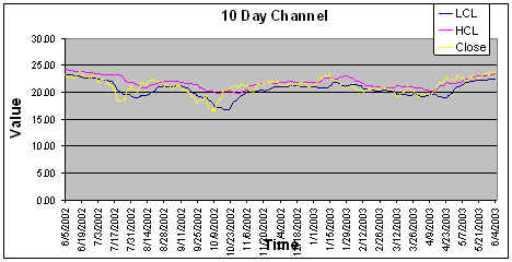
a) Channel
The 10 Day Channel uses a moving average to motivate indicators. The idea of a channel allows the technical analyst to see when trends occur when the price breaks out of the channel. When the price breaks above(below) the channel a sell(buy) signal is indicated. The inherit flaw in this indicator is when the buy/sell signals are given. In most cases during this experiment, the stocks would break above (below) the channel at such a point that when the opposite signal was given no real gains could be retained. Some analysts use a minimum level, or a secondary channel, to limit the amount of “whipsaws” an investor will incur.[23] Whipsawing is the amount of times an investor must get in and out of the market in a short amount of time. The idea of a secondary channel or confidence level is great in theory, but in actuality it is almost impossible to accurately do well when every stock behaves differently. The question then becomes of how much deviation to give to this secondary channel. This experiment tried a second confidence level to ensure “good” buy/sell signals, but what deviation worked for one stock, never worked for the second stock. This experiment was forced to adopt the slope method of finding indications, so that there was more confidence in the buy/sell signals, less whipsawing, and more time the money had exposure to the stock so it can grow.
This experiment’s channel was calculated by finding the 10-day moving average and applying a random deviation to it. The formula for this channel was:
CPt being the Current price at time t
In this instance, the slope was found using the Low Confidence Level (LCL) as the y component. When the LCL sloped up(down), a buy(sell) signal was given. The following is an example graph of a channel.
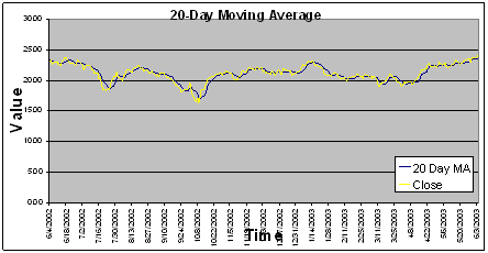
b) Moving Averages
A moving average is a good indicator. Using the slope method of this indicator, it is easy to see and to calculate when there needs to be a buy/sell signal. The moving average is also easy to calculate. Below is the equation for this experiment’s moving average:
In this experiment a 20-day moving average was calculated and then the slope method was applied to each month’s forecast to make an indicator. A graph of this indicator is below:
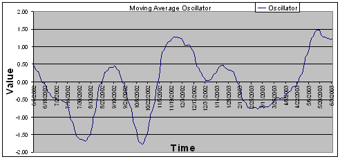
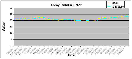
c) Moving Average Oscillator
This price oscillator was simply the difference in two moving averages. This experiment used the difference of a 20-day and 50-day moving average. The equation that was used was:
The slope method was used to find the true indicator by using a 12 day sample average of the oscillator. Below is an example of the Moving Average Oscillator:
d) Exponential Moving Average
The exponential moving average is another indicator used similar to the usual moving average. This moving average is calculated by using the following formula:
This experimented used a 12-day exponential moving average. Below is an example of the 12-day exponential moving average.
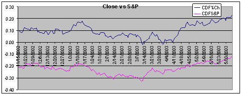
e) Price vs. S&P 500
The next indicator was used to relate the individual stock to the entire market of stocks. The S&P 500 was used as the market basket of stocks. The S&P 500 has always had a positive trend over the long run. This is due in part to the individual stocks that make up the S&P 500 driving this average up. So in turn those stocks that outperform the S&P 500 and help lift the market up are stocks that an investor wants to invest in. Otherwise, if a stock does worse than the S&P 500 and in the long run the S&P 500 goes up, than that stock of that company probably won’t survive in the long run. Therefore with that assumption, the Excel file was set up to give a buy signal if the % change in stock price is higher than the % change in the S&P 500. Than a 12 day sample average was taken for the forecasting period for each of the trading months. A graph of an example stock with the % change in S&P is given below.
f) Bollinger Bands
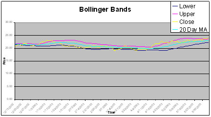
Bollinger Bands were developed by John Bollinger.[28] The bands allow investors to compare volatility to price levels. The bands are calculated using a moving average in the following manner.
In this experiment, the Bollinger bands were set to a 20 day moving average. The indicator was motivated to a buy signal when the price was within the bounds of the Bollinger bands. If the price went outside the bands, than the indicator gave a sell signal. Usually, when the price breaks above(below) the upper(lower) band than a sell(buy) signal is given. However, the indicator was changed to allow for more buy signals, which would be more indicative of the model that has been formulated and explained. A graph of a sample stock using Bollinger bands is shown below:
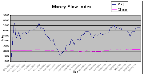
g) Money Flow Index (MFI)
The Money Flow Index is a volume weighted relative strength index. It is used to warn the investor of possible weakness in the trend of a stock. It is calculated by the following equations:
Where Negative and Positive Money Flow are calculated when the previous time’s price is higher than the current price or vice versa respectively.
A slope was calculated for the each of the MFIs. A 7-day sample was averaged for each month’s forecast to decide the indicator for that month. An example of a MFI graph is shown below:
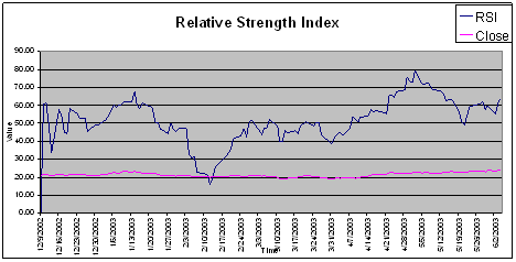
h) Relative Strength Index
The Relative Strength Index is a popular momentum oscillator created by J. Welles Wilder in 1978.[31] This gives analysts proof of the support the stock has in increasing value in the short term. It is calculated much the same way of the MFI, except it is does not use volume. It is calculated in the following manner:
The slope was also calculated for this indicator. Then a 5-day sample was taken for the average to get the indicator. A graph of a sample stock is shown below:
All the above indicators were calculated to get one final indication of buy or sell for the month. For each month the indicator was given a scale based upon the indication it gave. The numbers produced from all of the indicators was averaged and scaled to the 5 point scale for a final Strong Sell to Strong Buy indication. This final indicator, made up of all the others and equally weighted was the indicator that was used for that month’s actions. A sample look of the Excel file that accomplished this task is as follows:

The following rules were created for each portfolio to simulate real choices and constraints in investing. The following rules applied in to all portfolios in this model:
a. Invest in 5 stocks per portfolio.
b. Simulate 30 portfolios.
c. A flat commission rate will be assessed for every buy or sell action.
d. Taxes will be paid based upon current equations and rates of 28% capital gains tax for profits. Losses are calculated and used against the capital gains tax owed.
Both the “Smart” portfolio and the Dollar Cost Averaging portfolio invested $2000 a month for 6 months for a total of $60,000. The “Regular” buy and hold method invested the total $60,000 in 5 stocks in the beginning of the testing period. The “Smart” Portfolio also was constrained by the following rules:
e. If no buy signals are given in any stock for that month, the money will be put in a simulated “Savings Bank” that pays 1.5% annually.
f. If money is available, from other stocks or savings bank, than it will be used towards a stock with a buy signal.
g. Money that must be used for other stocks will be put towards stocks with buy signal by a random selection.
When all the thirty portfolios were calculated for each of the 3 strategies average returns were calculated and average differences were calculated with associated confidence levels at the 90% level.
Results
The results of testing these portfolios were not as conclusive as expected. Though the dollar cost averaging did beat the smart portfolio by 1.1%, it did not beat it as much as expected. In addition, all the models were able to beat the S&P 500 growth over the same period. The following charts give the details of the results.
|
Smart Returns* |
Regular Returns |
DollarCostAvgReturn |
|||
|
Average |
11.2% |
Average |
8.5% |
Average |
12.3% |
|
StDev |
0.070 |
StDev |
0.071 |
StDev |
0.064 |
|
StdError |
0.021 |
StdError |
0.021 |
StdError |
0.019 |
|
LCL |
9.1% |
LCL |
6.4% |
LCL |
10.4% |
|
HCL |
13.3% |
HCL |
10.7% |
HCL |
14.3% |
|
|
|
|
|
|
|
|
SmartvsReg |
SmartVsDlrCost |
SmartvsS&P |
|||
|
Average |
2.7% |
Average |
-1.1% |
Average |
3.6% |
|
StDev |
0.064 |
StDev |
0.052 |
StDev |
0.070 |
|
StdError |
0.019 |
StdError |
0.016 |
StdError |
0.021 |
|
LCL |
0.8% |
LCL |
-2.7% |
LCL |
1.5% |
|
HCL |
4.6% |
HCL |
0.5% |
HCL |
5.8% |
|
|
|
|
|
|
|
|
|
|
S&P 500 |
|
|
|
|
|
|
Opening Price |
909.03 |
|
|
|
|
|
Closing Price |
986.24 |
|
|
|
|
|
Gain/Loss? |
7.6% |
|
|
*All Confidence Levels were calculated using a 90% Confidence. LCL = Low Confidence Level HCL = High Confidence Level
The dollar cost averaging model was by observation the portfolio with the greatest returns with an average of 12.3%. When one does a t-test on the results those returns do not have much significance. A test on the returns of the smart portfolio versus the dollar cost averaging portfolio returned a t-value of -.64 and a t-critical value of 1.699. The two returns can be considered statistically the same. The dollar cost averaging portfolio was statistically different than the regular returns portfolio, because the t-value was 2.17 and a t-critical value of 1.699. The dollar cost averaging was also much greater than the actual return of the S&P 500, which was 7.6%. A histogram of the dollar cost averaging results as follows:
|
Histogram of DlrCost |
|
|
|
|
Bin |
Frequency |
|
CDF |
|
2.7% |
1 |
3.3% |
3.3% |
|
8.7% |
9 |
30.0% |
33.3% |
|
14.8% |
12 |
40.0% |
73.3% |
|
20.8% |
6 |
20.0% |
93.3% |
|
26.9% |
1 |
3.3% |
96.7% |
|
More |
1 |
3.3% |
100.0% |
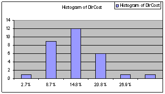
The histogram shows the dollar cost averaging had no occurrences of negative returns. All the returns were positive. All this evidence shows that the dollar cost averaging portfolio performed the best as far as real returns and risk are concerned.
The smart returns portfolio did not produce significant returns over the dollar cost average and regular return portfolios. It did not beat the dollar cost averaging portfolio, nor was its average return significantly different than the dollar cost averaging portfolio and the regular returns. The average difference between the smart return and the dollar cost averaging return was actually negative. The average difference between the smart return and the regular return was positive but by only 2.7%. When a t-test was performed on the smart portfolio versus the regular returns portfolio, a t-value of 1.48 was calculated with a t-critical value of 1.699. This shows one failed to reject the null hypothesis of both returns being equal. The smart return did beat the S&P 500 though. A histogram of the smart returns portfolio results is as follows:
|
Histogram of Smart Returns |
|
||
|
Bin |
Frequency |
|
CDF |
|
-1.0% |
1 |
3.3% |
3.3% |
|
4.5% |
3 |
10.0% |
13.3% |
|
10.0% |
11 |
36.7% |
50.0% |
|
15.5% |
8 |
26.7% |
76.7% |
|
21.0% |
4 |
13.3% |
90.0% |
|
More |
3 |
10.0% |
100.0% |
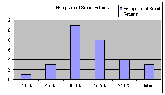
The histogram of the smart returns shows an occurrence of negative returns. As compared to the dollar cost averaging return, the smart return portfolio did not gain as many occurrences of higher than 21% returns, whereas the dollar cost averaging portfolio goes as high as 26.9%.
The regular returns portfolio managed to beat the S&P 500 by .9%. As expected this portfolio was not expected to beat the smart portfolio or the dollar cost averaging portfolio. This portfolio was only used for a basis of comparison. A histogram of the regular returns is as follows:
|
Histogram of Regular |
|
|
|
|
Bin |
Frequency |
|
CDF |
|
-9.1% |
1 |
3.3% |
3.3% |
|
-1.7% |
0 |
0.0% |
3.3% |
|
5.7% |
10 |
33.3% |
36.7% |
|
13.1% |
12 |
40.0% |
76.7% |
|
20.5% |
5 |
16.7% |
93.3% |
|
More |
2 |
6.7% |
100.0% |
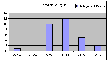
The regular return portfolio has an occurrence of a low -9.1%. No other portfolio has an occurrence with such a low observed return. This portfolio is considered the most susceptible to risk, based on the histogram range from -9.1% to 20.5%.
Conclusion
Dollar cost averaging was the one portfolio that had the best returns for an average investor. This type of portfolio is very easily managed and does not require special computers or knowledge base. This portfolio created the largest returns and was statistically different than the regular returns portfolio. The smart portfolio was impressive in scope and mathematics, but in actuality it did not do anything a simple investment plan could do. There can be value derived from studying quantitative analysis of stock charts, but for the average investor continued and incrementally invested money in stocks is the best.
[1] Salih Neftci. “Naïve Trading Rules in Financial Markets and Wiener-Kolmogorov Prediction Theory: A Study of ‘Technical Analysis’.” The Journal of Business. Vol 64. No 4, (Oct. 1991), 551.
[2] Jeremy Siegel. Stocks for the Long Run. McGraw-Hill, New York. 2002, 284.
[3] Jeremy Siegel. Stocks for the Long Run. McGraw-Hill, New York. 2002, 296.
[4] Irwin Friend. “The Economic Consequences of the Stock Market.” The American Economic Review. Vol 62. No ½, 1972, 212.
[5] Jeremy Siegel. Stocks for the Long Run. McGraw-Hill, New York. 2002, 297.
[6] W. Scott Bauman. “Evaluation of Prospective Investment Performance.” The Journal of Finance. Vol 23. No. 2, May 1968, 276.
[7] Jeremy Siegel. Stocks for the Long Run. McGraw-Hill, New York. 2002, 296.
[8] Ibid.
[9] George Constantinides. “A Note on the Sub-optimality of Dollar-Cost Averaging as an Investment Policy.” Journal of Financial and Quantitative Analysis, Vol 14, No 2. (Jun., 1979), 443.
[10] Ibid. 444.
[11] Ibid.
[12] Williiam Brock, Josef Lakonishok, and Blake LeBaron. “Simple Technical Trading Rules and the Stochastic Properties of Stock Returns.” The Journal of Finance, Vol 47, No 5. (Dec., 1992), 1735.
[13] Burton Milkiel. A Random Walk Down Wall Street. W.W. Norton & Co. New York. 1996, 155.
[14] Ibid.
[15] Andrew Lo and A. Craig WacKinlay. “Maximizing Predictability in the Stock and Bond Markets.” NBER Working Paper Series 5027. National Bureau of Economic Research, Cambridge. 1995, 32.
[16] James O’Shaughnessy. What Works on Wall Street. McGraw-Hill. New York, 1998, 16.
[17] Burton Milkiel. A Random Walk Down Wall Street. W.W. Norton & Co. New York. 1996, 129.
[18] James O’Shaughnessy. What Works on Wall Street. McGraw-Hill. New York, 1998, 16
[19] Wilbur LeWellen, Ronald Lease, and Gary Schlarbaum. “Investment Performance and Investor Behavior.” The Journal of Financial and Quantitative Analysis. Vol 14, No 1. (Mar 1979), 29.
[20] W. Scott Bauman. “Evaluation of Prospective Investment Performance.” The Journal of Finance. Vol 23. No. 2, May 1968, 285.
[21] Irwin Friend. “The Economic Consequences of the Stock Market.” The American Economic Review. Vol 62. No ½, 1972, 214.
[22] Ibid.
[23] Williiam Brock, Josef Lakonishok, and Blake LeBaron. “Simple Technical Trading Rules and the Stochastic Properties of Stock Returns.” The Journal of Finance, Vol 47, No 5. (Dec., 1992), 1736.
[24] Ed, Gately. Forecasting Profits using Price and Time. John Wiley and Sons Inc, New York. 1998, 39.
[25] Arthur, Hill. “Moving Averages.” StockCharts.com – Chart School. Internet: http://www.stockcharts.com/education/IndicatorAnalysis/indic_movingAvg.html
27 Mar 2004.
[26] Ed, Gately. Forecasting Profits using Price and Time. John Wiley and Sons Inc, New York. 1998, 45.
[27] Arthur, Hill. “Moving Averages.” StockCharts.com – Chart School. Internet: http://www.stockcharts.com/education/IndicatorAnalysis/indic_movingAvg.html
27 Mar 2004.
[28] Arthur Hill. “Bollinger Bands.” StockCharts.com-Chart School. Internet:
http://www.stockcharts.com/education/IndicatorAnalysis/indic_Bbands.html
27 Mar 2004.
[29] Ed, Gately. Forecasting Profits using Price and Time. John Wiley and Sons Inc, New York. 1998, 40.
[30] “Money Flow Index.” IncredibleCharts.com. Internet: http://www.incrediblecharts.com/technical/money_flow_index.htm
27 Mar 2004.
[31] Arthur Hill. “Relative Strength Index.” StockCharts.com-Chart School. Internet: http://www.stockcharts.com/education/IndicatorAnalysis/indic_RSI.html
27 Mar 2004.
[32] Ed, Gately. Forecasting Profits using Price and Time. John Wiley and Sons Inc, New York. 1998, 67.
Appendix


Bibliography
Bauman , W. Scott. “Evaluation of Prospective Investment Performance.” The Journal of Finance. Vol 23. No. 2, May 1968.
Brock , William, Josef Lakonishok, and Blake LeBaron. “Simple Technical Trading Rules and the Stochastic Properties of Stock Returns.” The Journal of Finance, Vol 47, No 5. (Dec., 1992).
Constantinides, George. “A Note on the Sub-optimality of Dollar-Cost Averaging as an Investment Policy.” Journal of Financial and Quantitative Analysis, Vol 14, No 2. (Jun., 1979).
Friend, Irwin. “The Economic Consequences of the Stock Market.” The American Economic Review. Vol 62. No ½, 1972.
Gately, Ed. Forecasting Profits using Price and Time. John Wiley and Sons Inc, New York. 1998.
Hill , Arthur. “Bollinger Bands.” StockCharts.com-Chart School. Internet:
http://www.stockcharts.com/education/IndicatorAnalysis/indic_Bbands.html
27 Mar 2004.
Hill , Arthur. “Moving Averages.” StockCharts.com – Chart School. Internet: http://www.stockcharts.com/education/IndicatorAnalysis/indic_movingAvg.html
27 Mar 2004.
Hill , Arthur. “Relative Strength Index.” StockCharts.com-Chart School. Internet: http://www.stockcharts.com/education/IndicatorAnalysis/indic_RSI.html
27 Mar 2004.
LeWellen , Wilbur, Ronald Lease, and Gary Schlarbaum. “Investment Performance and Investor Behavior.” The Journal of Financial and Quantitative Analysis. Vol 14, No 1. (Mar 1979).
Lo, Andrew and A. Craig WacKinlay. “Maximizing Predictability in the Stock and Bond Markets.” NBER Working Paper Series 5027. National Bureau of Economic Research, Cambridge. 1995.
Milkiel , Burton. A Random Walk Down Wall Street. W.W. Norton & Co. New York. 1996.
“Money Flow Index.” IncredibleCharts.com. Internet: http://www.incrediblecharts.com/technical/money_flow_index.htm
27 Mar 2004.
Neftci, Salih. “Naïve Trading Rules in Financial Markets and Wiener-Kolmogorov Prediction Theory: A Study of ‘Technical Analysis’.” The Journal of Business. Vol 64. No 4, (Oct. 1991).
O’Shaughnessy, James. What Works on Wall Street. McGraw-Hill. New York, 1998.
Siegel, Jeremy. Stocks for the Long Run. McGraw-Hill, New York. 2002.
 |
|||||||||
| Who is Eric? | Economics | English | Ethics | History | Interests | Leadership | Psychology | Politics | Links |
Date this page was last updated: 01/19/2005