LAYOUTS
Here are layouts I made myself. Some are actual layouts I used on my sites, others were free layouts that people could use. If you want to use the Free Layouts. PLEASE FOLLOW RULES.
1. Let me know if you are using the layouts.
2. Save the layout to YOUR OWN SERVER.
3. Give ME credit since I'm the one that made them!
** Click images to see bigger version **
USED LAYOUTS

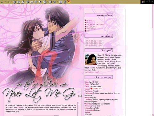
Details This is was third layout for my personal site at Enchanted. This was my very first time actually using brushes and all that because that was the first time I ever heard of nice brushes! LOL. I am really proud of this layout just because I thought it was a really good first attempt at brushes.

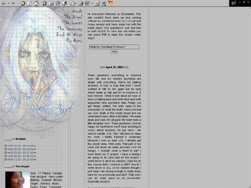
Details This was my fourth layout in my personal site. I personally really liked this layout because I loved the way the picture of the angel really blended in really well and I liked the colours. A lot of people thought the picture was kinda scary though. Hhahah. I find that funny.

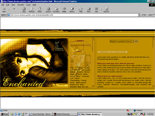
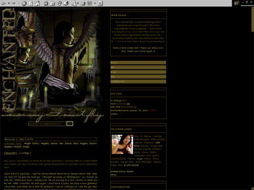
Details This was my very first layout that was horizantal. It didn't scroll horizantal though. It just stayed there. Unfortunately, it didn't work on browsers that was less than 1024x768 but for the people who did visit and can see it ... they liked it. I kinda suprised myself because I really didn't know how well the gold would work but in the end it worked out really nicely.

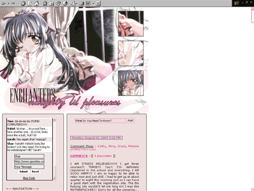
Details This is definitely one of my favourite layouts!! It looks simple but I just love the whole set-up of it and the biggest reason I love it is that it looks sooo cute and sexy at the same time. Some people didn't get the name "Enchanted's Naughty Lil Pleasures" because they didn't see, at first, the peeking of the girl's boobs and ass. When they did they thought it was really cute and racey. The colours just worked so well too.

Details I love this layout because of the colours and just the whole "techy" effect. This was my first time experimenting with these kinda of brushes. I loved how with even such a beautiful picture of Angelina Jolie, the background with the technical squares, lines, designs still made the overall graphic really really nice.

Details I've always had a thing for dark-themed layouts. That's why I was so fascinated by the picture that I used for this layout. It's a picture of a girl sewing a pair of wings to herself. It's somewhat very graphic but still very exotic and beautiful. I didn't think at first the the gold type colour would fit but in the end, it actually went with everything perfectly.

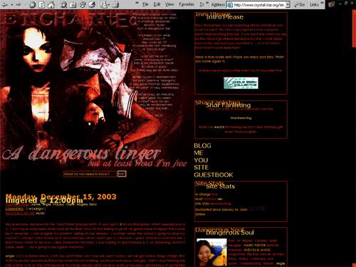
Details Another dark layout. Are you starting to see my love for dark things? LOL. I took two morbid type anime pictures and blended them together. It turned out better than I had thought. I didn't actually have a vision at first for this layout. I was just experimenting and ended up keeping what I had done. I barely even used brushes but it still looks good. LOL.
