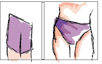
For many female body types there is a gap between the legs. Note the difference in the first 2 pictures. In the second image, the pull of the tight fabric should be more evident like shown in the 3rd sketch.

GK Art Tips: The Contrast.
This is just the start of this concept, but the idea is to share with visitors my observations basically concerning what makes one drawing look more professional than another. As far as I know, several things here have not be posted/explained/described elsewhere. I haven't seen the topic covered yet, but I'm sure others know these details and just never made a site about them. The listing is pretty random for the most part. Some things are in the back of my mind now, but there are plently of things I'll remember to include as later occasions. Now, I hope you like to read, words are as important as visuals y'know! O_o;
First off, I think I've come to realized one of a beginner's biggest barriers: attention to detail! We learn over time that you can't just jump in and create a masterpiece, but current skill levels and potential could be pushed even more to the max (like squaresoft games are on the original playstation) if the begginer was more willing to include details. I know I'm not the only one ever to pick up an old drawing and realize it isn't as good as I remembered it. If you ponder over this for alittle while, you figure that you felt you did the best you could on that drawing and were as proud as can be. I think I figured that at first, too. After considering this more, though, it occurs that maybe you just didn't know that you could have added just a bit more detail. I believe that I somehow thought there was nothing more I could add and left the clothes foldless or the fingers shapeless. Well, these days I just can't do that; I suppose it's like potatoe chips: once you start, you can't stop. I started adding details and didn't want to forget them in any doodles to come. And I know there are more observations waiting, too. Now with something to think about, go onto the feature presentation. :)
*Forgive me for many 'good' examples not being very good, lol!*
I'm going to start with a list of things that I feel call more attention and liking to a picture no matter a person's skill level. In fact, it seems that some flaws can be excused when these things of interest or difficultly are included--leaving the picture still very likable. Mind you that not every idea can be or is new, but combining ideas the way you want is what gives your image it's original quality.
Ok, more on this list later, I have other areas to attend to at this site as well as example images for here. ^_^
The Leg Gap
|
For many female body types there is a gap between the legs. Note the difference in the first 2 pictures. In the second image, the pull of the tight fabric should be more evident like shown in the 3rd sketch.
|
|
|
Back To: