A Few Cups of Tea - or a Dozen

The new issue ( April/May 2008 ) of Quilting Arts magazine features an article by the wonderful quilt artist Judy Coates Perez, in which she discusses a technique of adding sketches and drawings into a quilt top. It was so intriguing, I had to try it.

This experiment turned to several days of making a big mess. But it was a lot of fun, and the best part is, I seem to have stumbled upon something I want to use and explore further.

Her technique starts with washing watered-down textile paint onto fabric. I used Jaquard brand textile paint. JoAnn fabrics carries it (Hobby Lobby and Michael's did not), or you can find it online at Dick Blick Art Supplies.

Meanwhile, you need to make tea, and dry out the used bags. Then you take them apart and use them as thin tracing paper, to draw or trace line drawings. You then paste them to the painted fabric with acrylic medium.


My medieval tree block, painted with inks.
About 6 x 8 inches.
Day one, a long one :
Today I start with 12 dried tea bags, excited about some copyright-free medieval-style drawings I have long wanted to take advantage of. I trace them using a pigma Micron pen in black. It works well for tracing on the teabags, but did bleed a bit through to the book. When I do this again, I will protect the books by tracing first onto a piece of tracing paper and then trace THAT drawing onto the teabag.

For my first try, I quite successfully adhere the teabag tracings to the fabric background. I am so motivated at this point that I make a pile of little symbols - a crown, fleur-de-lis, birds, vines, etc. to make little collages around the initial figures. I am feeling so motivated that I decide to experiment with other types of papers. Why couldn't you use tracing paper for example, and avoid drying out all the teabags?. Unfortunately, you do miss the nice brown stain the bags offer, but let's see if it works.

Oh, boy. Let me save any of you out there from this stupid idea; the tracing paper ( artist quality ) wrinkles so fast when you apply the acrylic medium to it, that you can stand there and watch it sort of wrinkle into a little ball, right there on your collage. Actually, if you let it dry for 30 seconds or so, and then press it down hard, smoothing it with your fingers, it does adhere smoothly, and you can apply more acrylic. But as it dries, it curls up slightly on the edges anyway.

The curling in the end - after much smoothing and cursing and washing glue off my hands - was quite minimal and would be fine for many art projects, but for this, a fabric project and so small and detailed, I just didn't like it. So I trashed the first three fabric blocks, traced teabags and all. ( Yes, I know, it's sad. But there you are. )

Day 2, Optimism and New Energy :
Truth be told, the collage thing wasn't working anyway. It looked cluttered to me, and took away from the sort of illuminated manuscript appearance that was developing, which I really like. So the second day, I take advantage of what I have learned, and start the same way - cutting three blocks of white fabric, and washing them with paint. I am a little more liberal and free about the painting, knowing now how it looks when it dries. I retrace the drawings ( thank goodness I made a lot of tea ) and adhere them to the fabric.

But they still look so lonely there to me, like something is missing. I decide that some calligraphy is in order. I write some phrases alongside the figures (the French just makes it feel more European medieval somehow) and I am pleased with how they look. I add some initials. Now they all look great.

I sit down to paint them now with ink. What fun! It looks bright and intense, just as I was hoping. I hang them up to dry, feeling Day 2 has gone much better.


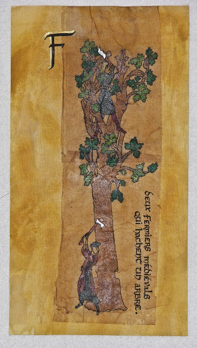
The king, minus the phrase to the
right, and the big R, upper left.
6 x 9.
The camera flash is adding a glare
that isn't present to the naked eye.
Day 3, Oops! :
Today begins with a horrifying realization. I check to make sure the ink on the calligraphy is dry, and it not only comes off on my finger, but smears!. This is strange, because the colored ink on the figure is intact and dry. It dawns on me that the colored inks I painted with are Tsukineko inks, preferred by textile artists ( get them at Soft Expressions online ) and the ink in the calligraphy pen is a cartridge - likely a good quality "india" ink, but specific to calligraphy and paper arts. Oh,no!

If I put a final coat of acrylic medium on to protect it, the water base of the acrylic will smear the ink in the calligraphy ( I have already brushed it over the colored figures, and that was okay ). I take a break to ponder my next move.

Later, when I return to the sewing room, one of the little blocks - the little medieval singing king - has fallen from the windowsill where it was drying. My blue heeler Sheila, a.k.a. Satan on Four Legs, has learned that fabric is great to munch on ( especially when one pulls it out of the trash behind Mom's back ). And so before I can notice, she is happily licking the KING! Well, it didn't hurt it, except that the calligraphed phrase came off! Completely, except for the first two little words!. Lucky for Sheila, I was thrilled by this. It didn't smear, just washed off. So I could redo it easily. And meanwhile something better : I hadn't liked the way the big "R" initial looked - smaller than the ones on the other two blocks. Now, I suspected I could get it off too, and do the whole thing over, leaving the king and the block intact.

As the day ends, I try something. I dig the old original blocks (those collaged nightmare tracing paper messes) out of the trash, and on one I draw some calligraphy letters. I take it outside with a can of Krylon spray matte finish and spray it. Sure enough, it doesn't run or smear, and is now waterproof. Although the Tsukineko inks should be heat-set with the iron, I won't need to with the Krylon coating. Yippee! Tomorrow I will re-letter the king block, and spray them all.

Then I need to think about what I want to do with borders for them. I am thinking of an idea that would be fun and unusual - we will see if I can pull it off . . . Day 4 will have to begin with some sketching.!


No Mom, it wasn't me!
The greyhounds did it!


Two peasants chopping down a tree, the third block of the three. It took two bags, one over the other. About 5 x 13 inches.

( Again, I apologize for the camera flash glare. If I didn't flash it, I would lose detail. )

The top chopper needed clothing that would contrast with the leaves and bark, so he would be noticed.

The bottom chopper looks good, but after I realized that in the middle ages, purple was a color considered royal, and peasants were not allowed to sport it. I just hope most people won't know that - and it is a faded, gray sort of purple, right? I hope this guy finishes his task AFTER the guy in the top . . .

At this point, I just love the stained, aged look of the blocks. I have always loved looking at medieval "illuminated" manuscripts, with their colorful illustrations on aged, browned vellum parchment. I have definitely discovered a way to get that look - and even add calligraphy to it!

I could trim the blocks more - closer to the teabags, but I don't mind that they are showing. It just adds to the overall aged parchment look. Right now, I would rather leave the wide margins to work with, since I need to piece them into something else like a border. I do want to leave them as three separate little works - perhaps to be displayed as a group, but independent. Putting them together would make it have a storybook, childish feel that I don't want. I want to give them as much dignity as I can, despite the fairy tale feel.

Back to Gallery Home