

Consider your audience carefully before you ever begin programming.
Your software should be designed with this group of people in mind.
AGE:
Is it for small children? Is it for adults? Is it for other middle schoolers?
Your audience should influence the depth of your topic, the way screens are
designed, the size of buttons and text, as well as the way graphics are used.
Remember! Kindergartners don't use Encarta and high school students don't use
The Magic School Bus software. Your audience matters; don't forget them!
PRIOR EXPERIENCE:
Does the user or users have existing knowledge about the subject
or will they need a full introduction?
COMPUTER SKILL:
Does the user need extra help built in to help him or her get around inside of the
software? Is the user fairly computer literate and will want advanced interaction:
video, virtual reality, sound, etc.?
A NEED:
Identify a real need that your software will meet. This information may come
from first-hand experience, interviewing a teacher, a person knowledgeable
about the subject in which you are interested, researching the topic from reading,
or by conducting a survey, etc.


Choosing a Topic / Identifying the Need
Once you have determined a topic on which software is needed, clearly define your
topic. Remember the scope of your topic - not too broad, not too narrow. You will
have roughly two and a half weeks in which to design and program your software.
Obviously, you are not going to be able to create detailed software on Word War II
in that time. Therefore, you must narrow your topic down to something manageable.
At the same time, don't choose something too narrow like "nimbus cloud
formations"
that won't provide much information from your research.
Academic Options
You have three academic options for this project:
- Cross-Class Credit: You negotiate the topic and scope of your
project with
another teacher (for example, with your science or social studies teacher).
Your interdisciplinary project will show your mastery of that subject as well as
the skills you are required to learn in computer class. Therefore, you earn
a grade for completing the project in my class - as well as receiving
extra credit in the other class. You must have the topic approved by the
other teacher and Mr. Teston.
- Academic/Personal Interest: You choose a topic that either you
have studied
before or that you would like to study. This project can serve as the means for you
to learn more about that topic. For example, if you've always wanted to know more
about "sharks" but have yet to really study them in school, here's your chance!
- Elementary Learner Collaboration: You choose an elementary or
primary
school teacher with whom to work. In collaboration with that teacher, choose a
topic that would be educationally beneficial to the students in that class.
For example, you might design software for a 5th grade class that teaches the
names and capital cities of the fifty states. Or you might design software for a
second grade class that teaches them about the culture of another country.
Stating Objectives
You must state at least three learning goals or "objectives" for your
software.
In other words, what are three distinct things you hope for you audience to
learn by using your software. Example "objectives" for software
designed
on "Georgia's State Parks" would be:
(1) My software will teach the user the names and locations of the
major state parks in Georgia.
(2) My software will teach the user about the activities and attractions
available at each park.
(3) My software will teach the user about how to plan a trip and make
reservations for a trip to one of the parks.
A Content Outline
You are to create on OUTLINE that shows what topic you plan for each
screen of your software and how you plan to organize your software
(see the topic on organization).
An Example Content Outline for software designed on
"Georgia's State Parks" would be:
- Title Screen (Have "Georgia On My Mind Theme Playing")
- Menu Screen (Home) (Menu is a map of Georgia with clickable park sites)
- Introductory Screen (Gives an overview and statistics on Georgia's State Parks)
- Okeefenokee State Park: location, description, pictures, attractions, contact info
- General Coffee State Park: location, description, pictures, attractions, contact info
- Providence Canyons Park: location, description, pictures, attractions, contact info
- Hamburg State Park: location, description, pictures, attractions, contact info
- Unicoi State Park: location, description, pictures, attractions, contact info
- Stone Mountain Park: location, description, pictures, attractions, contact info
- Ocmulgee State Park: location, description, pictures, attractions, contact info
- Processes: Requesting information and making reservations
- Conclusion (video sample)
- Bibliography/Credits


Linear Format: You Control the Order
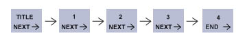
This organization format is like a structured Tutorial.
It provides step-by-step navigation that is controlled by you, the designer.
Use this format when you want to lead users step-by-step through a body of information.
A tutorial assumes that you (the designer) know what the user's purposes are and that
you know the best order to present the information. Since this format takes control
away from the user and gives it to the designer/programmer, a strict linear approach
should usually be supplemented by reference-type organizations.
Reference Format: The User Controls the Order
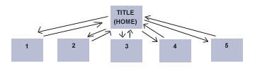
This format puts the user in control of the navigation.
A reference gives maximum control of the navigation to the users, not the designer.
The designer tries to make it so that the user always knows where he or she is, always
has choices of what information to access next, and generally feels in control of the
resources (rather than the resource being in control of them.) Generally, reference
sources are preferable to linear tutorial formats.
Hybrid Format: Allows Step-by-Step and Linear
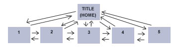
This format is a combination of the Linear model and the Reference models.
There is no limit to the number of ways that information can be organized in this style.
The user can navigate the software either in a step-by-step order or from a home
page.
Designers who use the Hybrid model should include a set of buttons such as:
<BACK | HOME | NEXT> This
is perhaps the best format.
Game Format: Complex, but Fun and Interactive
Games can be the most fun and interactive way to present information, but are
usually more difficult to design. A game is linear in that it takes control of navigation
away from the user and it can be frustrating or impossible to use at all if all you
want is to access a particular piece of information. Some simple games formats are:
- Multiple-Choice Quizzes
(Consider making your surveys into an interactive multiple-choice game)
- Choose-an-Adventure Games
(The user decides from "different journeys" which path to take.
For example, a Georgia Tourism Adventure)
- Interactive Multimedia Games (Requires advanced scripting knowledge
and large amounts of time)

Use graphics purposefully to convey information, not just for
the sake of using
graphics! Different graphics are good at showing different kinds of information.
Be sure that the graphics you choose ADD to the clarity of your purpose and that
they are not distracting.
- Different Types for Different Messages
- Buttons & Navigation Tools - helps the user find his or her way around
- Scientific Illustrations - helps user to understand a complex topic that words
alone really can't describe
- Flow Charts - shows a sequence of events by order or
by cause-effect relationships
- Graphs and Tables - shows data that highlights certain facts or relationships
- Diagrams - shows how something is arranged or organized
- Decorative Graphics - makes layout more attractive and can reinforce
the message of the content, but should never be distracting
- Animation - a graphic effect used to show motion within an illustration.
Use only if you have a purpose for this (For example, to show how the
moon's orbit around the earth.) Don't use animation just to move objects
on the screen - it can be distracting.
- Video - a great content resource, but make certain that it fits well and that
the user can control it (start, stop, and replay).
- Virtual Reality - a lot of effort is required to produce this type of graphic,
but it can be very useful and interactive in showing a 3-D object
(For example, showing a 3-D model of a planet if astronomy is your topic.)
- Graphics and Text Working Together
Good multimedia software uses graphics and text that work together to communicate
ideas. You should carefully choose graphics that fit with and extend what you are
writing in the text of a particular screen. Likewise, you should position text on the
pages
of your project so that the text will be read and understood more easily because of the
graphics that are nearby. Graphics can be used to give more detailed and specific
information.
Graphics can create interest in text by maintaining the users interest in the topic and
breaking up a heavy-text screen. Graphics can also provide multiple representations so
that a person might understand what you are saying from at least the graphics or the text.
- Composition and Screen Layout
You need to pay attention to the overall composition of your screens.
You should try for a balanced, professional look that is easy to use and interesting to
look at.
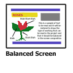
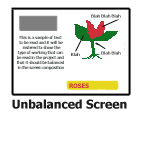
Why does the layout on the left look better than the one on the right? Here are a few
reasons:
- The dark, "heavy" graphics are balanced between left and right, rather than
crowded on one side.
- The columns and edges are lined up in straight lines, making the page look more
controlled and professional.
- The long horizontal bars help to bring the page together.
If you only concentrate on individual graphics and forget about the composition of the
entire screen, your finished screen will not look very professional or appealing to your
users.
- Backgrounds
Use only backgrounds that compliment your composition - not those that clutter or
compete
for your user's attention. Solid backgrounds, gradients (fading from one color to
another),
and simple photographs can all make interesting and effective backgrounds. Above all, make
sure that the background is appropriate for the topic.
- Appropriate Use of Color
Remember that while you may love odd colors or strange color combinations, your
users may not.
As a rule of thumb use no more than about two colors in the foreground and another in the
background to keep your screen designs appealing. High contrast colors (Red vs. Black) are
better when you are trying to offset text from the background.
- Appropriate Use of Fonts
Select a font to use for your title (maybe something interesting) and then a more
standard font
(Times, Arial, Garamond, etc.) for the text of your project. Old English type is nice, but
you
wouldn't want to read several paragraphs of it and neither does your user. Remember,
sometimes
using less can actually add more in appeal. You are striving for a professional looking
software
interface, not a ransome note! Keep the size of the font in mind too based on your
audience.
Scrollable text fields designed for adults to read should not use jumbo lettering.
Likewise,
small children will need larger, simpler type to read.
- Consistency
Above all, remember CONSISTENCY! Don't make random
changes in fonts, color,
backgrounds, fonts, etc. from one screen to the next just for the sake of doing so.
Pick a design theme and try to stay true to it. Professional designers and programmers
strive
very hard to keep as much of the layout and creative aspects the same so that the
interface
seems predictable, cohesive, and purposeful. Random changes in design and make your
user confused...."This looks so different from the last screen? Did I go to the wrong
screen?"

- Why is citation important?
Being a professional means giving credit where credit is due. If you used text,
photographs, sound files, video, music or other resources from a source other
than your own original work, then it should be cited. Failure to cite suggests
plagiarism and goes against the spirit of academic honesty.
- Citation Styles
* Web Pages should be sited by their title, date accessed, and a complete URL
(For example: "Hurricane Maps" (Oct. 24, 1999) www.cnn.com/weather/hurricane.html
* Books, magazines, encyclopedias, and other text resources should be cited
with the author, date of publication, title, and publishing company.
(For example: Frost, Jack. (1999) Winter Weather. New York: ABC
Publishers.
* Don't forget CD's and Videos must also be cited!
- Including URL's as Web Links
If you like, you can make the URL's in your Bibliography links
(such as the CNN link above) so that they become clickable and users with direct
Internet access on their computer can go directly to that web site.

- Piloting/Field Testing
Once you feel that you have a major section of the software complete, you
should test it by having a sample user (one or more members of your target
audience) actually use your software.
- Constructive Criticism
The sample user(s) should provide you "constructive" criticism regarding ease
of use, functionality, color, fonts, lay-out, graphics, and scope of content.
What should be corrected? What should be added? What did he/she like most?
like the least?
- Mentor Teacher Feedback
A great source of information for field testing your software is to have the
mentor teacher or a subject matter expert also use the software. The target
audience can direct you on ease of use and design, but they won't know
if the content you have provided is adequate or not - after all, your software
is suppose to be teaching them that content. So, ask Mr. Teston or your
Cross-Credit teacher..."Do you think I have covered my topic adequately?"
- Documenting Feedback
This field-testing data must be documented to show that you have actually
field tested the software and incorporated suggested changes and additions
into the software.

- Making Revisions
Carefully review the feed-back provided by your Field-testing and then
incorporate those changes and suggestions into the software.
Don't expect it to be perfect the first time (or even second or third time)
through. Remember programming is a multi-step process!
- Corrections & Spelling
Make sure that you have checked the spelling of your software!!!
Speling errars REALLY stand out in software once they are on the screen.
And Remember, only you can fix such mistakes. Once the final software
is in the user's hands, those mistakes are there and impact your software
FOREVER!

- Securing the Software
Before permanently burning the software onto a CD, you should:
(1) Remove the menubar from each screen so that your user's will not have
access to programming controls. (Ctrl + M on the keyboard)
(2) Make certain that you have "locked" ALL text objects by double-clicking
on each with the regular arrow tool and then selecting the "Read-Only" option.
This prevents the user from accidentally erasing or changing the text.
(3) Make CERTAIN that you have saved your FINAL version of your software
to the F: Drive under the account which bears your name!!!!
- "Burning" a CD of your Software
Mr. Teston will give you specific directions about this in class.
- Designing a CD Cover
There is a template located on the F: Drive, in the folder "Public", and then
in the sub-folder called "Images." The template is named "CD Cover."
Open this file using the Paint program and you can customize it for your own
CD Cover to accompany your software.