|
|
|
|
 |
|
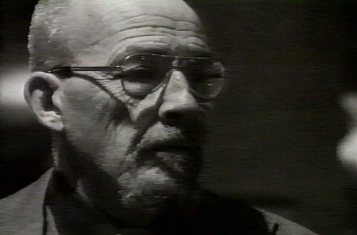
The Rule of Thirds states
that the frame is naturally divided into thirds (Fig. 2 & 3). The state of the art is to place the subject, or an important part of
the subject (like his eyes), on either one line or at the point where a vertical
and horizontal line intersect. The point is to avoid placing the subject
in the center. |
|
| Fig. 2. Mike Connolly paints
in CTV’’s “Valley Gallery.”
His left eye is at a point of intersection. |
|
|
|
|
|
|
|
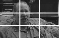
| In an interview, it’s usually
considered best to see both cheeks of the subject, but to have the subject
looking slightly away from the camera. Even though you don’t have a profile, remember to give some
proportional nose room (Fig. 3). |
|
|
|
|
|
 |
|
Finally, notice that there is not
a lot of space between the top of the head and the top of the frame (Fig. 3).
In fact, it’s often acceptable to cut off the top of the head (Fig. 1
& 2).
# # #
|
|
|
Fig. 3. Mike Connolly’s
interview for “Valley Gallery.” His
eyes are on a line of thirds. |
|
Visit Mike
Connolly's Web site.
|
|