Building a snowman with no direction:
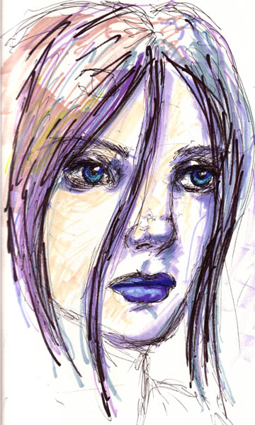
First, I sat in a dark room whating some tv show with my roommate. Then i decided, It's winter break baby! time to draw! A week ago i read about a little competition over at apx (nothing big, though good start for subject and motivation to draw). Topic: winter. Well that's broad enough for me, so let's start with drawing a.. um.. girls face! First i drew a couple photo referenced shots at different angles, since my drawing skills aren't really up to par. after that i was ready, and drew this with a pen and some markers. (i typically don't draw with pencil since i'll spend too much time in erasing and perfecting the drawing. I had a deadline to contend with!)

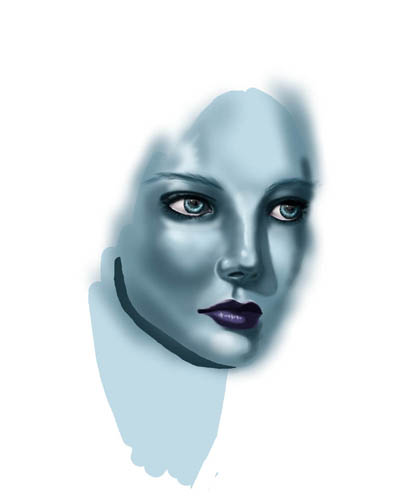
I usually start with painting the eyes. and that's usualy done in a couple steps, so i don't have any wip shots of the process. basically, start with solid colors, then shade it like a sphere, and finally add the special touch of reflections. the shading process is similar to how i do the face, except eyes are very simple shapes so i finish them pretty fast.
Next we go to the face! and first i make a rough shading thing so i know where the nose is. it also helps to establish the light source i want. (just remember to have consistant light sources with the eyes and face).

Now it's time to start establishing some form. I mainly work on the nose and smooth out the rough shadows from before. i basically play around with the colors till the face starts to look like a face. So i don't imediately just place colors down knowing how a face should look. (i'm not an artist, so i don't just have these things pop up in my head).
some mouse user tips:
Since i'm a poor starving college student, i can't afford one of those fancy drawing tablets. now, since i am a human, and i'm not the only human going to college, i can deduce that there are probably others out there in the same economic pinch as me. thus you just gotta use what you have to digi paint. many people think it's crazy to draw with a mouse, but after doing it for a while you get used to it and gain pretty good control. though sometimes it's just hard to get a curve down. I find it easier to create a layer, and then use the eraser to create a shape. just draw a big fat line and go in and trim it down with the eraser. that way you get a consistant colored line.
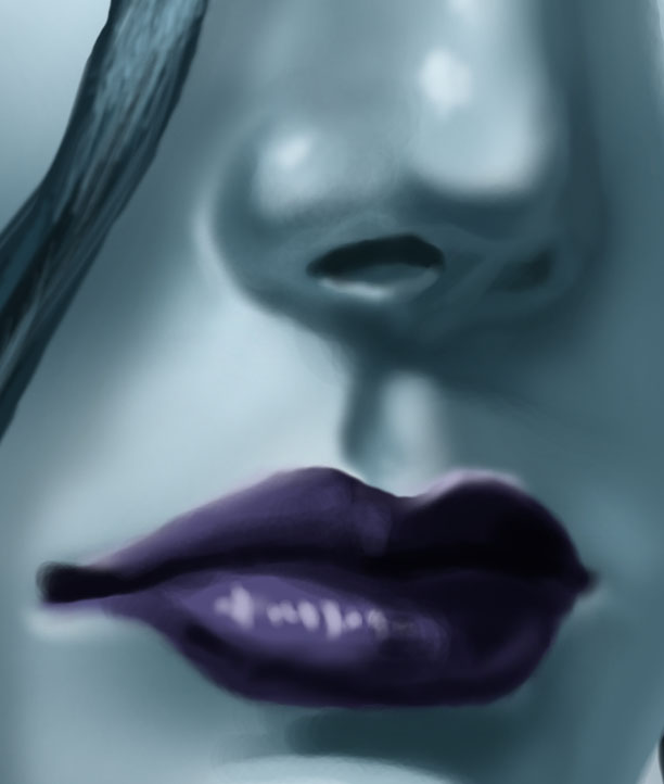
now i decided the painting needs a little more contrast, so i add brighter highlights and darker shadows. i took some time to work on the lips. i basically just added a shadow to the left of the botom lip and then lightened some areas to make them look a little more 3d (hopefully). you can see a detailed shot of those down below. now here i was painting and i thought to myself, "gee, those eyes look far apart..." so i moved them closer together. you'll notice adjustments like that through out this. Why? mainly cuz i'm not too sharp on drawing like i used to be, so i have to make adjustments as i go along. the smart thing to do is to make a fairly accurate initial drawing. but if you're like me and can't draw that well, just start working at it and do little adjustments here and there.

I drew an ear! why? well i like to have some flexibility with my painting, so i usually paint extra just in case. i layed down the structure of the hair using a custom set of brushes that consist of several fuzzy dots in a rough line at different angles. also again, i wasn't too happy with the face proportions, so i squished it a little and shank the right side eye. remember, we all know what a head looks like (and if you forget, just look in a mirror) so just mess around with things if it doesn't look right. typically for me, i seem to draw the eyes too big, so i always look there first if something doesn't look right.

the hair is given some shading using the custom set of brushes. at this point i start adding cast shadows of the hair strands to the face. i also add some single hair strands around the edge of the hair just for some extra detail.
Now to the composition! i had a background planned with a cave and ice everywhere and all kinds of cool stuff... till i thought to myself, "then why have this girl here? i need to integrate her more" so i changed the composition and drew out a little scene with a snowman (on a sheet of paper with a pencil). it looked promising so i started the new composition. right now she's petting the snowman.

general shadows are layed down for the clothing. i wanted to do something weird so i went for a blanket look. wow that's a mighty thick blankey! it's almost there, but something just ain't looking right....

i darkened the top of the eye balls a little cuz they were too bright for my taste. the arm was kinda funky, so i changed that too. then i called upon my great training to become an artist back a couple years ago and decided to make a more interesting cloth effect. i kept the general shading from above, but went in and added smaller wrinkles. also i got rid of the super thick look by giving the blanket thing an edge with a thickness (the white line). for wrinkles just shade them like cylenders and such. add some extra here and there and use your judgment on if it look good or not. also look at some live examples by not making your bed in the morning and analysing the sheets. if you're wearing jeans, look at those to help gain a sense of shapes for wrinkles. oh, and remember to keep the lighting consistant. don't introduce a new light source that only works on the clothes.
another thing to test around with is the concept of the core shadow. if you've taken an art class, you've learned about this. the core shadow is the dark shadow that lies underneath the highlights. what i do to get this effect is i just add a lighter shadow color near the bottom of the shadow area. play around with that and see if it looks good or not. you can really see this in action for the snowman ball. there's this light area in the shadow part. oh, and since i've introduced the snow ball, i picked a blue color for the shadow since white snow reflects the sky color and gets a blue tint. to get a nice color, i also looked at some snow pictures and did some experimental drawings to simulate snow.
what causes a core shadow?!? some simple physics:
being the physics nerd i am, i just can't tell someone, "oh yeah, add a core shadow cuz it makes the picture look better." so here's a quicky on the core! basically we have our friend the light ray thing. technically there is no such thing as a light ray, but... since this isn't about the wave nature of light, we'll just pretend there exists this thing called a light ray. yup, a beam of light. so when you turn on a light, a little light ray shoots out and hits a surface, then is warped by the surface and a light ray is reflected back to your eye and magically you see the object. well, sometimes light will reflect off many surfaces before getting to your eyes. if there is two surfaces next to each other and one surface gets hit by a light ray, that light ray might bounce off and hit the other surface. the light ray is still a light ray, so it has the same behavior and bounces off the second surface making it look lighter. thus it makes it look like the shadow is darker near the highlight, then below it.

now onto the arm and hand! i used the disolve paint brush type to shade the arms. this helps create the efect that the material on the arm is that sparkly spandexy type of deal. i gave the snowman a nose (obviously). now to the glove! i did a basic shading of it (sorry, it was a simple shape so i don't have awip of that) and then gave it some texture. first i made a bunch of 'x' marks acrossed it and i tried to adjust for forshortening issues. after that, i put some dark spots in the middle of the x's to give it that holey kind of feel.

I looked up some pictures of carrots since i had no live subjects around, and studied them for a couple seconds. with that knowledge i went into shading the carrot nose. to get the texture i mainly just painted curved stripes. i also started the hand of doom. i sat by a mirror and drew several hands to try and figure out how the hand should look. once i came up with an acceptible drawing, i started to put it on the puter screen. i put down some shadows to halp define the form of the hand. last, i put in a charcoal eye. i was kinda lazy on that an just drew it without any research :(

ok, almost done!!! i smoothed out the shading on the hand from above and then added the same texture technique for the wrist to the hand. i was getting near the end and decided that the arm color sucked. so i darkened it, and i think it looks a lot better darker. i added the mountains in the back and the ground. as you can notice, there's a lot of messy spots on the edge. this is because i already had my crop, but i still painted outside it a little just so if i needed to move the crop a little i could.
after this stage i quickly shaded the mountains (don't add too much detail since it's far away) and i added clouds. i hate clouds personally. they've always been my soar point in painting. though i have learned more and more about them each time i attempt to paint them. just remember, clouds have a 3d shape, so it's underside should be shaded and the under side should be fairly large (at least for this view). i played around with that till i was pleased and thus arrived at the final drawing:
Making a Snowman

Detail full resolution shots:


Back to drawing board.
Back to the processes.