Pie Charts and Pictograms, Line Graphs
| home | stands | games | about | mpjournal | back | links |
A sample is a subset of a population selected to represent the whole
population in some way. The population is the set of elements of interest, for
example, people, events, objects, areas, or animals. When studying the
properties of the population, it is usually impossible to examine every element
in the population, and it becomes desirable to choose a sample from the
population, and to make inferences about the properties of the population from
the characteristics of the sample.
In a random sample, each member of the population has the same chance of being
included in the sample. No subgroup is deliberately excluded from the sample,
and any deliberate source of bias is eliminated. Consequently, a random sample
is likely to be representative of the whole population. However, it is still
possible for a random sample to be unbalanced by chance.
The list of units, or the subset of the population, from which the sample is
actually selected is called the sampling frame. Ideally, the sampling frame will
include every unit in the population, but this is often not possible, and some
elements are excluded. An unrepresentative sampling frame can be a source of
bias.
It is necessary to use samples because it is not always possible to obtain information about a whole population. For example, collecting information about a population may actually destroy the population. To find out how long a batch of machine components would last would mean wearing them all out, and testing fireworks would also destroy the population being tested. It may well be impractical to obtain information for every member of a population due to the amount of time it would take or the amount of money it would cost. For example, asking every person in a country whether they use a particular product would take too long and be too expensive to be useful to a company. If it takes too long to obtain the information about a population the situation may have changed for the first members of the population assessed by the time the last members of the population are assessed. Another situation in which sampling is essential is when the population to be measured is infinite, for example, when measuring a physical constant, which makes it impossible to ever measure the whole population.
Sampling with replacement is where each member of the population chosen to be in
the sample is "replaced" into the population, and is therefore
available to be chosen again. Theoretically, when sampling with replacement from
a finite population the population may be considered to be infinite.
Sampling without replacement is where each member of the population cannot be
chosen more than once. For many practical applications, if a finite population
is large, it can be considered as infinite, even when sampling without
replacement.
There are a number of ways of selecting a sample from a population. When choosing which method to use it is important to bear in mind whether the scheme will produce a random sample, how much it will cost, how long it will take, and, if the population is a group of people, how convenient it will be for the person being questioned.
It is not always possible to ensure that data collected are completely
accurate. Errors can occur for a number of reasons. For example, equipment used
in an experiment might not be calibrated properly, values might be written down
incorrectly, or a questionnaire might be designed badly. However, even when an
experiment or survey is carried out properly, it is not possible to stop a
certain degree of error occurring. Even the best equipment can only measure a
quantity with a certain degree of accuracy, and, even with a properly designed
questionnaire, the people being questioned may not answer the questions
completely truthfully. Therefore it is usually a good idea to give an indication
of the range of values a parameter can take when the degree of error is allowed
for. This is often done by giving the standard error.
The standard error is the standard deviation of the sampling distribution. For
example, if a large number of random samples of size n are taken from a
population and the mean of each sample, x?, is found, then these sample means
will form a sampling distribution of the sample mean. The standard deviation of
this distribution is the standard error of the mean, and is given by
where s is the standard deviation of the population.
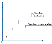
Since it is impossible to measure a data value completely accurately, scientists cannot assume that a value they obtain in an experiment is necessarily the correct one. Therefore, scientists often present their data values with a measure that gives an indication of the range that the actual value is likely to be in. For example, if a series of readings have been taken they might be plotted on a graph with vertical bars extending above and below the points to indicate the standard deviation. The standard deviation bars show a range of values that we can be reasonably certain the true value will fall within. Often, scientists repeat an experiment a number of times to help iron out any unreasonable values obtained. The points plotted on a graph are often the means of the values from these repeated experiments. When the values plotted are means, the bars used to indicate the range of values we are reasonably certain that the real value must fall within are standard error bars.
In order for us to be reasonably sure that a random sample is representative of the population we are interested in, it needs to be large. This means that we will end up with a large amount of data from a sample. It is difficult to draw meaningful conclusions about a large set of data without first summarizing it in some way. Data can be summarized either graphically, on a table or diagram, or statistically, using a range of statistical measures.
There are a number of different graphical methods for representing data. Some methods are used for discrete data and some are used for continuous data.
Often the first stage in summarizing data is to put it in a table. The most
common type of table is probably a frequency table, which gives all the possible
results and the number of times that each occurs. For continuous data, or
discrete data covering a wide range, it is more useful to divide the data into
groups. For example, Table 1 gives the number of people in different age groups
in a random sample of 100 people.
|
Table 1 |
|
|
Age (years) |
Frequency (Number of people) |
|
Under 20 |
24 |
|
20-under 30 |
13 |
|
30-under 40 |
15 |
|
40-under 50 |
12 |
|
50-under 60 |
12 |
|
60-under 70 |
11 |
|
70-under 80 |
8 |
|
80 and over |
5 |
Another form of frequency table is a stem and leaf diagram, which is used only for discrete data. The number of tens in each value forms the stem and the numbers of units form the leaves. For example, suppose 20 people enter a quiz and get the following scores (out of 50): 42, 12, 35, 16, 37, 29, 5, 31, 49, 3, 11, 17, 24, 32, 29, 4, 41, 33, 35, 9. Their scores are summarized in the stem and leaf diagram (Table 2).
|
Table 2 |
|
|
Stem |
Leaf |
|
0 |
5 3 4 9 |
|
1 |
2 6 1 7 |
|
2 |
9 4 9 |
|
3 |
5 7 1 2 3 5 |
|
4 |
2 9 1 |
The leaf part is then reordered to give the stem and leaf diagram in Table 3.
|
Table 3 |
|
|
Stem |
Leaf |
|
0 |
3 4 5 9 |
|
1 |
1 2 6 7 |
|
2 |
4 9 9 |
|
3 |
1 2 3 5 5 7 |
|
4 |
1 2 9 |
Bar charts and frequency diagrams can be used to summarize discrete data. Bar charts are usually used for qualitative data and frequency diagrams are used for quantitative data. A bar chart has rectangular bars of different heights to represent the frequencies, and a frequency diagram has lines of different lengths for the same purpose. For example, Table 4 displays how many bars of chocolate a shop sells in half-hour periods.
|
Table 4 |
|
|
Number of chocolate bars sold |
Frequency (Number of half-hour periods) |
|
0 |
1 |
|
1 |
5 |
|
2 |
12 |
|
3 |
24 |
|
4 |
10 |
This can be summarized on the frequency diagram in Diagram 5.
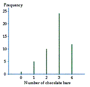
Diagram 5
A histogram is the equivalent of a bar chart, but for continuous data. For a histogram, we plot the frequency density rather than the frequency. The frequency density is the frequency divided by the class width. Thus the frequency is given by the area of the rectangular bar rather than the height. For example, suppose we record the length of telephone calls to a particular house and get the data in the table in Diagram 6.
|
Length of call (minutes) |
Frequency (Number of calls) |
Class width |
Frequency density |
|
0-1 |
3 |
1 |
3 |
|
1-2 |
7 |
1 |
7 |
|
2-5 |
27 |
3 |
9 |
|
5-11 |
24 |
6 |
4 |
|
11-14 |
6 |
3 |
2 |
|
14-17 |
3 |
3 |
1 |
|
17 and over |
0 |
- |
- |
This data can be summarized on the histogram in Diagram 7.
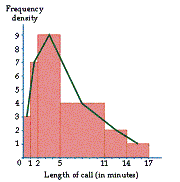
Diagram 7
Often we join the middles of the tops of the bars together with a line to form a frequency polygon.
Another sort of diagram commonly used for displaying data is a pie chart. A pie chart is a circle divided up into different sectors, where the sizes of the sectors are related to the frequencies. A pictogram uses symbols to represent frequencies. The symbol used is usually related to the quantity being represented. Either the size or number of the symbols is related to the frequencies.
One of the most important ways of summarizing data is on a line graph. Line graphs are only used for continuous data. A series of points plotted on the graph can be connected using either straight lines or a curve.
Statistical methods for summarizing data can be broadly divided into measures of location and measures of dispersion or spread. A measure of location is a single value that summarizes a distribution by giving some kind of average value. A measure of dispersion gives an idea of how spread out the values in a distribution are. A measure of location and a measure of dispersion are often used together to summarize a set of data more effectively.