 |
|
|
 |
 |
 |
 |
 |
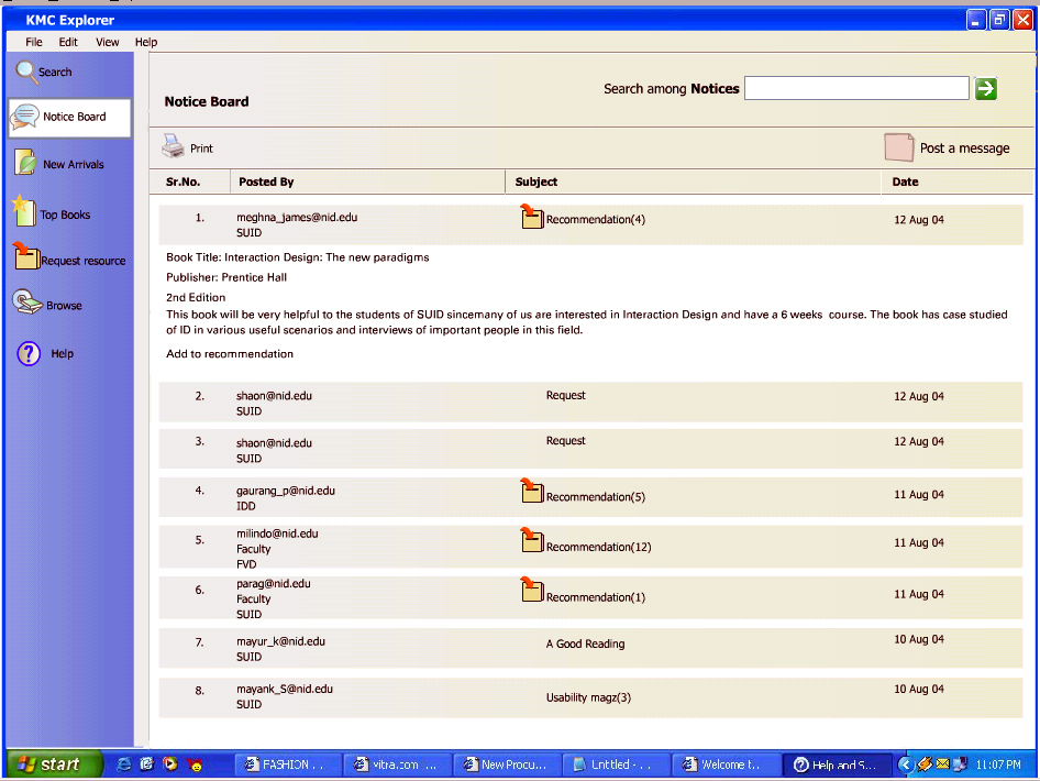
Project Brief: To re-design the catalog system of the Knowledge and Management Center of KMC on two platforms desktop and web Process: Initial Research: An understanding of the current system and practices in order to manage the resources of KMC was gathered. There are several types of resources with the book being maximum in number. Also took a look at the current desktop application in the KMC, which is used to search for all resources. User Study: A user questionnaire was prepared and user interviews were carried out with the selected sample. Samples were chosen based on their frequency of visit to the KMC. Some of the questions asked were like • How frequently did the user visit the KMC? • What are the most frequent tasks carried out in the KMC? • What resources frequently searched/browsed by the user? • Would the user prefer to use the application or search manually for a resource? • What are the difficulties faced while using the application? • What are other glitches in the system that can be rectified for user's benefit? • Others. A walkthrough of the existing desktop application for all the user tasks revealed many problems. Analysis: A task list was prepared consisting all the major and minor tasks and was sequenced according to their priority. All tasks were further broken down into several sets of activities that could be performed in order to accomplish the task. An understanding of the two platforms desktop and web- revealed their strengths and weaknesses and clarified their purposes. It was decided that desktop application was to be put in the KMC computers for fast and easy access to resources. The application on the web would be accessed by anyone from anywhere in the campus and outside mainly to look at the new arrivals, manage their resources issued by them, reserve and re-issue books without coming to the KMC. It would also help outsiders, visitors and students from other colleges to look for availability of books in the KMC. We could have taken the administrative functions as well but we didn't due to time constraints. Information Architecture: The current application had everything hidden within the menus. A major feature of all desktop applications is the menu but all the frequently used functions should be presented to the user upfront on the screen as soon as the application opens. Search was put right up front and links to other information was put as tabs. A login section was created on the web application for the user to manage the resources. Prototyping: The prototypes were made in Flash. User Testing: User testing was performed on a sample of users and feedback was received in terms of the functionality, navigation and look and feel of the two applications. Changes were incorporated accordingly. |
|---|