|
|

Naked
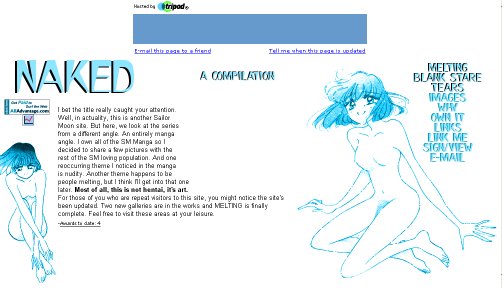
Naked is perhaps the most unique site in the Sailor Moon online community. There are lots of picture galleries out there, and there are quite a few manga galleries. In the spirit of trying to attract attention, the webmaster has taken a risque approach to provide a theme for the site. This of course, gets many reactions. Some are not as enlightened as others. Here's an example: OK SAILORMOON IS NOT SUPOSED TO BE NAKED SHE IS A LITTLE GIRL YOU STOPID PEDOPHILE SHE IS NOT NUDE SHE IS NOT ALLOWED TO YOU DREW ALL THESE PICTORES YOURSLEF YOU PERVERT YOU USE THESE TO GET% HARD WELL YOU SICKO TAKE THIS SITE OFF THE INTERNET RIGTHT NOW YOU GROSS PERVORT This is one of the reactions from a person who signed the guestbook. Most of the rest of the reactions seemed to be more positive, and echoed the thoughts of the webmaster, and myself. For those of you who are concerned, the site is NOT a hentai site. Most manga, including Sailormoon is targetted toward older teenagers and young adults, and the showing of the naked body is not perverted. One of the reasons I brought the subject up first is the splash page of the site features a large picture of Usagi naked...something that kinda screams SEX!! And the webmaster then takes off on that with a "Now that I have your attention" line... The site loads quickly, and the light blue and white-based page does not look bad at all. Also, as most well-done pages do, most of the pages in the site are compact enough to fit on the screen once it loads. The images in most of the galleries tend to load up in a neat square in the center of the page, which makes them easy to get at. There are anywhere from two to fourteen or more pictures per page, and they are of good quality. Naked has a couple things it needs work on. The menu needs to be completed, as there are a couple unfinished links. A good procedure is to not even list a link to the page until it is completed. However, it is a minor thing, and I understand the reminder value of "Oh yes, I have to get to that..." It can be annoying to the average web-surfer though. The "Melting" images (and by this I mean the Usagi image on the main page of this section) tends to load slow, or parts don't load at all. Glancing at the code, I see that it appears to be a direct image map-like picture (where you chop up the large pic into several sections) without the links that an image map would use. This is a problem that the Three Cats are in the process of solving for our own site. In the case of Naked, simply scan the entire thing as one image and save it as a JPG. The picture is not overly complex and it shouldn't take up more than 30k, and most browsers should be able to load the entire thing in no time. Another problem with the images noted above is that sometimes that fail to load properly at all. All the way through the site, the right-side image, next to the menu, failed to load properly. The result was that the character's face was messed up and there was a block of white space immediately to the right of it. One minor content problem arises when the author in the "Why" section of "Melting" says: "With such graphic pictures it's almost hard to believe that these books are intended for children." This might be a bit of cultural confusion. Through my studies of manga, which have come largely through my interest in Sailor Moon, I have discovered that the targeted age range of almost all manga is roughly 17 and up. So, manga is targeted toward young adults. So too is the anime that is created from it. About 95% of all manga is eventually animated. The problem is that in some parts of the world, specifically the US, anime is considered a cartoon, and cartoons in this country are targetted specifically for children. Naked is truly one of the neater sites in the SMC simply because of its unique take on manga. It is a site that is still growing. It has attracted a lot of visitors and probably a loyal following. It will be very interesting to see this site continue to grow. Keep up the good work. Artemis' Score: 8.7
LAYOUT: A The sky-blue & white composition is aesthetically attractive, and almost soothing. It lends greatly to the site's interpretation of its contents as art, not sensationalism. With the exception of the site's splash page, the layout is modest and straightforward, demanding serious respect from its visitors. The splash pages for "n a k e d" and the "melting" gallery are very effective for eliciting the types of reactions the webmistress is seeking. At the same time, they are ideal examples of Naoko's artwork at its most beautiful. The webmistress made great choices for the layout and I must applaud her decisions whole-heartedly:). Nit-pick: The AllAdvantage stickers on the bottom of every page could have been done without; however, since they perfectly match the color schemes, they aren't bothersome at all. NAVIGATION: B- This is possible the only area where "n a k e d" might receive negative points. Even though the toolbar on the side upholds the site's consistency, it does not properly emphasize the webpages that need to be emphasized. For instance, the links for the "blank stare" and "tears" galleries are there, but you cannot click on them(yet). Argh! While this is admittedly better than, say, a link to a file that says this page is under construction, unclickable links tend to frustrate visitors instead of teasing them. It especially hurts when the unopened galleries are printed in bold. I would prefer that the boldface be used to attract attention to the "images" gallery-- which the entire site is named after. The second navigational issue I have is the lack of descriptions in the text-only galleries. It was a smart move on the webmistress's part to include text-only versions to accompany the "images" and "melting" galleries. Sadly though, these versions are nearly unusable since the images are numbered and lumped together in what seems like an arbitrary order. Thus, you have to download each image to see what it is a picture of, completely defeating the purpose of a text-only system. On the plus-side, the image-maps used in the regular version are creatively put together, lending to the site's overall cleanliness and originality. CONTENT/INFO: A+ This place doesn't have a load of SM information for the newbies. Still, while traversing the site you get the impression that the webmistress owns a lot of manga and possibly all of them. Since the galleries showcase images from Season 1 straight up until SailorStars, you get the strong impression that the webmistress didn't leave out anything. I figured there would be more Minako images, but hey, I only have 2 volumes of the manga, how should I know??^_^. Upon leaving "n a k e d" one has a new understanding of how the SM anime differs from the manga. On top of that, you could just how greatly Japanese themes differ from American ones. The SM manga has a familiarity with sexuality that seems comforting and natural. Nit-pick: The webmistress's reasons for putting up the site are more convincingly explained on the main page than on the "why" page. That didn't quite make sense to me:). OVERALL: A+ The site's sheer originality makes it stand out from the hundreds of galleries that plague the SM online community. If you have an open mind, visit it. Even if you don't, visit it:).
Luna's Score: 9.2
As for navigation... It was simple to get around, having the links on almost all of the pages, even though that's not always my favorite. I love it! I loved it the first time I stummbled across the site, and I still love it now! I aplaud you for your original idea, and the guts to show people the naked truth! (no pun intended! ;p) Anyone who doesn't see the beauty in this site, and Naoko's original works, obviously hasn't hit maturity yet. You get an A+! Diana's Score: 9.3 Overall Score: 9.0 MAIN | ARCHIVES | ARTICLES | FAQ's | SUBMIT |
|