|
|
 
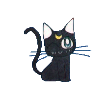
Love & Beauty is a shrine site to Sailor Venus that features information and a picture gallery dedicated to Mina and Sailor Venus. When I first dropped into the webpage, I was surprised by the splash page, which is quite nicely put together with nice font. What surprised me was the original 3D picture of Sailor Venus off to the side, which I thought was a very nice touch. The site navigation is artfully placed on the splash page, so I dove in. The subpages seem almost to be from a different site, or perhaps a different incarnation of Love & Beauty. From the light, airy feel of the splash page, the viewer is dropped into deep blue background with a simple image running down just right of the center of the page. About 3/4 of the way dowm is a cute manga pic of Sailor Venus. The information provided in some areas is brief, but it is accurate. However, the information covers a lot of different subjects, from attacks to fukus, to mythology. The "counterparts" area appears to have the author's opinion on which villain would be best matched up with which senshi, but perhaps this should be presented as an opinion. The site maintains a picture gallery both of Mina and Sailor Venus. The pics are arranged in collage-style image maps that don't look too shaby. There's a pretty good selection of good-quality pics in the galleries. The author also takes the time to give credit to those who deserve it, which is always a good thing to do in my book. There are a few things I would work on in future updates to this site. First thing I would advise is for the author to work on giving the subpages a different feel...perhaps one similar to the main page. As it is, the subpages have a real gloomy feel to them. Perhaps I'd also add in a few more graphics on the info pages..either to spice them up or to lend more meat to the info itself. For instance, in the fuku information, pictures would have shown the differences between the various fukus. I'd also advise the author to work on re-organizing the material a bit. The information is currently organized in a long string of material down the left side of the screen with bold lettering to break it up when a new item is mentioned. With a little work, that could be spruced up. I liked that the author specified which programs and fonts were used in creating the site. To improve this, perhaps the author should upload the font file to the site, then link to it so that viewers can obtain that font. And perhaps links to the sites providing the programs would also be a plus. Most sites are continuously under some form of construction, no matter how good they are. There are some rough spots to Love & Beauty, but the site shows real promise. Artemis' Score: 8.4
LAYOUT: B The first thing I noticed when I glanced at this page was -oh my goodness! - an original SM image. Kudos to the web-mistress, for not recycling the same old images we've seen a thousand times. The 3-dimensional image of Venus is as beautiful as it is unusual. The circular layout is also original and inviting. Unfortunately, it seems as though the sub-pages are not given the same attention. The good news is that the look of the minor pages is universally consistent, making the navigation predictable and easy to follow. However, with the same background used over and over and the lack of images, it all gets the same rather quickly and the visitor loses the stimulation to keep surfing. I would like to have seen the hearts-font from the original page repeated on the others pages. I also believe that integrating the main page's lively color scheme (red-white-blue-orange-and-yellow) would make the entire site more exciting. NAVIGATION: A The site's break-down is clean and easy to follow. The site's sheer uniformity is a major plus- I wouldn't change that at all. I also love the way the web-mistress thumb-nailed the gallery images. She definitely put some thought into its organization and aestheticism, and it shows. Meanwhile, the thumbnails remain easily accessible and large enough to see. Great work. CONTENT/INFO: C+ The site's info is precise and complete. Sadly, it has all the charm of a Calculus textbook. The "Attacks" page repeats info that could be found in any Sailor Moon encyclopedia. The long, rigidly organized list is just tedious. Some accompanying images or episode references would really make that page come alive. The "about mina" page balances well-known statistics with some new material. However, once again these are all technical descriptions with no evidence of personal intervention. For instance, take a glance at this paragraph. Super Sailor Venus's fuku is a little bit different then her plain Sailor Venus fuku. She has a white leotard with chiffon sleeves. Her collar is orange with a white stripe down it. In the middle of her leotard there's a blue bow with an orange star on it. Her orange skirt is pleated with a long blue bow in the back. Her orange shoes are highheeled. Sailor Venus's gloves are white and elbow length with orange lining. She wears her hair down with a big red bow. A picture is worth 1000 words, baby. In addition, the small white text against a purple background makes reading the content seem more like a chore. OVERALL: B- The site gives you everything you need to make a Sailor Venus costume- including all the little details, magical items and transformation phrases. But where is the "Venus" behind all this? Minako has the most open and fun-loving personality of all the girls, yet none of it is translated here. To me, this site became something of a let-down because the cuteness and originality of the main screen was never seen again. The webmistress has obvious talent with Adobe Photoshop, and she can improve the site just by showing off with it a little more.
Luna's Score: 7.9
Wee! The layout is very pretty. Quick loading, neat, and original. Everything is grouped together in a few simple catagories, and simple to find! The subpages are all uniform, keeping to the same theme... When you use a resolution smaller than 800x600 you can see the pretty side border of Sailor Venus. Plus the content looks a little squished. You could probrably fixed this by changing the tables around a little bit to make the site more 'liquid'. I like how you have little mini-images, custome tailored to fit the site. ^^ The collage to see the image galleries is unique, but it takes way too much time to load. Little thumbnails may be a pain to make, but they will never fail you on loading time. A Venus Shrine! And what Venus shrine would be complete without the basics? You've got the basics down pat, along with cute images, and personal comments! Excellent! My favorite two sections are "Almost Twins" and "Dream Chaser". It gives you some special insight on Venus that you don't see often. To make this site better? Not much... just more Minako! There are voice sniplets, fanworks... all sorts of Minako-goodness that could be added to the page. This was well rounded, pretty, and had great personalized content. I plan on coming back to this shrine to see if anything new pops up! Diana's Score: 8.0 Overall Score: 8.1 MAIN | ARCHIVES | ARTICLES | FAQ's | SUBMIT |
|