| PAPER PROTOTYPING |
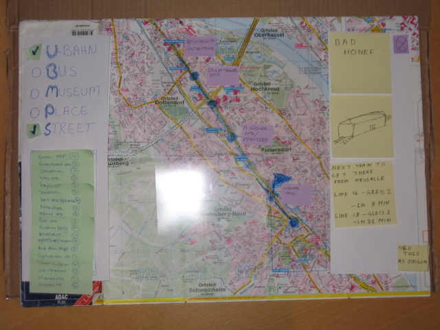
First we have prototyped the check box on the left side pane with a different check box style. It was something like a multiple select radio check box. When we completed our paper prototype, we have found that this might somehow be confusing to the users. the users may not understand that he is supposed to select or deselect multiple layers at the same time. Therefore, we have changed the multiple select enabled radio box to a normal check box with a tick mark. Here we show our first design.
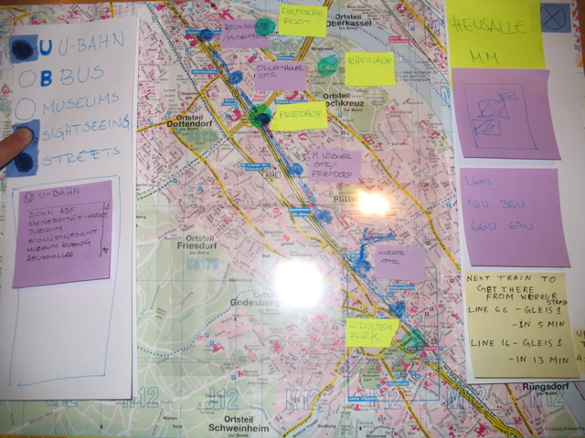
Previously, when showing the layer of the U-bahn stations, the line numbers were not displayed on the map. One of our test user pointed out that the number of the lines when displayed under the names of the U-bahn stations directly on the map, will be very helpful. We agreed that this was a good idea and decided to implement it.
At the beginning, by selecting multiple layers at the same time(for example the layer of the U-bahn stations and the layer of the streets selected at the same time), multiple list boxes appeared on the left side. Our user pointed out that this is quite confusing to him. After reconsidering the structure of the left side pane, we have put all the entries from every list in one list. That means that when the streets and at the same time the U-bahn stations are selected, a list box will appear and it will contain all the entries from both the U-bahn list and the street list. We now differentiate the various types of map points by adding an icon for each type.
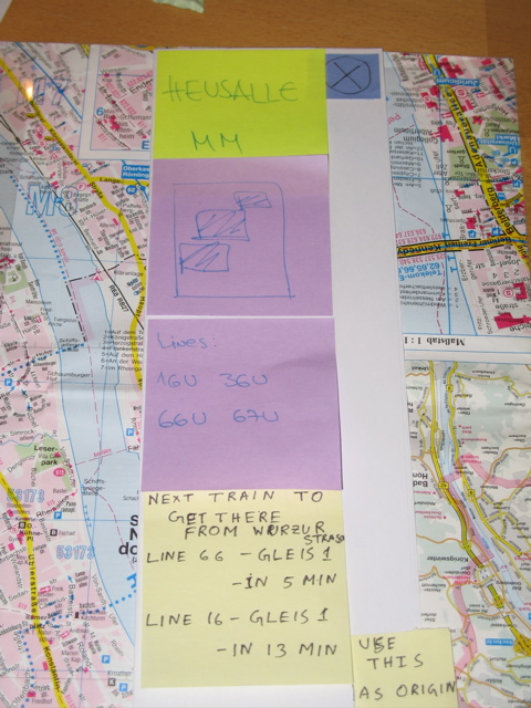
We also introduced an information pane on the right of the system. It appears on the screen every time a destination is selected. We asked the users, whether they would like to have a picture of the selected place on that pane. We had a picture drawn on a post-it note. We removed the picture and then put it back again to simulate the two systems. They suggested that a picture would be helpful to have a better understanding of the place. Previously the information window on the right side pane had more information. After implementing the paper prototype, we understood that there was too much information. Our potential users also confirmed the issue. Hence, we have decreased the amount of text selected on the information pane.
|