Project 1a
Charts and Graphs:
Data can be described by constructing appropriate summary measures, tables and graphs. There are numerous ways to do this, limited only by our imagination, but there are several tools used more often. The data sets available to companies in computerized world tend to be extremely large and filled with unstructured data. It is a real challenge to summarize the data in such a way that the important information stands out clearly.
Data for Quality, Temperature and Pressure for a finished Product
|
Date |
Quality |
Temperature |
Pressure |
|
Jan-01 |
71.3 |
90 |
60 |
|
Feb-01 |
73.0 |
80 |
60 |
|
Mar-01 |
70.9 |
90 |
60 |
|
Apr-01 |
73.2 |
100 |
55 |
|
May-01 |
97.4 |
90 |
55 |
|
Jun-01 |
63.4 |
90 |
50 |
|
Jul-01 |
69.8 |
100 |
55 |
|
Aug-01 |
42.5 |
100 |
60 |
|
Sep-01 |
61.6 |
90 |
50 |
|
Oct-01 |
46.4 |
100 |
50 |
|
Nov-01 |
71.2 |
80 |
60 |
|
Dec-01 |
46.6 |
100 |
50 |
|
Jan-02 |
72.5 |
100 |
55 |
|
Feb-02 |
93.7 |
80 |
55 |
|
Mar-02 |
49.1 |
100 |
50 |
|
Apr-02 |
50.7 |
80 |
50 |
|
May-02 |
38.7 |
100 |
60 |
|
Jun-02 |
90.9 |
80 |
55 |
|
Jul-02 |
74.5 |
80 |
60 |
|
Aug-02 |
41.4 |
100 |
60 |
|
Sep-02 |
93.8 |
90 |
55 |
|
Oct-02 |
68.8 |
90 |
60 |
|
Nov-02 |
63.4 |
90 |
50 |
|
Dec-02 |
49.4 |
80 |
50 |
|
Jan-03 |
50.8 |
80 |
50 |
|
Feb-03 |
90.9 |
80 |
55 |
|
Mar-03 |
92.1 |
90 |
55 |
Frequency tables and Histograms:
A frequency table indicates how many observations fall in various categories.
Objective: To see the trend of Quality in the product.
|
Range |
Frequency |
|
40 - 50 |
6 |
|
50 - 60 |
2 |
|
60 - 70 |
6 |
|
70 - 80 |
7 |
|
80 - 90 |
0 |
|
90 - 100 |
6 |

Interpretation:
Here we see that quality is not centered in any particular range. It also shows a lot of variability.
Scatterplot:
A scatter plot shows you that if there is a relationship between the 2 variables and if so what type of relationship is it.
Objective: To observe the relationship between quality and pressure.

Interpretation: Here we see that pressure definitely affects the quality. Here we see that the optimal pressure for quality is about 55.
Pi chart:
This provides an incredible amount of useful information about a data set. They also help us to “slice and dice” data in a variety of ways.
Objective: To see the way quality of a product is distributed.

Interpretation: Here we see that quality between 40 to 50 , 60 to 70 , 70 to 80 and 90 to 100 is evenly distributed.
Time series plots:
When we are interested in forecasting future values of a time series, it is helpful to create a time series plot. This is essentially a scatter plot, with the time series variable on the vertical axis and time itself on the horizontal axis.
Objective: To see the effect of time on quality of a product. We can also see the effect of temperature, pressure and time on the quality of the product.
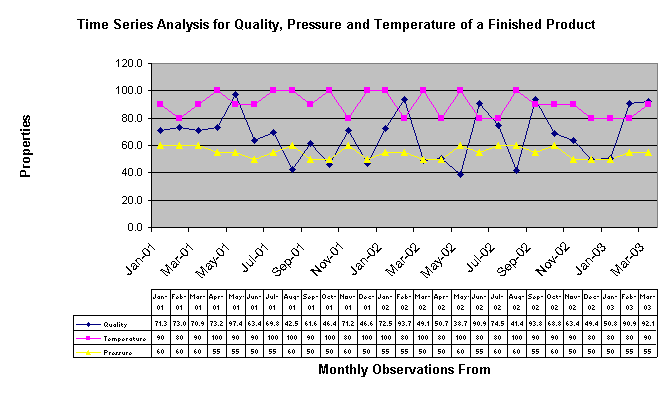
Interpretation: Here we see that quality does show some spikes depending on the month. But this could also be attributed due to the combination of time and pressure.
Conclusion:
The graphs and tables above are very useful in describing data sets. The graphs show at a glance how a single variable is distributed, how two variables are related or how a variable varies over time. The tables are not useful only in their own right but also for providing the data needed to create the graphs. Pivot tables allow us to see relationships in a data set that would be very difficult to see in any other way.