Description of the Situation:
For this assignment I am using problem 76 on page 120 in the
textbook. I will analyze the percent of the U.S. population without health
insurance coverage. The file P3_76.XLS
contains these percentages by state for both year 1994 and 1995.
Objective:
To compute and analyze measures of central
tendency,dispersion and future prediction with the given datasets.
Variables:
States percentage of population without health insurance
coverage for 1994 and 1995.
Analysis:
|
Summary measures for selected variables |
|
||
|
|
|
Percent94 |
Percent95 |
|
|
Count |
51.000 |
51.000 |
|
|
Mean |
13.755 |
14.155 |
|
|
Median |
13.000 |
13.500 |
|
|
Standard deviation |
3.724 |
4.098 |
|
|
Minimum |
8.400 |
7.300 |
|
|
Maximum |
24.200 |
25.600 |
|
|
Range |
15.800 |
18.300 |
|
|
Variance |
13.868 |
16.795 |
|
|
First quartile |
10.900 |
11.500 |
|
|
Third quartile |
16.100 |
15.800 |
|
|
Interquartile range |
5.200 |
4.300 |
|
|
Mean absolute deviation |
2.947 |
3.144 |
|
|
95th percentile |
20.650 |
20.550 |
|
|
|
|
|
A. Describe the
distribution of state percentages of Americans without health insurance
coverage in 1995. Be sure to employ
both measures of central location and dispersion in developing your
characterization of this sample.
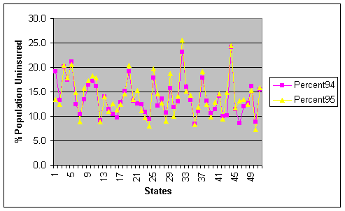
To describe the distribution of state percentages without health insurance coverage, I will begin with a line graph demonstrating the similarities between the two datasets. We see, the data are very closely related with the basic trend in most of the sates same except the of states 1(Alabama), 43(Tennessee), and 46(Vermont)(Refer To excel File DataForProject1-b).
Central Tendency:
The mean denotes the average
of all values of a variable. This is
the most likely value, when nothing else is known. In this case we expect that the percentage of the population
without health insurance coverage increased from 1994 to 1995 by 0.4
percent.
The median, which is the
“middle” observation, when dataset listed in an ascending order, is very
similar in this case. From ’94 to ’95,
the percentage increased by 0.5 percent.
Dispersion:
I will use the standard deviation
to determine the variability around the mean.
From ’94 to 95 the standard deviation increased by 0.377. This means that there is greater variability
around the mean in 95 than in year 94.
However, the interquartile range
decreased from 5.200 to 4.300.
Additionally, the first quartile increased by a greater amount
than the third quartile decreased.
Therefore, it is likely that there are some values that are much higher
within the third quartile. (Thus,
driving the increase in mean, and median.)
The increased range substantiates this in ’94 to ’95 from 15.800 to
18.300, respectively.
Moreover, the minimum percent
value suggests improvement because it dropped by 1.1 percent from ’94 to
‘95. However, the maximum percent
value increase by 1.4 percent from ’94 to ’95.
The measures of central tendency
are close to the difference between the minimum and maximum values, 0.3
percent. The mean was 0.4 percent
change, and the median was 0.5 percent change.
A. B. Compare the 1995
distribution with the corresponding set of percentages taken in 1994. How are these two sets of figures
similar? In what ways are they
different?
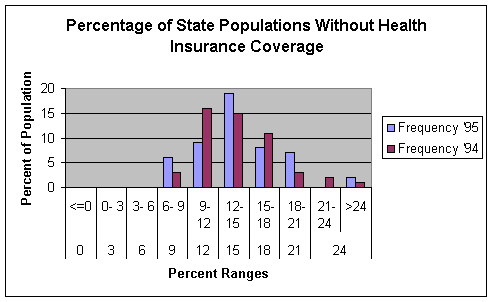
This histogram is symmetrical but is somewhat positively
skewed which explains for the increase in the mean value. It is evident that the percentage of
uninsured is rising. Both datasets are
similar in that the majority of the individual percentages are between the 9
and 18 ranges. However, they differ in
the 21 to greater than 24 ranges. There
are more occurrences of the ’95 dataset.
Alternatively, there are more occurrences of the ’94 dataset in the 9-12
range and 15-18 range.
B. C. Compute a correlation
measure for the two given sets of percentages.
What does the correlation coefficient tell you in this case?
In this section
I computed the correlation measure for both sets of percentages.
|
Table of correlations |
|
||
|
|
|
Percent94 |
Percent95 |
|
|
Percent94 |
1.000 |
|
|
|
Percent95 |
0.903 |
1.000 |
The correlation coefficient is close to 1.000 with a value
of 0.903. This means that the points
will be very close to a straight line on a scatter plot.
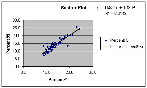
In fact, the scatterplot for uninsured percentages in ’94
and ’95 does indicate a high correlation coefficient. The trend line shows that
it is a very good fit. These values
apparently are the reasons why many of the measures increased from ’94 to ’95.
C. D. Based on your answers in
parts b and c above, what would you expect to find upon analyzing similar data
for 1996?
Based upon my answers for parts b and c, I expect to find almost similar data for 1996. Plugging in the value of percentage 95 we can predict the value for percent 96 for different states. The current trend leads me to believe that there will be an even greater variability around the mean. The range will increase, as well. The histogram used in part a combined with the summary of measures leads me to believe that 1996 will see even greater range. There will be higher values in the third quartile as well as lower values for the first quartile.