Heebink's Notes - An Interview
with John Heebink
Over the course of a number of emails in 2003 and 2004, I
corresponded with John about his work on Nick Fury. Presented below are his
notes on the issues he worked on and his thoughts on Nick Fury and SHIELD.
Humberto M. Ferre'
John Heebink: Former Nick Fury penciler Heebink's proudest accomplishments are the horror-action graphic novel Doll and Creature and the erotic s-f spoof Space Chicks and Businessmen. He's been a penciler on such titles as Quasar, Daredevil, Elvira, Mighty Morphin Power Rangers and currently pencils Peter David's Soulsearchers & Co. He also teaches art in the Academy of Art University's new comic book program in San Francisco)
On Nick Fury
Fury was my favorite Marvel character (thanks to Steranko), I was thrilled
that I got to work on the title for my first regular Marvel work and wish I
could revisit the character with my present-day skills.
Favorite comics
and artistic influences
Tom Strong, The Kirby Collector, Green Arrow, 'sixties and 'seventies Kirby,
'seventies Frank Robbins. I like Mignola, Bruce Timm, the Romitas, Moebius.
I love Wood, Stan Drake, Leonard Starr, Al Williamson, Garcia-Lopez, some lesser-known
Europeans and South Americans. Grew up on Neal Adams, Kubert Sr. and later
Chaykin. I could go on and on...
On becoming penciler
for the SHIELD book
I got the Fury job because it was offered to my pal Mike Manley. I was assisting
him part-time with Darkhawk, etc. He was too busy to take it on. I did a two-page
tryout, and that was enough. Marvel was hiring everybody in this period. My
prior professional experience was mostly with Gladstone-Hamilton and Fantagraphics
and assisting others.
On drawing the SHIELD cast
I figured that Dum Dum was a big Irish guy who liked food and drink, so I drew
him heavy because he didn't have the artificially slowed aging Fury does and
muscular guys tend to get paunchy when they're in their seventies--especially
if they like to drink, as I assumed Dum-Dum would. So I was trying to be realistic.
I'd do the same again.
I think I had more license to determine the looks of the characters than I took, except in case of Dum-Dum, where I took quite a bit. Val's beauty mark came from Gil Kane issues of Cap, I think. I always loved her design, with the hair. I didn't get to design any characters from scratch that I can remember--except the flying armor the SHIELD guys wore in the last issue (feh--armor design was definitely not my "strong suit").
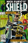
On the cancellation of Nick Fury: Agent of SHIELD (2) and its final issue
Greg [writer Gregory Wright], who from his tenure as an editor had many friends
inside Marvel, says the sales were coming up on our issues. Ironically, I came
onto the book with the understanding that it was slated to be canceled--a further
irony was that the sales, then in the 25,000-30,000 range, would make it a
minor hit in today's market...I found notes from an early phone conversation
with Greg that said he was "promised" issues #42-50 with the possibility
of a new #1 after!
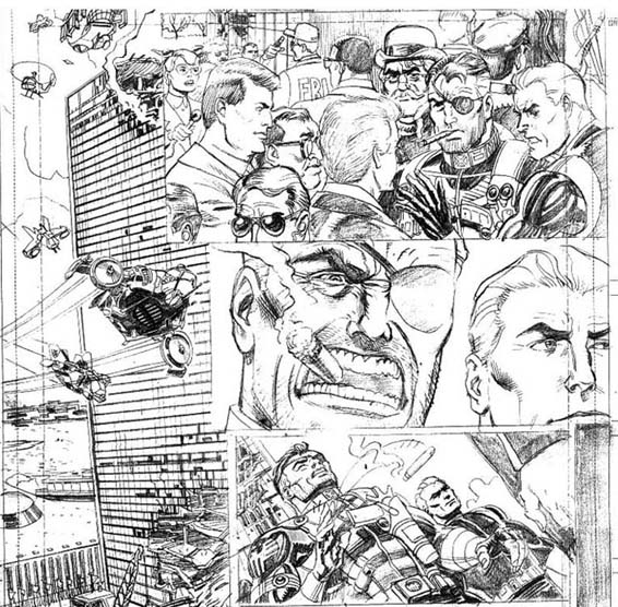
The last issue was hasty. Greg was trying to do in one issue what he thought he would be able to do in four (or more, in effect, had Marvel made the reasonable decision to make #50 a double issue). I was behind and did all but the first few pages as breakdowns. Fill-in inker Brian Garvey did a dynamite job on the page where the UN blows up (Editor Mike was instructed by Macchio that it should only be damaged, not destroyed, for Marvel-wide continuity purposes), and presumably worked fast. I'd come quickly to appreciate the sympathetic work of regular SHIELD inker Don Hudson... I missed him on that final issue of SHIELD, though Garvey did a fine job on a tight deadline.
Had I been allowed to destroy the UN Greg's way, the presence of high-level people like Clinton, Gore and Boutros-Galli on the site afterward would have made more sense. But post-9/11, the idea of sending the Pres, VP and Secretary General to the same disaster site seems risky. I caricatured Boutros-Galli from a verbal description.
On the Nick Fury FOX TV movie
It was a thrill seeing characters I'd drawn come to life on screen in the FOX
TV movie--especially the minor ones for some reason--"There's Pierce!
I drew him!" I don't even think I minded the low-budget aspect of it.
I just didn't like Hasselhof as Fury, though I think he was having the time
of his life.
On the MAX Fury series
I wasn't particularly wowed by the MAX FURY, even though it was nicely penciled
by my buddy and past studiomate Darick. In structure, it was a movie, not a
comic -- too little visual variety, having by my count all of four locations,
none particularly interesting visually. At least Ennis's' script was somewhat
real-world, even if not particularly adult in any way but violent content.
On Nick Fury and SHIELD's future
As an adult guy, I would like to see a SHIELD comic with some understanding
of the real motives and aims of SHIELD, HYDRA, etc. What's in it for them.
The morality of it has always been too G.I. Joe for my taste. That might be
the fiber that connects Stan's old SHIELD work with Ellis' Max Fury: We fight
them because they fight us and because we like fighting.
I want to know what the good guys and the bad guys want! That way you can understand the conflict in a real way. It brings the level of the drama up to that of your average movie. I think if there were to be a new SHIELD series, the biggest need would be for new and better villains, maybe without WWII backgrounds. As sort of a would-be writer's thought exercise, I used to think, what if there were a villain (or organization) who would view Von Strucker as a mere irritant and brush him out of the way to get at SHIELD? I never came up with anything...
Heebink's technical comments on his issues
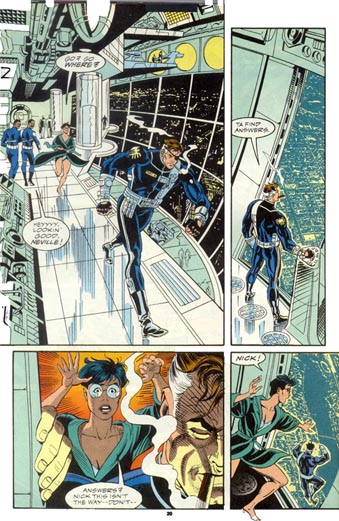
Nick Fury Agent of SHIELD (2) #42 Page 20 is one of the Fury pages I'm still really proud of. It's also one of very few interior views of the front of the Heli-carrier that I'm aware of. |
 |
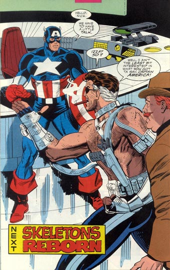 Rockwitz
had me redraw the final splash page because my first one wasn't dynamic
enough. As I recall, Cap wasn't full figure and he had his thumb hooked
in his belt loop. I might as well have had him with a hayseed in his
mouth and standing in a barrel for as impactful as it was. I'm glad he
had me change it. Rockwitz
had me redraw the final splash page because my first one wasn't dynamic
enough. As I recall, Cap wasn't full figure and he had his thumb hooked
in his belt loop. I might as well have had him with a hayseed in his
mouth and standing in a barrel for as impactful as it was. I'm glad he
had me change it. |
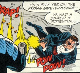
Nick Fury Agent of SHIELD (2) #43 By this time Don Hudson's inking is already really clicking with my style. He's a quick study. His hair and clothing folds are particularly great. His inks preserve the vitality and expressions of the faces. Page 9--Looks like Greg and I decided to try one page with black borders to see how it would work? This successful dry run was deceptive (see below). Some of my page layouts don't suck. (11's good.) On page 6, Rockwitz made the peculiar decision to save the reveal of Cap till later, having had me go to the trouble of redoing my awful first pencil of the final page--see below. So Cap's emblematic head-wings became nubs and his figure was clothed in shadow, in a failed attempt to keep people in the dark about just who was standing in Avengers Mansion! Mike later laughingly admitted this wasn't his greatest decision. Greg got after me for having little Red fire an automatic weapon with one hand. Oops! Hey, maybe she's really strong!? The Kevin Tinsley color guides were okay for the time, but the (Quebecor?) separations are awful--full of mistakes: flesh-colored teeth, white eyelids and the like. Who was minding the (then-expanding) store? |
Nick Fury Agent of SHIELD (2) #44: Throughout this run I was trying to do a sort of watered-down version of the Image style (this is embarrassing to admit), pretty much of my own volition. You can really only see it in some of the shading, where I used the "sawtooth" or "scallop" device. Wish I'd just been myself. Jim Lee I ain't. Lee does a great Nick though and I stole a lot of costume ideas for Nick from his X-Men work. It was cool to be able to draw the surviving Howlers. Greg didn't like my having Cap express surprise by opening his mouth "like a lovedoll." Heheh! Greg: always right, never a diplomat. I think this issue represents a step backward in the art quality. |
 |
 |
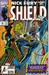
Nick Fury Agent of SHIELD (2) #45: "The Treachery
Within" Quebecor seemingly forgot this book was a bleed book (that is, one where the art can bleed off the edge of the page) and shot several pages at a smaller size so the edges of the art would be well clear of the trim. Why? Did Phil Felix letter outside the "live area"? That would be unlike him. His lettering might be the most unfailingly professional aspect of this book. That and Don's inks. Hmm. On p.24, he's definitely lettering outside the live area though. At this point I started going more often to Greg's house so he could oversee what I was doing and we could both have some company as we worked. He gave me a lot of much-needed coaching on how to make this stuff more punchy and dynamic. I think this issue is much better than #44. Fury is still in
his tux in the bloody final scenes, because of an oversight. Greg'd
meant to have him back in the zip suit, but he or I slipped up.
We both liked the result. |
 |
Nick Fury Agent of SHIELD (2) #46: "Revelations" |
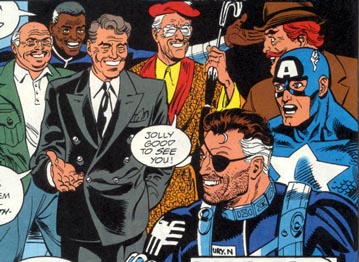
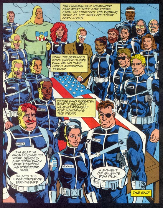
Nick Fury Agent of SHIELD (2) #47: "Final Retibution" Oh cover colorist..how you suck! Thanks for making every object flatly monochromatic. Thanks for the horrible clashing blues. This was my swan song as far as Fury, but I somehow suspect that this was not the end of Baron Von Strucker. I drew myself as the priest on the last page. And apparently I drew Peter David as Dum Dum! Can I blame that one on Garvey? Yes. yes, I can. |
 |
 |
A big thanks to John Heebink for all his time and effort for this interview! |