Defining Supporting Analytics:
In addition to defining your KPIs, it is helpful to identify the information a
user will want to see in order to diagnose the condition of a given KPI. We
refer to this non-KPI information as “supporting analytics” as it provides
context and diagnostic information for end users in helping to understand why a
KPI is in a given state. Often times, these supporting analytics take the form
of more traditional data visualization representations such as charts, graphs,
tables and, with more advanced data visualization packages, animated what-if or
predictive analysis scenarios.
For each KPI on a given dashboard you should decide if you want to provide supporting analytics and, if so, what type of information would be needed to support analysis of that KPI. For instance, in the case of a KPI reporting on aging receivables, you might want to provide the user a list of accounts due with balances past 90 days. In this case when a user sees that the aging KPI is trending in the wrong direction he/she could click on a supporting analytics icon to bring up a table of accounts due sorted by balance outstanding. This information would then support the user in his/her ability to decide what, if any, action needed to be taken in relationship to the condition of the KPI.
Choosing the Correct KPI Visualization Components:
Dashboard visualization components fall into two main categories: key
performance indicators and supporting analytics. In either case, it is important
to choose the visualization that best meets the end users need in relationship
to the information they are monitoring or analyzing.
For KPIs there are five common visualizations used in most dashboard solutions. The following lists each component’s relative merits and common usage scenario.
- Alert Icons: The simplest visualization is perhaps an alert icon,
which can be a geometric shape that is either color-coded or shaded various
patterns based on its state. Potentially, the most recognizable alert icon
is a green, yellow or red circle, whereby the color represents a more or
less desirable condition for the KPI.
When to use: These types of visualizations are best used when they are placed in the context of other supporting information, or when you need a dense cluster of indicators that are clearly labeled. Traditional business scorecard dashboards that are laid out in table like format can benefit from this visualization, whereby other adjacent columns of information can be analyzed depending on the state of the alert icon. These types of icons are also useful in reporting on system state, such as whether a machine or application is online or not. Be cautious of using icons that depend exclusively on color to differentiate state, as 10 percent of the male population and 1 percent of the female population is color-blind; consider using shapes in conjunction with color to differentiate state.
- Traffic Light Icons: The traffic light is a simple extension of
the alert icon, and has little advantage over the alert icon in terms of
data visualization. Like the alert icon, this component only offers one
dimension of information, but it requires 300 percent of the screen real
estate. The one advantage of the traffic light icon is that it is a more
widely recognized symbol of communicating a “good state”, “warning state” or
“bad state.”
When to use: In most cases a simple alert icon is a more efficient visualization, but in situations where your dashboard is being used by a wide audience on a less frequent basis, a traffic light component will allow users to more quickly assimilate the alert information due to their familiarity with the traffic light symbol from real world experience.
- Trend Icons: A trend icon represents how a key performance
indicator or metric is behaving over a period of time. It can be in one of
three states: moving toward a target, away from a target, or static. Various
symbols may be used to represent these states, including arrows or numbers.
Trend icons can be combined with alert icons to display two dimensions of
information within the same visual space. This can be accomplished by
placing the trend icon within a color- or shape-coded alert icon.
When to use: Trend icons can be used by themselves in the same situation you would use an alert icon, or to supplement another more complex KPI visualization when you want to provide a reference to the KPI’s movement over time.
- Progress Bars: A progress bar represents more than one dimension
of information about a KPI via its scale, color and limits. At its most
basic level a progress bar can provide a visual representation of progress
along a one-dimensional axis. With the addition of color and alert levels,
you can also indicate when you have crossed specific target thresholds as
well as how close you are to a specific limit.
When to use: Progress bars are primarily used to represent a relative progress toward a positive quantity of a real number. They do not work well when the measure you want to represent can have negative values: The use of shading within a “bar” to represent a negative value can be confusing to the viewer as any shading is seen to represent some value above zero regardless of the label on the axis. Progress bars also work well when you have KPIs or metrics that share a common measure along an axis (similar to a bar chart) and you want to see relative performance across those KPIs/metrics.
- Gauges: A gauge is an excellent mechanism by which to quickly
assess both positive and negative values along a relative scale. Gauges lend
themselves to dynamic data that can change over time in relationship to
underlying variables. Additionally, the use of embedded alert levels allows
you to quickly see how close or far away you are from a specific threshold.
When to use: Gauges should be reserved for the highest level and most critical metrics or KPIs on a dashboard because of their visual density and tendency to focus user attention. Most of these critical operational metrics/KPIs will be more dynamic values that change on a frequent basis throughout the day. One of the most important considerations in using gauges is their size: too small and it is difficult for the viewer to discern relative values due to the density of the “ink” used to represent the various gauge components; too large and you end up wasting valuable screen space. With more sophisticated data visualization packages, gauges also serve as excellent context-sensitive navigation elements due to their visual predominance within the dashboard.
In Part 2 of this series, we will talk about how to design supporting analytics, make your dashboard interactive, and create a visually compelling layout that is both engaging and efficient.
Additional Information:
Mr. Gonzalez is the founder and Managing Director of BrightPoint Consulting,
Inc, serving as a consultant to both fortune 500 companies and small-medium
businesses alike. With over 20 years experience in developing business software
applications, Mr. Gonzalez is a recognized expert in the fields of business
intelligence and enterprise application integration within the Microsoft
technology stack.
References:
Tractinsky, Noam “Aesthetics and Apparent Usability: Empirically Assessing
Cultural and Methodological Issues” Association for Computing Machinery, Inc.,
1997
Tufte, Edward Envisioning Information Graphics Press, 1990
Fitts, P.M. (1954). “The information capacity of the human motor system in
controlling the amplitude of movement.” Journal of Experimental Psychology, 47,
381-391
Copyright © 2005 BrightPoint Consulting, Inc. Used by permission.
![]()
By Tom Gonzalez
BrightPoint Consulting
Introduction:
In part
one of this series we covered the basic requirements of a corporate
dashboard solution and went on to discuss the first steps of the dashboard
design process. The two main areas covered were determining the appropriate key
performance indicators (KPIs) and how to design a dashboard with the five most
common KPI visualizations: alert icons, traffic lights, trend icons, progress
bars, and gauges. In this article we complete the design process and cover
visualization of supporting analytics and the layout techniques used to create a
visually efficient and compelling design.
Supporting Analytics:
Supporting analytics are additional data visualizations that a user can view to
help diagnose the condition of a given KPI or set of KPI’s. In most business
cases these supporting analytics take the form of traditional charts and tables
or lists. While the scope of this article is not intended to cover the myriad of
best practices in designing traditional charting visualizations, we will discuss
some of the basics as they relate to dashboard design.
When creating supporting analytics, it is paramount that you take into account the typical end user who will be viewing the dashboard. The more specialized and specific the dashboard will be the more complexity and detail you can have in your supporting analytics. Conversely, if you have a very high level dashboard your supporting analytics will generally represent higher level summary information with less complex detail.
Below we will discuss some of the most common visualizations used for designing supporting analytics.
- Pie Charts: Pie charts are generally considered a poor data
visualization for any data set with more than half a dozen elements. The
problem with pie charts is that it is very difficult to discern proportional
differences with a radially divided circle, except in the case of a small
data set that has large value differences within it. Pie charts also pose a
problem for labeling, as they are either dependent on a color or pattern to
describe the different data elements, or the labels need to be arranged
around the perimeter of the pie, creating a visual distraction.
When to use: Pie charts should be used to represent very small data sets that are geared to high level relationships between data elements. Usually pie charts can work for summary level relationships but should not be used for detailed analysis.
- Bar Charts: Bar charts are an ideal visualization for showing the
relationship of data elements within a series or multiple series. Bar charts
allow for easy comparison of values due to the fact that the “bars” of data
share a common measure and can be easily visually compared to one another.
When to use: Bar charts are best suited for categorical analysis but can also be used for small time series analysis (e.g. the months of a year.) An example of categorical analysis would be examining sales of products broken down by product or product group, with sales in dollars being the measure and product or product group being the category. Be careful in using bar charts if you have a data set that can have one element with a large outlier value; this will render the visualization for the remaining data elements unusable. This is due to the fact that the chart scale is linear and will not clearly represent the relationships between the remaining data elements.
An example is below.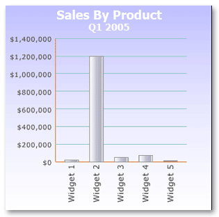
* Notice that due to the fact widget2 has sales of $1.2MM you cannot easily discern that widget3 has twice as many sales ($46,000) as widget1 ($23,000).
- Line Charts: Line charts are ideal for time series analysis where
you want to see the progress of one or more measures over time. Line charts
also allow for comparative trend analysis as you can stack multiple series
of data into one chart.
When to use: Use line charts when you would like to see trends over time in a measure versus a side by side detailed comparison of data points. Time series line charts are most commonly used with the time dimension along the X axis and the data being measured along the Y axis.
- Area Charts: Area charts can be considered a subset of the line
chart, where the area under or above the line is shaded or colored.
When to use: Area charts are good for simple comparisons with multiple series of data. By setting contrasting color hues you can easily compare the trends over time between two or more series.
- Tables and Lists: Tables and lists are best used for information
that either contains large lists of non numeric data, or data that has
relationships not easily visualized.
When to use: You will want to use tables or lists when the information you need to present does not lend itself to easy numeric analysis. One example would be a financial KPI that measures a company’s current liquidity ratio. In this case, there can be a complex interrelationship of line items within the companies balance sheet where a simple table of balance sheet line items would provide a more comprehensive supporting analytic than a series of detailed charts and graphs.
A Word About Labeling Your Charts and Graphs:
Chart labels are used to give the user context to the data they are looking at,
both in terms of scale and content. The challenge with labeling is that the more
labels you use and the more distinctive you make them, the more it will distract
the user’s attention from the actual data being represented within the chart.
When using labels, there are some important considerations to take into account. Foremost of these is how often your user will be viewing these charts. For charts being viewed on a more frequent basis, the user will form a memory of relevant labels and context. In these scenarios, you can be more conservative in your labeling by using smaller fonts and less color contrast. Conversely, if a user will only be seeing the chart occasionally you will want to make sure everything is labeled clearly so the user does not have to decipher the meaning of the chart.
Putting It All Together; Using Size, Contrast, and Position:
The goal in laying out an effective dashboard is to have the most important
business information be the first thing to grab your user’s visual attention. In
your earlier design stages you already determined the important KPI’s and
supporting analytics, so you can use this as your layout design guide. Size,
contrast, and position all play a direct role in determining which visual
elements will grab the user’s eye first.
Size: In most situations, the size of a visual element will play the largest role in how quickly the user will focus their attention upon it. In laying out your dashboard, figure out which element or group of elements will be the most important to the user and make their size proportionally larger than the rest of the elements on the dashboard. This principle holds true for single element or groups of common elements that have equal importance.
Contrast: After size, the color or shade contrast of a given element in relationship to its background will help determine the order in which the user focuses attention on that element. In some situations contrast alone will become the primary factor, even more so than size, as to where the user’s eye will gravitate. Contrast can be achieved by using different colors or saturation levels to distinguish a visual element from its background. A simple example of this can be seen in the screen below.

As you can see, the black circle instantly grabs the user’s attention due to the sharp contrast against the white background. In this example, the contrast even overrides the size of the larger circle in its ability to focus the user’s visual awareness.
Position – Visual position also plays a role in where a user will focus their attention. All other factors being equal, the top right hand side of a rectangular area will be the user’s first focal point, as seen in the picture below. The next area a user will focus is the top left hand side, followed by the bottom right and finally the bottom left. Therefore if you need to put an element on the dashboard that you don’t want the user to have to hunt around for, the top right hand quadrant is generally the best place for it.

Position is also important when you want to create an association between visual elements. By placing elements in visual proximity to each other, and grouping them by color or lines, you can give an implied context and relationship between those elements. This is important in instances when you want to associate a given supporting analytic with a KPI or group together related supporting analytics.
Validating Your Design:
You will want to make sure that your incorporation of the above design
techniques achieves the desired affect of focusing the user’s attention on the
most important business information, and in the proper order. One way to see if
you have achieved this successfully is to view your dashboard with an out of
focus perspective. This can be done by stepping back from your dashboard and
relaxing your focus until the dashboard becomes blurry and you can no longer
read words or distinguish finer details. Your visual cortex will still recognize
the overall visual patterns and you will easily see the most attention grabbing
elements of your design. You want to validate that the elements attracting the
most visual attention correspond with the KPI’s and supporting analytics that
you had previously identified as being most critical to the business purpose of
your dashboard.
Please bear in mind, the design guidelines presented in this article should be used as general rules of thumb, but it is important to note that these are not hard and fast rules that must be followed in every instance. Every dashboard has its own unique requirements, and in certain cases you will want to deviate from these guidelines and even contradict them to accomplish a specific visual effect or purpose.
Additional Information:
References:
Tractinsky, Noam “Aesthetics and Apparent Usability: Empirically Assessing
Cultural and Methodological Issues” Association for Computing Machinery, Inc.,
1997
Tufte, Edward Envisioning Information Graphics Press, 1990
Fitts, P.M. (1954). “The information capacity of the human motor system in
controlling the amplitude of movement.” Journal of Experimental Psychology, 47,
381-391
Mr. Gonzalez is the founder and Managing Director of BrightPoint Consulting, Inc, serving as a consultant to both fortune 500 companies and small-medium businesses alike. With over 20 years experience in developing business software applications, Mr. Gonzalez is a recognized expert in the fields of business intelligence and enterprise application integration within the Microsoft technology stack.
![]()
By Joel Levine and Thomas Roos
Dartmouth College
The following article is excerpted by permission from Introduction to Data Analysis: The Rules of Evidence, edited by Joel H. Levine and Thomas B. Roos. Our Server more than 600 Pages.
What is the wealth of the United States? Who’s got it? And how is it changing? What are the consequences of an experimental drug? Does it work, or does it not, or does its effect depend on conditions? What is the direction of the stock market? Is there a pattern? What is the historical trend of world climate? Is there evidence of global warming? — This is a diverse lot of questions with a common element: The answers depend, in part, on data. Human beings ask lots of questions and sometimes, particularly in the sciences, facts help. Data analysis is a body of methods that help to describe facts, detect patterns, develop explanations, and test hypotheses. It is used in all of the sciences. It is used in business, in administration, and in policy.
The numerical results provided by a data analysis are usually simple: It finds the number that describes a typical value and it finds differences among numbers. Data analysis finds averages, like the average income or the average temperature, and it finds differences like the difference in income from group to group or the differences in average temperature from year to year. Fundamentally, the numerical answers provided by data analysis are that simple.
But data analysis is not about numbers — it uses them. Data analysis is about the world, asking, always asking, “How does it work?” And that’s where data analysis gets tricky.
For example: Between 1790 and 1990 the population of the United States increased by 245 million people, from 4 million to 249 million people. Those are the facts. But if I were to interpret those numbers and report that the population grew at an average rate of 1.2 million people per year, 245 million people divided by 200 years, the report would be wrong. The facts would be correct and the arithmetic would be correct — 245 million people divided by 200 years is approximately 1.2 million people per year. But the interpretation “grew at an average rate of 1.2 million people per year” would be wrong, dead wrong. The U.S. population did not grow that way, not even approximately.
For example: The average number of students per class at my university is 16. That is a fact. It is also a fact that the average number of classmates a student will find in his or her classes is 37. That too is a fact. The numerical results are correct in both cases, both 16 and 37 are correct even though one number is twice the magnitude of the other — no tricks. But the two different numbers respond to two subtly different questions about how the world (my university) works, subtly different questions that lead to large differences in the result.
The tools of the trade for data analysis begin with just two ideas: Writers begin their trade with their A, B, C’s. Musicians begin with their scales. Data analysts begin with lines and tables. The first of these two ideas, the straight line, is the kind of thing I can construct on a graph using a pencil and a ruler, the same idea I can represent algebraically by the equation “y = mx + b”. So, for example, the line constructed on the graph in Figure 1 expresses a hypothetical relation between education, left to right, and income, bottom to top. It says that a person with no education has an income of $10,000 and that the rest of us have an additional $3,000 for each year of education that is completed (a relation that may or may not be true).
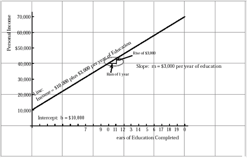
Figure 1
Hypothetical Linear Relation Between Income and Education
The hypothetical line shows an intercept, b, equal to $10,000 and a slope, which
is the rise in dollars divided by the run in years, that is equal to $3,0000 per
year.
The additive model analyzes each datum, each of the quantities in the table, into four components — one component applying to the whole table, a second component specific to the row, a third component specific to the column, and a fourth component called a “residual” — a leftover that picks up everything else. In this example the additive model analyzes the temperature in Phoenix in July into
- 64.5° to establish an average for the whole table, both cities and both dates,
- plus 7.5° above average for Phoenix, in the first row,
- plus 21° above average for July, in the second column,
- plus 1° as a residual to account for the difference between the sum of the first three numbers and the data.
Adding it up,
Observed equals All Effect plus Phoenix Effect plus July Effect plus Residual.
That is,
92° = 64.5° + 21° + 7.5° + (-1° )
Figure 2
Normal Daily Mean Temperatures in Degrees Fahrenheit
From the Statistical Abstract of the United States, 1987, Table 346, from the
original by the U.S. National Oceanic and Atmospheric Administration,
Climatography of the United States, No. 81, Sept., 1982. Also note John Tukey’s,
Exploratory Data Analysis, Addison Wesley, 1970, 0. 333.
There you are, lines and tables: That is data analysis, or at least a good beginning. So what is it that fills up books and fills up the careers of data analysts and statisticians? Things begin to get “interesting”, that is to say, problematical, because even the best-behaved data show variance: Measure a twenty gram weight on a scale, measure it 100 times, and you will get a variety of answers — same weight, same scale, but different answers. Find out the incomes of people who have completed college and you will get a variety of answers. Look at the temperatures in Phoenix in July, and you will get a variety, day to day, season to season, and year to year. Variation forces us to employ considerable care in the use of the linear model and the additive model.
And life gets worse — or more interesting: Truth is that lots of things just are not linear: Adding one more year of elementary school, increasing a person’s years of education from five to six, doesn’t really have the same impact on income as adding one more year of college, increasing a person’s years of education from fifteen to sixteen — while completing a college degree. So the number of dollars gained for each extra year of education, is not constant — which means that, often, the linear model doesn’t work in its simplest form, not even when you allow for variation. And with tables of numbers, the additive model doesn’t always add up to something that is useful.
So what do we do with a difficult problem? This may be the single most important thing we teach in data analysis: Common sense would tell you that what you tackle a difficult problem with a difficult technique. Common sense would also tell you that the best data analyst is the one with the largest collection of difficult “high powered” techniques. But common sense is wrong on both points: In data analysis the real “trick” is to simplify the problem and the best data analyst is the one who gets the job done, and done well, with the most simple methods.Data analysts do not build more complicated techniques for more complicated problems — not if we can help it. For example, what would we do with the numbers graphed in Figure 3? Here the numbers double at each step, doubling from 1, to 2, to 4, to 8, which is certainly not the pattern of a straight line. In this example, the trick is to simplify the problem by using logarithms or the logarithmic graph paper shown in Figure 4 so that, now, we can get the job done with simple methods. Now, on this new graph, the progression, 1, 2, 4, 8,… is a straight line.
 Figure 3 Non-Linear Relation Between X and Y |
 Figure 4 Linear Exponential Relation Between X and Y Made Linear Using a Semi-Logarithmic Graph |
“Tricks” like this enormously extend the range of things that an experienced data analyst can analyze while staying with the basics of lines and tables. In sociology, which is my field, this means learning to use things like “log people”. In business and economics it means learning to use things like “log dollars”. In biology it means learning to use things like the square root of the number of beasties in a drop of pond water or the cube root of the weight of an organism. Learning what these things mean is perhaps the most time consuming part of an introduction to data analysis. And the payoff is that these techniques extend the ability of simple tools, of the line and the table, to make sense of a complicated world.
And what are the Rules of data analysis? Some of the rules are clear and easy to state, but these are rather like the clear and easy rules of writing: Very specific and not very helpful — the equivalent of reminders to dot your “i’s” and cross your “t’s”. The real rules, the important ones, exist but there is no list — only broad strategies with respect to which the tactics must be improvised. Nevertheless it is possible to at least name some of these “rules.” I’ll try the list from different angles. So:
- Look At the Data / Think About the Data / Think About the Problem / Ask
what it is you Want to Know
Think about the data. Think about the problem. Think about what it is you are trying to discover. That would seem obvious, “Think.” But, trust me, it is the most important step and often omitted as if, somehow, human intervention in the processes of science were a threat to its objectivity and to the solidity of the science. But, no, thinking is required: You have to interpret evidence in terms of your experience. You have to evaluate data in terms of your prior expectations (and you had better have some expectations). You have to think about data in terms of concepts and theories, even though the concepts and theories may turn out to be wrong.
- Estimate the Central Tendency of the Data.
The “central tendency” can be something as simple as an average: The average weight of these people is 150 pounds. Or it can be something more complicated like a rate: The rate of growth of the population is two percent per annum. Or it can be something sophisticated, something based on a theory: The orbit of this planet is an ellipse. And why would you have thought to estimate something as specific as a rate of growth or the trace of an ellipse? Because you thought about the data, about the problem, and about where you were going (Rule 1).
- Look at the Exceptions to the Central Tendency
If you’ve measured a median, look at the exceptions that lie above and below the median. If you’ve estimated a rate, look at the data that are not described by the rate. The point is that there is always, or almost always, variation: You may have measured the average but, almost always, some of the cases are not average. You may have measured a rate of change but, almost always, some numbers are large compared to the average rate, some are small. And these exceptions are not usually just the result of embarrassingly human error or regrettable sloppiness: On the contrary, often the exceptions contain information about the process that generated the data. And sometimes they tell you that the original idea (to which the variations are the exception) is wrong, or in need of refinement. So, look at the exceptions which, as you can see, brings us back to rule 1, except that this time the data we look at are the exceptions.
- Falsifiability
Falsifiability requires that there be some sort of evidence which, had it been found, your conclusions would have had to be judged false. Even though it’s your theory and your evidence, it’s up to you to go the additional step and formulate your ideas so they can be tested — and falsified if they are false. More, you yourself have to look for the counter evidence. This is another way to describe one of the previous rules which was “Look at the Exceptions.”
- Validity
Validity in the scientific sense, requires that conclusions be more than computationally correct. Conclusions must also be “sensible” and true statements about the world: For example, I noted earlier that it would be wrong to report that the population of the United States had grown at an average rate of 1.2 million people per year. — Wrong, even though the population grew by 245 million people over an interval of 200 years. Wrong even though 245 divided by 200 is (approximately) 1.2. Wrong because it is neither sensible nor true that the American population of 4 million people in the United States in 1790 could have increased to 5.1 million people in just twelve months. That would have been a thirty percent increase in one year — which is not likely (and didn’t happen). It would be closer to the truth, more valid, to describe the annual growth using a percentage, stating that the population increased by an average of 2 percent per year — 2 percent per year when the population was 4 million (as it was in 1790), 2 percent per year when the population was 250 million (as it was in 1990). That’s better.
- Parsimony
Parsimony is the analyst’s version of the phrase “Keep It Simple.” It means getting the job done with the simplest tools, provided that they work. In military terms you might think about weapons that provide the maximum “bang for the buck”. In the sciences our “weapons” are ideas and we favor simple ideas with maximum effect. This means that when we choose among equations that predict something or use them to describe facts, we choose the simplest equation that will do the job. When we construct explanations or theories we choose the most general principles that can explain the detail of particular events. That’s why sociologists are attracted to broad concepts like social class and why economists are attracted to theories of rational individual behavior — except that a simple explanation is no explanation at all unless it is also falsifiable and valid.
I will be specific about the more easily specified rules of data analysis. But make no mistake, it is these broad and not-well-specified principles that generate the specific rules we follow: Think about the ata. Look for the central tendency. Look for the variation. Strive for falsifiability, validity, and parsimony. Perhaps the most powerful rule is the first one, “Think.” The data are telling us something about the real world, but what? Think about the world behind the numbers and let good sense and reason guide the analysis.
Additional Information:
Suggested Reading:
Stephen D. Berkowitz, Introduction to Structural Analysis, Chapter 1, “What is Structural Analysis,” Butterworths, Toronto, 1982; revised edition forthcoming, Westview, Denver, circa 1997.
Stephen J. Gould, “The Median Isn’t the Message,” Discover, June, 1985.
Charles S. Peirce, “The Fixation of Belief”, reprinted in Bronstein, Krikorian, and Wiener, The Basic Problems of Philosophy, 1955, Prentice Hall, pp. 40- 50. Original, Popular Science Monthly, 1877.
This article taken from
Introduction to Data Analysis: The Rules of Evidence, edited by Joel
H. Levine and Thomas B. Roos.
Volume I: Well-Behaved Variables Copyright (C) 1994-2002, Joel H. Levine, All
rights Reserved.
Volume II: Linear Relations Copyright (C) 1994-2002, Joel H. Levine, All Rights
Reserved
Part of this work has been developed in association with the Math Across The Curriculum Project at Dartmouth College operating under National Science Foundation Support -- Dorothy Wallace, Principal Investigator, Thèrese Stukel, Principal for Statistics and Data Analysis.
Address correspondence to Joel.Levine@dartmouth.edu and Roos@dartmouth.edu.
![]()
By Jim Wirth
B-EYE Network
Today’s manufacturing companies are using business intelligence to improve their integrated supply chains.
More than ever, today’s leading global manufacturing companies are using business intelligence to improve their integrated supply chains. The benefits can range from identifying which supply chain processes result in unfavorable variances and why, to reporting and analyzing vital information such as:
- days sales outstanding,
- order backlog,
- time to fill orders, inventory days of supply, and
- order to cash cycle time.
In addition, costs can be reduced by understanding buyer and supplier performance metrics and better management of demand and supply planning.
As we all know, large volumes of raw data are generated and stored by each process of the supply chain—plan, source, make, deliver and return—by the automated enterprise applications being used at most large, global manufacturers. The challenge for many manufacturers lies in determining what information is necessary to drive improvements and efficiencies at each process in the supply chain, and designing an information management environment to turn the raw data into meaningful metrics and key performance indicators (KPIs).
The Supply Chain Operations Reference-model (SCOR) is a valuable information source regarding KPIs and metrics that are used to better manage the supply chain process. SCOR is a cross-industry standard for supply chain management, which was developed in the mid-nineties by the Supply Chain Council. This organization was founded jointly by AMR Research and Pittiglio Rabin Todd & McGrath (PRTM). The Supply Chain Council is an independent, not-for-profit organization comprised of approximately 1,000 member companies today—many of which are leaders in their respective industries.
The purpose of the SCOR process reference model is to provide manufacturing organizations with a standard language and approach to describing, measuring and evaluating integrated supply chain processes. The SCOR model contains standard descriptions of the supply chain management processes, a framework of the relationships between the standard processes and many cross-industry standard metrics that can be used to measure and improve process performance throughout the supply chain.
The boundaries of the SCOR model have been defined to reach from a manufacturer to the supplier and the supplier’s supplier, and also from the manufacturer to the customer and the customer’s customer. This ensures that all transactions associated with the five standard major supply chain management processes are addressed by the model. The scope of these five standard major processes, as defined by the Supply Chain Council, includes:
- Plan: Demand/Supply Planning and Management—Processes that balance aggregate demand and supply to develop a course of action that best meets sourcing, production and delivery requirements.
- Source: Sourcing Stocked, Make-to-Order, and Engineer-to-Order Product—Processes that procure goods and services to meet planned or actual demand.
- Make: Make-to-Stock, Make-to-Order and Engineer-to-Order Production Execution—Processes that transform product to a finished state to meet planned or actual demands.
- Deliver: Order, Warehouse, Transportation and Installation Management for Stocked, Make-to-Order and Engineer-to-Order Product—Processes that provide finished goods and services to meet planned or actual demand, typically including order management, transportation management and distribution management.
- Return: Return of Raw Materials and Receipt of Returns of Finished Goods—Processes associated with returning or receiving returned products for any reason. These processes extend into post-delivery customer support.
The SCOR model is comprised of three hierarchical levels of process detail. It starts with the “big picture” and progressively moves into increasing levels of process granularity.
At the top level, or Level 1, the scope and contents of the Supply Chain Operations reference model are defined at the major process level. They are defined by processes such as plan, source, make, deliver and return. Additionally, the basis of performance targets for key high-level metrics that may cross multiple SCOR processes are established here. At Level 1, the major supply chain business processes are aligned with the company’s organizational structure, including business units and geographical regions. At this top level, it is also imperative that the business intelligence governance model and enterprise information stakeholder communication process be defined and aligned across the major process areas. Level 1 of the SCOR model includes 13 high-level metrics, which are associated with one of five key performance attributes: supply chain reliability, supply chain responsiveness, supply chain flexibility, supply chain costs and supply chain asset management. Examples of Level 1 metrics include delivery performance, fill rates, order fulfillment lead times, supply chain response time and inventory days of supply.
Level 2 of the SCOR reference model is called the “configuration level.” This is the level where the major supply chain processes are refined and aligned to the organization’s physical and technology infrastructure and supply chain strategies. For example, is the company’s strategy to deliver stocked products, made-to-order products or engineered-to-order products? The answer to this question has implications at each major process of the integrated supply chain and will determine how the company should configure its supply chain process model. The metrics at Level 2 are tied to the lower level subset of processes identified at this level. Furthermore, as with Level 1, the SCOR reference model provides many standard metrics from which to choose. Examples of Level 2 metrics include cash-to-cash cycle time, make cycle time, source cycle time, delivery performance to customer request date, order management cycle time and supplier on-time delivery performance.
Level 3 of the SCOR reference model is called the “process-element level.” At this level, operational detail is added to the Level 2 design of the supply chain model that is configured to the organization’s business strategies. Level 3 is where detailed business processes, operational objectives and associated metrics are identified, as well as the information systems infrastructure necessary to support them. As with each of the higher levels, the SCOR reference model provides many specific metrics that should be considered for measuring and improving upon Level 3 detailed processes. Examples of Level 3 metrics include percent product transferred damage free, percent orders/lines received complete, inventory obsolescence, packaging cost, warranty costs and scrap expense.
Whether or not an organization chooses to approach supply chain management based on the framework recommended by the SCOR model, a top-down and integrated design approach is highly recommended. When designing or refining the supply chain management framework, it is also important for manufacturers to define a portfolio of metrics and KPIs is based on their specific business strategy and objectives. This should also closely align with their major supply chain process and associated sub-process. While doing this, several basic tenets should be remembered:
- Take a top-down approach. Begin with a list of high-priority business objectives in each process of the supply chain. Next, identify a limited set of KPIs that will drive performance toward achievement of the business objectives when measured against targets. Then, identify the lower-level metrics required in the calculation of the KPI. Finally, identify the source data elements required to support the lower-level metrics. While this top-down approach is more time-consuming and difficult than it sounds, it will assist in the proper definition of KPIs. This approach will also ensure that each KPI is tied to an identified business objective that supports the overall business strategy.
- Think beyond the “financial scorecard.” Many companies make the mistake of implementing performance management programs that are primarily based on financial performance metrics. While value exists in understanding the financial state of your organization at any point in time, most financial metrics are historic in nature and are best used to measure the impact of a change in a business process or the result in a business decision. Non-financial KPIs and metrics, on the other hand, are generally more valuable for understanding what actions will produce improvements across each of the integrated supply chain processes. Examples of these non-financial metrics include delivery performance to customer request date, quote-to-cash cycle time, make cycle time, source cycle time, forecast accuracy, inventory days of supply, returns by product category.
- Make it actionable. Each KPI that is generated in a dashboard or report should have a pre-defined target associated with it. These KPIs also need a defined process to follow when it is either above or below the target by a variance outside of a tolerable range. When presented with any KPI, the user should clearly understand what action to take. Keep in mind that the targets will most likely be variables based on data from one of the other stages of the integrated supply chain process.
- Less is more. Try to limit the number of high-level KPIs for each supply chain process to as few as possible. Remember that each identified KPI must be clearly defined, designed and developed into the business intelligence environment. They must also be monitored and managed, governed, supported and maintained over time. Some organizations mistakenly try to define as many KPIs as possible, and they subsequently pay the price of a highly complex business intelligence environment and information overload.
Organizations must identify and define the requirements for the actionable information that are needed to manage and improve each process of the integrated supply chain. Once they have done this, the benefits of business intelligence best practices can be leveraged to put the supply chain management program into action. To maximize the success of a supply chain business intelligence initiative, it should be approached at an enterprise level across major processes, business functions and geographies. Business intelligence project teams should collaborate very closely with the supply chain management process design and operations teams to ensure that their informational requirements are clearly understood and designed into the solution.
Using business intelligence to enhance the integrated supply chain provides clear benefits for all manufacturers. The KPIs and metrics that you define, implement, report and analyze aid in the identification of supply chain processes that require attention or correction to achieve top performance. They also help the supply chain organization focus on what is really important and help employees throughout the supply chain understand how their decisions and actions affect other areas of the company.
For more information about the SCOR model, visit the Supply Chain Council.
Additional Information:
Jim joined
Knightsbridge as a Senior Principal and Practice Area Leader for
High-Technology in 2003 after their acquisition of BASE Consulting Group, where
he was President and Co-Founder. Jim hasmore than 16 years of experience in
information systems consulting, both in solutions delivery and business
development. He has worked with numerous high-technology companies to ensure the
most appropriate data warehousing and business intelligence solution is defined
and delivered to meet their specific needs. Prior to co-founding BASE Consulting
Group, Jim was a senior information systems auditor for Pacific Bell Directory.
Before that, he was a senior consultant with
PricewaterhouseCoopers'
Computerized Information Systems Advisory Business Services department. Jim
holds a Masters in Business Administration from Michigan State University, with
an emphasis on accounting and information systems.
![]()
By Stephen Hunt
Accenture
Finance executives can gain immediate benefits from tactical solutions and best practices that enable operational managers to adopt forecasting and budgeting processes as key management tools.
Ask most CFOs and finance directors to describe an ideal forecasting and budgeting process, and they’ll likely portray it as part of an overall integrated performance management framework, ultimately driven by value-based measures. At the same time, however, they’ll admit that this vision involves a significant transformation to their current forecasting and budgeting processes, systems, and organization. Accenture’s experience shows it can take three to five years to fully implement and embed these changes.
Meanwhile, finance organizations face a more immediate problem. Legacy systems and processes that have been in operation for the past 10 years are often broken. Despite significant efforts, they can no longer support the dynamic changes affecting the business. Increasingly, then, the question becomes, “What practical steps can we take to improve or replace existing processes and systems?” — usually combined with “before we start the next budgeting cycle.”
The good news is that tactical solutions deliver significant and usually exponential benefits. However, tactical solutions should not detract from pursuing a longer-term strategic forecasting and budgeting solution that is aligned to the overall strategy and business requirements. In fact, tactical initiatives, delivering quick wins and visible benefits, are essential in obtaining support and sponsorship for an overall strategic initiative.
As with any longer-term solution, successful tactical initiatives also require strong executive sponsorship, a robust and proven approach, a persuasive business case, and a significant change to the way the organization views and operates the forecasting and budgeting process.
Articulating the Issues
Although issues with the existing forecasting and budgeting process and systems
are often well-known, it is important to fully document and communicate their
impact to gain executive sponsorship, drive momentum for change, and ensure that
the benefits are understood (see Figure 1). This is especially true since many
of the benefits are qualitative and focus on accuracy and accountability.
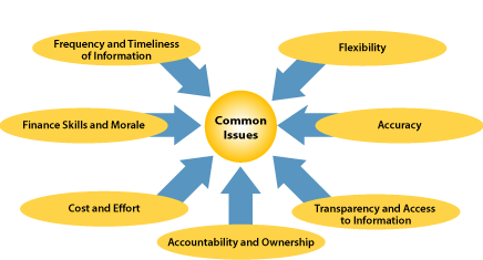
Figure 1: Budgeting and Forecasting Issues
Frequency and Timeliness
Annual forecasting and budgeting cannot keep pace with today’s dynamic business
environment because the information produced is often out-of-date and
irrelevant. Managers need to be able to understand and respond quickly to the
impact of competitive forces and rapid changes affecting their business, yet
most organizations fail to forecast the financial impact of these changes fast
enough.
All too often, the end-to-end process takes too long. Quarterly forecasts take two to five weeks to finalize. Budgets are often not finalized until well into the actual year they are purported to budget. Similarly, the time taken to produce each iteration of the forecast or budget is too long, frequently taking days and sometimes weeks. In today’s environment, the impact of any change to the financials needs to be understood within the day or even the hour.
It is surprising that the need for faster delivery of forward-looking forecasts and budgets has not received more attention, especially in light of the time and effort spent implementing ERP solutions and the drive toward a faster close, which, by definition, provides backward-looking information.
Flexibility
Most forecasting and budgeting processes and systems lack sufficient flexibility
to accommodate the reorganizations, divestitures, mergers, and acquisitions that
have become the hallmark of contemporary business. These changes need to be
modeled and reflected within forecasting and budgeting systems, both in the
future and also retrospectively to ensure relevant prior-year comparisons.
Without this flexibility, finance professionals spend significant time and
effort restating the numbers.
In recent years, this effort has become so immense that more and more organizations choose not to make restatements, deciding instead to highlight them via footnotes within the forecast and budget documentation, which makes historical comparison and trend analysis of questionable value.
In addition, most systems are not flexible enough to accommodate the demand for multiple views of forecast and budget information. Consequently delivering slice-and-dice views of data and what-if analyses requires time-consuming, offline data manipulation.
Cost and Effort
The cost of existing forecasting and budgeting processes is significant and
appears to be growing every year. Accenture’s Planning for Value research study,
conducted in conjunction with Cranfield University, found that the budget
process for lower-quartile companies takes longer than six months. Similarly, $1
billion companies take, on average, 25,000 man-days to complete their budget.
Accountability and Ownership
The finance function is so involved in forecasting and budgeting that it becomes
the owner of the process rather than the facilitator. “These are not my numbers”
is a regular cry heard when operational management reviews forecasts and
budgets. This has much to do with last-minute changes made without the agreement
of all those involved.
Transparency and Access
Lack of accountability also relates to the lack of transparency and access to
information offered to operational management. Operational managers work hard to
produce information but may receive little or no feedback after the numbers are
submitted and, thus, cannot easily view the forecast and budget information
presented to senior management. Often they are also unable to access the data
for modeling or examination. As a result, they see the forecasting and budgeting
process as an effort by the finance function to collate and aggregate bottom-up
data, turning it into “just another management request for information.”
Accuracy
Forecasts and budgets are often inaccurate. Despite technological advances, most
organizations use a patchwork of spreadsheet models to undertake their
forecasting and budgeting, with multiple hand-offs and revisions throughout the
process. Inaccuracies arise due to lack of version control, transposition of
numbers, and unallocated numbers (“buckets”) with aggregated data not equaling
the sum of their parts. The impact is significant, leading to a lack of
confidence in both the numbers and the ability of the finance function to
deliver.
This impact extends to the analyst community as well, creating potentially a far greater cost to the organization. Empirical research tells us that shareholder value is materially affected when companies fail to provide accurate projections of business performance.
Finance Skills and Morale
Trying to manage such a problematic process often takes a toll on those involved
and has a negative impact on how the finance function is perceived. Though
forecasting and budgeting is often managed and operated by highly qualified
finance professionals, the function can be relegated to nothing more than a
factory for producing numbers. Rather than focusing on delivering value-added
analysis, the finance function spends a disproportionate amount of time and
effort cranking the numbers through multiple iterations using ill-equipped
mechanisms and processes.
In summary, these issues combine to deliver a forecasting and budgeting process that takes too long, costs too much, and is too manually intensive. To make matters worse, the resulting forecast or budget is typically inaccurate, lacks accountability, and is out-of-date by the time it is produced.
Applying Best Practices
Although much has been written about best practices in budgeting and
forecasting, most of it has been academic, until recently (see Figure 2). Now,
however, technological advances offer capabilities that enable many best
practices to be delivered.
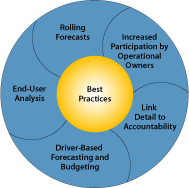
Figure 2: Budgeting and Forecasting Best Practices
The following best practices are increasingly being adopted by organizations to solve common forecasting and budgeting issues. Importantly, no one best practice is a panacea for all the issues mentioned. Only by implementing a combination of these practices can organizations really begin to overcome the problems they face.
Rolling Forecasts
Traditionally, the budget process has been a one-off event, albeit a long and
arduous one, and the forecasts, though more frequent, remain as a series of
one-off quarterly events.
However, significant gains can be made from eradicating this single period/annual mindset and moving to a rolling forecast approach. Operations do not switch off on Dec. 31 each year and start afresh on Jan. 1. Customers do not think of your business in this way, so why monitor and manage the business in such discrete timeframes?
The first step in implementing rolling forecasts is to define what is meant by a “true rolling forecast.” Figure 3 best illustrates the concept of a 12-month rolling forecast. As each additional month’s actual information is finalized, the forecast is updated to provide an additional month’s forecast, thus always providing a 12-month projection into the future.
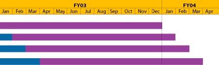
Figure 3: A True Rolling Forecast — Blue bars indicate actual results.
The move to rolling forecasts provides a number of benefits, in particular:
- Reducing or eliminating the traditional approach of the previous period plus an uplift. This approach forces the individuals undertaking the forecasts to update their business projections each month and embed the activity in monthly procedures;
- Helping to eliminate the annual mind-set and focus on the current year, acknowledging that the business functions as an ongoing operation and needs to be managed accordingly;
- Providing a continual 12-month business outlook at all times, enabling management to take remedial action as forecast business conditions change;
- Eliminating the unrealistic December-to-January gap that appears when next year’s budget is calendarized for the first time. By undertaking rolling forecasts, the December-to-January forecast is no different than any other two-month period; and
- Reducing or potentially eliminating the annual budgeting process. At the normal budget time, management will already have a very good idea of what the following financial year will look like from their latest rolling forecast. For example, an organization operating a 15-month rolling forecast will already have, at the end of the third quarter, a complete projection of the next financial year.
An alternative to a true rolling forecast is a “fixed period rolling forecast,” with which a number of organizations operate. Although this approach has the benefit of ensuring that forecasts are updated monthly, the benefits just described are not fully realized because the forecast remains focused on the current period. The key problem with this approach is that the business still has a fixed horizon — with associated performance management implications.
Increasingly, top-quartile companies have moved or are moving toward rolling forecasts. This is no small achievement. Usually there is significant cultural attachment to the forecasting and budgeting process, so the transition to rolling forecasts should not be underestimated. A budgeting process, for example, that starts in March and ends in August can become a raison d’être for the finance organization during this time, with much political power and control associated with the process.
In transitioning an organization towards operating rolling forecasts, a number of practical issues must be addressed. Most importantly, it cannot be done in isolation. It is not simply a matter of repeating on a monthly basis what is currently undertaken quarterly or semi-annually. This message must be communicated early in the process, or managers will worry that they “won’t be doing anything else but forecasting all day.”
Transitioning to a 12-month rolling forecast immediately can prove difficult, especially if the new process involves operational managers who have not directly participated in the forecasting process before. If the organization conducts forecasts semi-annually or less frequently, moving to a quarterly forecast first is a sensible option. If the organization forecasts quarterly, an approach to transition would be to first move to a rolling forecast with the required detail for the first six months and then to quarterly totals for the next six months.
In reality, the organization may be unwilling to completely discard quarterly forecasting or annual budgeting activities. Indeed, more detail may be required for quarterly forecasting and annual budgets due to external reporting requirements. Rolling forecasts do not remove this need, but they do provide management with timely information to support business decisions. Over time, the existing spiked quarterly effort will — and should — reduce as the rolling forecast becomes embedded in the monthly management of the business.
Increased Participation
Driving down the forecasting and budgeting process to operational managers has
gained more ground as the best way to ensure accurate and reliable forecasts.
Historically, any suggestion of this approach would have been met with
disbelief, giving rise to visions of even more data aggregation, longer cycle
times and increased manual handovers. However, technological advances in recent
years, most noticeably the Web, have given rise to a number of solutions that
are highly scalable to hundreds and even thousands of end users, enabling the
forecasting and budgeting capability to be placed in the hands of the business.
The advantage of this is obvious — those who can produce the best projections of
business activities are those who undertake and are responsible for those
activities.
For example, consider a bank with a large branch network where forecasting and budgeting is likely to be done by the finance function at a regional or group level, using tools and techniques available only to them. Today’s Web-based solutions enable the process to be driven down to the regional or even branch manager by providing little more than access to an Internet browser.
Of course, as with any new initiative, delivering sufficient practical training to the end users is essential for successful adoption of the new solution. Training should not be limited to the new technical solution alone, but also to the underlying concepts of forecasting and budgeting. A recent example of a forecasting and budgeting implementation saw the users receive a half-day training session, only 15 percent of which was targeted at the use of the technical solution. The majority of the session was focused on such basic concepts as “What is a forecast?”, “What is the organization trying to achieve with the forecast?”, and “Where and how do you get the underlying information?”
Detail Linked to Accountability
Another best practice is to link detail to those items that end users are
actually accountable for and which they control. In short, keep it simple and
relevant. Traditionally, finance professionals have gained comfort from the
detail. In fact, Accenture’s Planning for Value research study found that
bottom-quartile companies budget for more than 250 lines of detail. Projecting
at such a level of detail is not only unrealistic but also assumes a spurious
level of detail. In contrast, by linking detail to accountability, accuracy will
likely increase as operational managers forecast or budget items that they
manage and discuss on a day-to-day basis.
Returning to the banking example, suppose that the regional finance function currently undertakes a forecast of regional and branch profitability. When driving down forecasting and budgeting to the branch management, there is little point in forcing branch managers to forecast profitability, since they have no control over the pricing of mortgages or savings products their branch sells or the cost of funds associated with them. What the branch or regional manager is accountable for, however — and acutely aware of — is the number of mortgages and savings accounts sold and managed by the branch.
Practically, the roles and responsibilities of operational managers should be assessed to understand what common elements of the business model they are accountable for and — just as importantly — for what elements they are not.
Driver-Based
Driver-based forecasting and budgeting enables the underlying business model to
be encapsulated within a standardized and structured forecast and budget
capability. The benefits can be significant and include:
- Releasing potentially hundreds of business users from building and maintaining individual, usually spreadsheet-based, forecast and budget models;
- Allowing common parameters to be incorporated within the models, eliminating the need for end users to forecast items for which they are not responsible;
- Ensuring transparency and providing modeling capabilities to operational managers; and
- Providing management with the confidence that forecasts and budgets are derived from one common modeling methodology and set of algorithms.
In addition, thought should be given to incorporating an upward reporting and governance process for forecasting and budgeting into the model. To support this, many of the new technical solutions provide for multiple hierarchies and online workflow control.
Using the banking example, a driver-based modeling capability provided locally to branch management would incorporate common information on price, cost of funds, and central allocations. Local branch management could then forecast the volumes of savings and mortgage products as well as branch costs, enabling branch profitability to be calculated. Similarly, individual branch profitability would then aggregate automatically through the reporting hierarchies to provide regional, divisional, and country profitability.
Practically, investment is required upfront in taking time and effort to talk to the various business stakeholders to ensure that the business model and processes are correctly understood and can be translated into the appropriate driver-based model.
End-User Analysis
Advances in forecasting and budgeting applications enable analysis and reporting
capabilities — not just data collection — to be deployed to a larger and widely
distributed base of operational end users. Previously, finance was the only
function with access to modeling tools, such as spreadsheets and business
objects, and the training and skills to use them.
In the banking example, a branch manager using a local forecast or budget model could undertake what-if analyses to assess scenarios for deploying branch staff to different activities. Providing analytical capabilities to local operational managers gives them tools to manage and track their local business. This helps empower local management and ensures buy-in to the new forecasting and budgeting process.
Again, this requires upfront investment to understand the business requirements of both operational management and senior management. This ensures that operational managers receive a model with reporting and analytical capabilities that help them run their local business. Building only the analysis required by the corporate center into the forecasting and budgeting tool will compromise the end users’ perception and successful adoption of the solution.
The Way Forward
While no one particular best practice solves all the issues, leveraging a
combination of best practices enables operational managers to adopt forecasting
and budgeting processes as key management tools.
To facilitate this greater level of involvement from operational management, forecasting and budgeting processes and systems must be timely, relevant, and useful to end users. No longer should the budget process be a one-off event that is rushed through as an administrative chore.
In an ideal world, forecasting and budgeting processes and systems become so embedded at the operational level that aggregating results for management is merely a byproduct of operational managers using forecasting and budgeting tools in their normal management routines.
Additional Information:
Stephen Hunt is a senior manager in Accenture's Finance and Performance
Management Service Line in London.
This article was first published by the CFO Project. Reprinted by permission.
![]()
By Dave Wells
TDWI
Although BI means “business intelligence,” it sometimes seems that the technology interests supersede those of the business. If your BI program gives more attention to dashboards, scorecards, OLAP, and data warehouses than to finance, R&D, marketing, operations, and customer support, then you likely need to put the business back into BI.
The sole purpose of business intelligence is to deliver information that makes a difference—substantial, bottom-line business impact that is achieved through increased revenue, reduced expense, and risks avoided. The challenge of BI lies in making the connection between these business goals and the information that is actually delivered. All too often, BI delivers the metrics that are available, obvious, and easy, and misses opportunities to deliver truly high-impact information.
Managing big-picture BI is a challenge that demands clear relationships between business impact and information services. This article proposes a framework to meet that challenge by intersecting concepts of business management, business measurement, and corporate governance. At a macro level, the framework looks at BI program management as a multi-dimensional discipline, as illustrated in Figure 1.
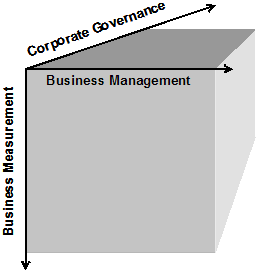
Figure 1. Managing “big-picture” BI.
The Business Management Dimension
Business intelligence is, first and foremost, about business. Yet all too
frequently the basics of business don’t have a place in the overall structure of
BI program management. Virtually every business has processes, functions, and
organizations with responsibility for each of eight business management
disciplines:
- Strategy and planning, including business mission and goals, business strategy to achieve the goals, and the business processes, functions, and plans that carry out day-to-day actions to meet those goals. A high-value BI program must connect with business strategy and support planning processes.
- Financial management with all of its many sub-functions—budgeting, cash management, credit and debt, revenue and expense, fixed assets, general ledger accounting, and more—is central to every business. Financial metrics are common in BI applications. Strong connection of financial measures with other business measures is more difficult, but a core element of real intelligence.
- Research and development is crucial to the long-term viability of commercial enterprises. In a rapidly changing, technology-driven consumer marketplace, continuous market and technology research are essential to managing a competitive pipeline of new and exciting offerings to customers. R&D intelligence is a key component of a well-rounded BI program.
- Marketing defines the market position of a company, its products, and its services. Knowledge of market segmentation, pricing, distribution channels, customer relationships, and campaign effectiveness are all significant factors of competitive positioning, and they are all information-dependent processes that benefit from BI solutions.
- Sales, customer support, operations, and human resource management round out the eight dimensions of business management with the disciplines, processes, and functions that translate strategy and positioning into actions and business results. Each of these benefits from informed management, and each is a supplier of feedback data into a comprehensive BI system.
The Corporate Governance Dimension
The most effective BI solutions are corporate systems that integrate across the
organizational, functional, and data boundaries of the enterprise. As with any
enterprisewide resource, coordination is best achieved, and value is maximized,
through governance. Seven elements of corporate governance have a role in
big-picture BI:
Business organization defines the structure of business units, relationships among those units, and responsibility and accountability structures. Successful BI has cultural impacts that change the nature of responsibility and accountability, and frequently drive organizational change.
- Business ethics regulate the behavioral culture of an organization. Increased availability of information through BI systems brings new considerations about privacy, security, and policies governing appropriate use of information.
- Legal counsel is the counterpart to ethics—ethics provides a regulatory framework, but legal counsel provides enforcement and remedy structures.
- Business policies and procedures are inevitably affected by BI. As metrics and measures impact organizations and decision processes, policies and procedures must change to keep pace.
- Compliance, risk management, and audits complete the seven elements of corporate governance. Each is information-dependent, readily enabled through intelligence, and essential to sustained corporate success.
The Business Measurement Dimension
BI delivers business measures, which are the essence of dashboards and
scorecards. But measures alone don’t assure success or value. This truth is
effectively illustrated in a statement that I heard from Aaron Walz, business
architect at the University of Illinois: “You can’t make a pig fat by weighing
it.” This short quote makes two important points: Measures aren’t useful unless
they are actionable; and they aren’t valuable unless they are acted upon. Moving
from measures to value demands attention to six principles of business
measurement:
- Data is the raw material from which information is created. Every business measure is a data point from which higher-level measures and metrics are constructed. You can measure only where data is available and where measurement systems can be put into place.
- Information is data in context. Measures alone have little meaning for decision-making processes. When translating measures (data) into metrics (information), be clear about the level of detail and the benchmark or threshold criteria against which the metric is evaluated for decision purposes.
- Knowledge is a human thing that is unique to organizations and to individuals. Consider those to whom information is delivered, and how best to align information with knowledge in ways that enable informed decisions and drive continuous knowledge growth.
- Actions, outcomes, and value complete the six principles of business measurement. Action means doing something. Weighing the pig suggests that a change of diet may be needed, but it is actually changing the pig’s diet that might make it fat. Outcomes are the results of action. When the pig gets fat, a desired outcome has been achieved. As well as providing input to decision processes, measures help to evaluate the effectiveness of the decisions made. Value is derived through the achievement of desired outcomes, completing the data-to-value chain.
Putting the Pieces Together
Intersecting the eight disciplines of business management, the seven elements of
corporate governance, and the six principles of business measurement yields more
than 300 perspectives to manage BI. Each point of intersection provides an
opportunity to build strong connections—and the right connections—between
business value and BI programs.
When examining the intersection of business management with corporate governance—financial management with compliance, for example—ask questions such as:
- What dependencies exist here?
- What decision processes need to be supported with information?
- What information is needed here? And what information is created here?
When looking at the intersection of business management with business measurement, ask questions such as:
- What are the related business strategies, and what information supports them?
- What information tracks achievement of goals?
- What information discovers opportunity?
At the intersection of corporate governance with business measurement, explore questions such as:
- What information exposes risk?
- How does information enable compliance?
- How does information support business policies and procedures?
Systematic attention to business management and corporate governance first, followed by consideration of business measures, and finally the technology to deliver measures, will build BI systems that are truly business driven—putting the business back into business intelligence.
Additional Information:
Dave Wells is director of education for TDWI.
TDWI provides education, training, certification and market research for
executives and business intelligence professionals worldwide. Founded a decade
ago, TDWI is the premier educational institute for business intelligence and
data warehousing, delivering content online, onsite, and through more than 20
conferences and seminars annually.
Click here if you are interested in registering for TDWI's "BI This Week" or
"Case Studies & Solutions" newsletters.
![]()
By Bill Collins and Richard Keith
DecisionPath Consulting
Summary: Even sophisticated organizations are sometimes unsure how to proceed with analytic applications. This article uses a case study to define an analytic application and characterize the problems analytic applications are good at solving. It then shows how analytics can deliver value to the operations function.
As organizations mature in their use of data warehousing/business intelligence (DW/BI) solutions, many see the use of analytic applications as a logical next step. Success stories, such as credit scoring and fraud detection in the credit card industry, are well publicized and make analytic applications sound wonderful. Yet many organizations, even those that are quite sophisticated in their use of DW/BI technologies, are unsure how to proceed with analytic applications.
Analytic applications for operations, sometimes called operations analytics, can be a place to start.
What is an Analytic Application?
According to the dictionary, analytics is the science of analysis. Generally,
analytics refers to analysis of data using Pareto analysis, trending,
seasonality, regression, correlation, control charts and other statistical
techniques. Many DW/BI solutions provide analytic tools and techniques in their
data marts.
An analytic application is a step upward in sophistication from merely providing analytic techniques or tools:
- It automates the thinking and, in most cases, a portion of the decision-making of a human being.
- It typically uses complex quantitative techniques, such as multivariate regression analysis, data mining, artificial intelligence or nonlinear programming.
For example, an analytic application used for credit scoring might:
- Calculate a credit-worthiness score.
- Automatically accept or deny the credit application.
- Select the credit limit.
- Select which credit card product (interest rate, payment terms, etc.) to issue this applicant.
Good Candidates
Some characteristics of business problems for which an analytic application
enabled by DW/BI is a good solution include:
The optimal decision is based on quantitative data and requires sophisticated analysis of multiple interrelated variables. Problems for which the solution is best determined using the skilled judgment of a human expert are not good candidates for an analytic application (unless the expert's judgment can be reduced to a set of rules for an artificial intelligence-based analytic application). Similarly, if the problem can be well solved by simple quantitative techniques (such as adding two numbers, for example), there is no need to have an analytic application.
If the optimal decision is based on subtle statistical interrelationships among ten or more variables, then an analytic application may be able to produce better solutions than a human decision-maker.
The problem to be solved is central to the organization. An initiative to provide an analytic application will receive more interest and support if the problem it solves is critical to the profitability of the business or, in the case of governmental or not-for-profit organizations, closely tied to the mission. For example, both a manufacturing company and a bank may have an analytic application for cash management. For the manufacturing company, managing cash is important in order to be able to meet payroll, pay suppliers according to payment terms, etc., but is an administrative process performed by the treasury function. For a bank, on the other hand, having the right amount of cash on hand is critical to customer service (being able to service withdrawal requests), meeting reserve requirements and maximizing investment revenue (funds set aside to support operations are not invested and, therefore, are not earning a return). A cash management analytic application is much more central to the bank than to the manufacturing company.
Multiple, independent decision-makers remake the same decision frequently. IT systems, including analytic applications, are costly to develop and maintain. It can be difficult to justify an analytic application to automate the work of a single decision-maker who makes his or her decision once per year. Such an investment becomes easier to justify if 150 decision-makers each make a new decision every week.
An example of a good candidate for an analytic application might be restaurant-level inventory management for a chain of fast-food restaurants. Each restaurant has limited storage space for its food ingredients. Some of these materials are fresh and have a short shelf life; but no restaurant wants to be unable to service customer orders because it runs out of an ingredient. If the current process is for each restaurant manager to decide twice a week what quantities of which ingredients to order from the centralized supply point, there is an opportunity to have an analytic application at headquarters take the place of independent decisions made at each restaurant.
The current decision-making process is intuitive or informal. If the multiple, independent decision-makers make their decisions based on intuition or "rules of thumb" rather than using quantitative methods (and the problem is fundamentally a quantitative rather than qualitative one), it is a good potential candidate for an analytic application.
Continuing our fast-food restaurant example, a restaurant manager may use simple rules for ordering, such as, "On Monday, I order twenty dozen buns, but on Thursday I order thirty dozen, because we're busier on the weekend than during the week." Such a heuristic does not take into account how much storage space is available at the restaurant, the freshness profile of the current bun inventory, or which menu items that require buns are on promotion this week.
Decisions from the analytic application can be quantifiably better than the current decisions. If the organization is content with the decisions made by the current decision-making process or it is unclear how an analytic application could produce better decisions, it will be difficult to "sell" the analytic application. Cash management at a bank can yield quantifiable benefits - less money tied up in cash at the branches (thereby more available for investment), while still meeting customer service objectives for funds availability. Better inventory management of ingredients in a fast-food restaurant chain also can be quantified: fewer stock-outs, less inventory throwaway due to aging and reduced inventory carrying cost. A less obvious way the automated solution can be better is that it makes the decision in a consistent way.
The time spent in the present decision-making process has a high opportunity cost. A universal challenge of sales forces is reducing the time the salespeople spend on administrative matters such as filling out expense reports so they can spend more time calling on customers and potential customers. A ubiquitous challenge for executives is how to spend more time on strategic issues. An analytic application can deliver value by automatically making routine decisions, thereby freeing up the time of key individuals for other activities.
A business problem does not have to meet all of these criteria in order to be a good candidate for an analytic application. For example, an analytic application that automatically makes a routine decision that is currently made frequently by multiple decision-makers can be a good choice, even if the problem is not central to the organization and does not require sophisticated quantitative methods.
Operations Analytics
The locus of decision making in operations is the front-line manager. While
executives and/or headquarters staff set strategy, actual performance results
from tactical decisions are made at the front line. This is particularly true
for service operations (banks, restaurants, chain supermarkets, some government
agencies and the like), because the front line typically is the point of contact
with the customer. Therefore, one way for operations analytics to achieve
maximum business benefit is to focus on providing decision-making help to the
front-line operational manager.
Operations analytics can help the front-line manager in two ways. The first is by utilizing the common, integrated data provided by DW/BI and analytical techniques to make a better decision than the manager can make using informal methods or intuition. The second is by saving the manager time, thereby freeing him or her for customer service, people management or other activities.
Case Study
To illustrate which analytic applications might be useful for a service
operation, let's examine an operation most people would rather avoid, a
Department of Motor Vehicles (DMV) office. The services a DMV office provides
are related to driver's licenses and motor vehicle registrations. It is a
distributed operation (that is, there are multiple physical locations performing
essentially identical work) in that each state typically has multiple DMV office
locations.
Operations Challenges
A DMV office has elements typical of many service environments: a flexible
workforce able to perform all of the work activities, predictable traffic
patterns, and customers who would prefer not to wait at all. A primary
management challenge is scheduling the available staff to meet the service needs
of the walk-in customer traffic. To meet this challenge, managers at each DMV
office make real-time adjustments, moving staff from administering the written
tests to taking photographs and issuing licenses, in order to keep the lines
moving. Another management challenge is to continually improve labor
productivity because the budget situation of state governments does not allow
staffing to increase proportionally with demand.
Further complicating the job of the DMV is the explosion of transactions processed on the Internet and by mail -- channels provided for customer convenience and to reduce traffic to DMV offices. Historically, vehicle registrations, license renewals and other routine transactions required an in-person visit to the local office. This single customer contact method allowed the office manager to minimize work in process and enabled customers to leave having completed their transaction. However, if a customer's Internet or mail transaction is delayed, he or she may go to the local office to determine the reason. Therefore, the availability of alternative channels (Internet and mail) has the potential to increase the in-person traffic to the DMV offices, rather than decrease it.
Information Needs
The DMV has two levels of management with distinct, yet overlapping, information
needs. Local office managers need information about customer wait time,
productivity, number of license plates issued, number of vision tests
administered, and so on for their individual office. The state executive in
charge of the entire DMV organization needs the same information, but is less
concerned with immediate-term issues (e.g., How long is the wait time for
service in office X right now?) and more concerned with consistency of test
administration among offices, identification and promulgation of best practices,
optimal allocation of available resources (primarily staff) among offices and
other network-wide issues.
With this understanding of the organization and operations of the DMV, we can examine how DW/BI and operations analytics can deliver business value to it. Providing metrics on accuracy, service, productivity and costs to meet the needs of both local office managers and the state DMV executive is a straightforward application of DW/BI technologies. The DMV also has business problems that operations analytics enabled by the DW/BI solution can help solve.
Staff Planning
A useful application that could be enabled by the described DW/BI solution is a
macro-level staffing model. Such a model would consider forecasted demand for
the various services provided by the DMV, the labor productivity for each
service, the existing employee population by office, skill set and grade level,
projected retirements and other turnover and other factors to develop a hiring
plan and/or plans to develop or redeploy the existing staff. This model
typically would be executed annually as part of the annual planning and
budgeting process.
Additional analytic applications using this and other data include the ability to:
- Assess the need for additional DMV offices and determine where they should be located.
- Evaluate alternative methods of service delivery, such as self-service kiosks and mobile DMV operations (a DMV bus similar in concept to a bookmobile).
- Examine policy alternatives, such as which days and hours DMV offices should be open to the public.
These applications do help the DMV optimize operations, but they do not help the local office managers with their decision making. For an example of that, let's look at staff scheduling.
Staff Scheduling
The macro-level staffing model used by headquarters helps determine how many
employees are allocated to each office, which, from the perspective of the
office manager, merely is a resource constraint. What the office manager needs
is a tool to help match resources to demand by scheduling when to have the
employees in that office work. Staffing is the primary supply element in the
demand-supply equation for a DMV office. The factors affecting this supply and
demand include:
- Walk-in traffic patterns throughout the day, week, month and year.
- Wait-time and other service objectives.
- Vacation schedules.
- Laws, bargaining agreements and DMV policy regarding employee work schedules.
- Budgetary constraints on whether and how much overtime can be worked.
- Mandatory employee training.
Much of this data is quantitative and can be provided by the DW/BI repository of application and HR data. In addition, there will always be relevant information about the local situation that is not reflected in the historical data, but which a good office manager will know. For example, a new Wal-Mart store down the street has its grand opening Thursday of next week, and the increased traffic to the neighborhood on that day may bring more people into the DMV office, requiring more staffing. The best approach to staff scheduling for the DMV (and similar service operations) is a scheduling workbench that combines the computational power of the analytic application with the local knowledge of the office manager. The analytic application suggests a solution to the manager based on the quantitative data, which the manager refines, if necessary, perhaps using simulation.
The benefits of this analytic application are to:
- Help meet service objectives, particularly for wait time, with the least staffing and therefore the lowest cost.
- Minimize the time office managers spend doing staff scheduling.
Inventory Management
Each DMV office has an inventory of blank driver's license and vehicle
registration forms, license plates and registration stickers to affix to license
plates. Management of this inventory is important because the office doesn't
want to run out of any of these items, but high inventory increases the risk of
theft and fraud. The traditional approach to this inventory management problem
is for the manager of each office to track inventory (perhaps even manually) and
decide when, what items and how many of each to order from the central supply.
However, because the usage of each material (that is, its issuance to driver's
license and vehicle registration applicants) is captured by the application
processing systems, an analytic application can be developed to manage the
material inventory and automatically replenish each office as needed.
Such an analytic application would:
- Remove a routine administrative function from the local office managers, freeing them to spend more time on other matters.
- Give DMV headquarters more ability to control the amount of inventory in the network of offices.
- Provide a mechanism to detect theft, fraud or misuse by comparing the historical usage (issuances) by each office to the quantities replenished.
Analytic applications combine DW/BI technologies with quantitative techniques to automate part or all of a decision-making process. Success with these applications begins with selection of the right business problems to solve with them. Characteristics of such problems include a solution based on complex quantitative analysis of data provided by DW/BI, centrality to the organization, multiple, independent decisions remade frequently, an intuitive current decision-making process, opportunity to make demonstrably better decisions and decision-makers whose time has high-value alternative uses.
As our case study of the DMV shows, operations has business problems which have these characteristics; and, therefore, operations analytics - analytic applications for the operations function - can be a good place to begin for organizations looking to leverage their investment in DW/BI.
Additional Information:
Bill Collins is practice leader of DecisionPath Consulting's business
performance management practice. Before joining DecisionPath, he spent 23 years
in operations and IT positions with several Fortune 500 manufacturing and
distribution companies. Collins is APICS certified at the Fellow level and can
be reached via e-mail at
bill.collins@decisionpath.com.
Richard Keith is a senior consultant in DecisionPath Consulting's business performance management practice. His background includes 12 years of operations management experience in the retail banking industry. Keith can be reached via e-mail at richard.keith@decisionpath.com.
This article was originally published in DM Review.
Copyright 2006, SourceMedia and DM Review.
Reprinted by kind permission of DecisionPath Consulting.
![]()
By Steven Campbell
International Legal Technology Association
While there is no one definition of business intelligence, there appears to be general agreement on what it does: it converts operational data to knowledge, providing meaningful information that facilitates effective decisions aligned with firm strategy. Offering unlimited analytical potential, BI is most successful when implemented with the support of senior management as part of a change initiative, often in the areas of enterprise performance management that employs elements of the balanced scorecard.
Firms employing BI can effectively communicate strategy on a real-time basis firm wide through a combination of dashboards, event-driven reporting and report alerts reflecting specifically selected key performance indices (KPI) aligned with firm or business unit strategy. Strategy-linked performance measures guide individual firm members to take timely actions when actual results fall short of expectations.
Profitability Metrics
Using matter profitability as an example, if a firm employs a fully loaded
costing model that includes partner/shareholder compensation, the need for
different strategies for each business unit often becomes readily apparent.
Assume that a firm has only two practice areas. If one practice area makes a
profit, then the other area racks up an equal and opposite loss. The reason is
that when the two practices are consolidated, the consolidated net income is
zero—which is what the partnership achieved after it allocated all income to the
partners.
By knowing this relationship, a firm is generally motivated to grow the profitable practice and restrict growth in the losing practice until it delivers a positive return. A performance measure for the profitable practice may therefore be to set a growth objective of X percent in the current year, while performance measures for the practice in the loss may be to improve effective collection rates, leverage and/or utilization.
Business intelligence is most powerful when organizations learn through analysis how to set unique performance measurements. Over time, as managers achieve their targets, new goals will perhaps emerge focusing on new metrics. For example, growth may eventually become an objective for a once-losing practice. Performance measurement systems therefore have a built-in continuous improvement component, provided measures are dynamic and evolve as the environment dictates.
Beyond Financial Measurements
Performance measurement systems should focus on more than just financial
metrics. Research proves that satisfied clients are strongly correlated with
satisfied lawyers and staff, who in turn drive higher partner profits. Lawyers
often lament the myopic focus on financial results in their firms, insisting
that being a professional is a vocation focused on helping clients and one in
which recognition by your peers for excellence and community involvement is one
of the more important measures of success. To invigorate their professional
staff, firms will have to heed lawyers who say they want to be measured on a
more complete scorecard.
We know that law firm corporate clients understand that the drivers of long-term financial success (maximum shareholder value) include client satisfaction, quality of product/service, efficiency and firm staff satisfaction. Factors that lawyers often claim are soft are seen by firm clients as leading indicators of long-term success. By inference, law firm clients are saying that a myopic focus on financial metrics without nurturing the well-being of the organization is akin to the children’s story, “The Goose that Laid the Golden Egg.”
Firms intrinsically accept this position, as references to client satisfaction, the importance of employees and other “soft” factors are appropriately reflected in firm strategies and vision statements. The disappointment with many firm strategies lay not in the planning but in the execution. The reasons most often cited were that firms did not know how to measure what they wanted, so they measured what they knew how to measure—namely, financials.
Business intelligence facilitates the measurement process as it reads and analyzes data from previous disparate sources. BI technology supports holistic performance measures from four broad perspectives, including the financial, client, people and internal perspectives. Potential measures and sources of the performance data under each of the perspectives include but are not limited to:
| Finance | |
| GOALS | MEASURES |
| Rates | Accounting data |
| Realization | Accounting data |
| Utilization | Accounting data |
| Leverage | Accounting data |
| Expenses | Accounting data |
| Bill/collect speed | Accounting data |
| Clients | |
| GOALS | MEASURES |
| Satisfaction | Survey data; client review trends over time; increasing revenues from existing clients |
| Cross-selling | Cross tab of matter departments by timekeeper departments |
| Profitability | Based on cost accounting or activity-based accounting assumptions |
| Client industry-sector knowledge | Client surveys |
| Value | Success rates |
| People | |
| GOALS | MEASURES |
| Satisfaction | Staff attrition rates; internal survey |
| Skill set | Recent experience on matters of industry code, task description, etc. |
| Continuous learning | Hours spent on education |
| Strategic awareness | Survey, improving results against KPI |
| Leadership / teamwork | Time spent on matters by other timekeepers; end of matter surveys |
| Innovation / Internal Perspective | |
| GOALS | MEASURES |
| Consistent quality and standards | Internal and client surveys |
| Quality of firm infrastructure | Number of calls to the help desk; internal survey |
| Number of new practices / industry focus | Revenue growth by new sector |
| Ancillary services | Revenues by type of service |
| Timeliness | Time from opening to closing files |
BI solutions promise spectacular return on investment (ROI) when designed to support strategy. Studies suggest that most companies pay back their full investment within the first year of implementation. Returns are typically cited in the following areas:
Tangible Benefits
- Timesaving. Staff spends more time analyzing results as opposed to preparing reports
- Reduced cost. Consolidation of reporting systems/warehouses
- New analytics. Move the firm from gut-feel management, new opportunities for break-through improvement often identified
- Improved resource utilization. Timelier reporting of variance, implementation of leading indicators such as projected utilization
Intangible Benefits
- Real-time information. Faster and timelier intervention
- Internal consistency. Reports internally verifiable through corroboration-building credibility, and greater reliance upon reports and related targets
- Better implementation of strategy and tactics. Clearly defined targets communicated on a real-time basis
- More efficient and effective processes. Performance is regularly measured and processes adjusted when performance falls short of expectations
- Greater partner and staff satisfaction. Performance metrics measure and value total contribution
According to The Conference Board (www.conference-board.org), if you can’t measure it, you can’t manage it. The real promise of business intelligence solutions is to help firms measure what they want rather than wanting what they can measure.
Additional Information:
Steven Campbell, CPA, has more than 14 years' experience as the COO/Executive
Director in law firms -- one of them voted as the best law firm to work for in
the country. He can be reached at
scampbell@elite.com or 763.208.1741.
Copyright ILTA. All Rights Reserved.
Reprinted by permission of Steven Campbell and
ILTA.
![]()