These are the two comps for my first project - the Cantering Caterer. Thank you to Brian for critiquing them.

This first idea of mine is very strong, except in some cases the font is hard to read.
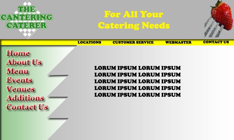
This one is much better design wise, because it has more of a three-dimensional view to it. On this one, however, I used too many colors in this version.
It takes away from my mood.
These are issues that should be sufficiently corrected if you look at my Project 2 comps located here.