Here are the two comps for my second project -
A WebSite design for Sonic Sound.
Sonic Sound wanted a professional looking website, so the design has to be sharp and accurate, while reflecting on the company's
usage in electronics and other media to create great sound. I utilized the brushes, layers, and fonts of each front page to showcase both
their clear-cut image and their dynamic enthusiasm. In a way, this will be an excellent company for Kineticcutters to do a website for!
I wanted to use black and white to project clarity in sound. To add development, we need to enter another primary color.
Upon looking at several options, the primary color that works best in this situation is blue. Yellow would have been too glaring
against black and invisible against white. Red, of course, is not suitable in a website unless creatively applied, and any
unnecessary creativity would have damaged the professionalism of this particular website.
Upon making my selection, I hereby took the color and
incorporated how it looked first against the black and then against the white.
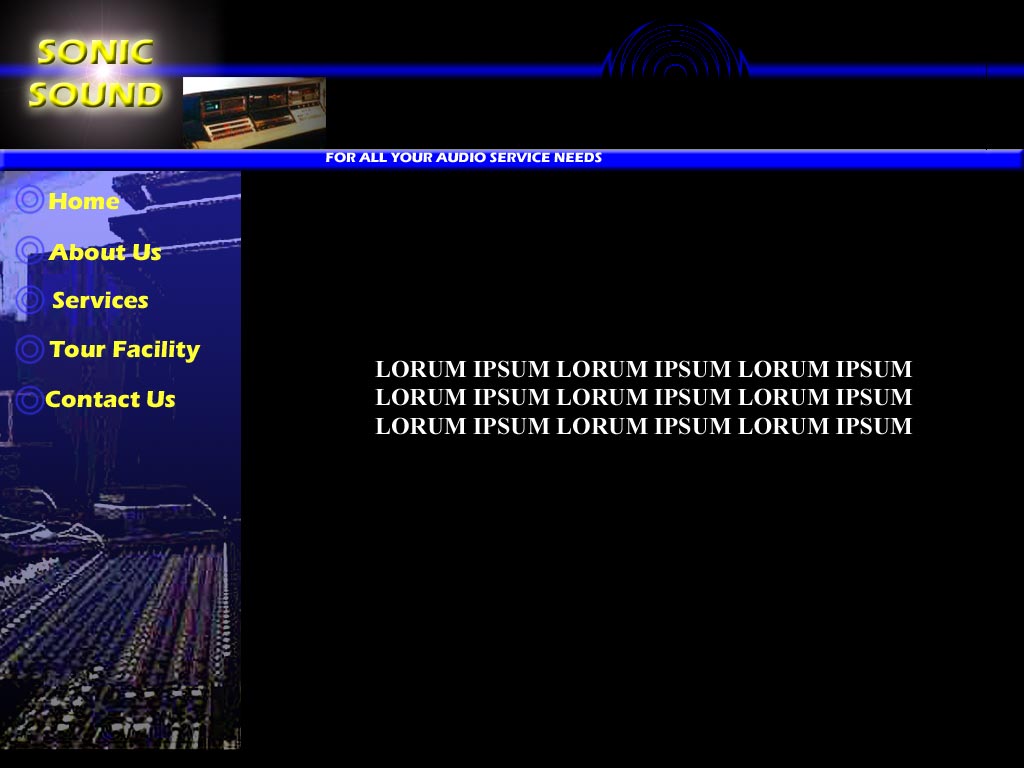
The first design is a darker, more emphatic look. The font is Eras Bold, a sans serif font which sharpens up the page. The outerglow
and bevel elements give it a 3-D effect and will attract the viewer's eye. This is
very effective against the black background.
The navigation is the standard navigation toolbar.
This is the most professional version of toolbar, although it limits the amount of content you can produce on a particular page.
The buttons are designed to look like sonic waves, as is the filtered design in the topbar. This design is achieved using
a "spherize" filter on Adobe Photoshop.
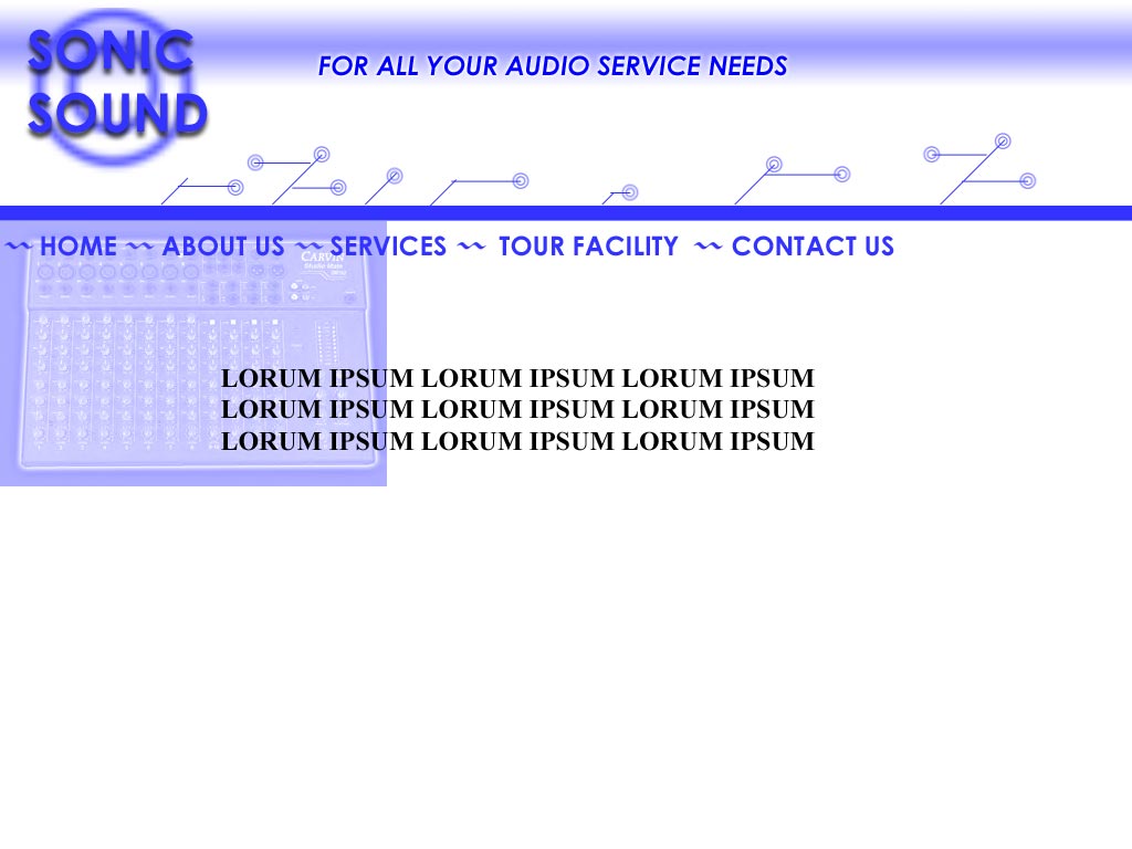
The second design is more light and calm. The "branches" expanding into the topbar
draw attention to the company's focus on electronic technology. The font is Century Gothic, which is more blocky but still sharp and works well against the lighter background.
This is especially true with the drop shadow element, also designed for 3-D effect. I decided to divert from the traditional navigation setup by
making the navigation toolbar a right-to-left scrolling setup directly below the topbar. This allows more room for content.
After further discussion with Sonic Sound(thanks, Bri!), we have come out with this revised look -

We have incorporate the lighter background from the second comp and the gradient layout from the first. This includes the ripple effect - notice how much easier it comes out with the lighter background! The font in this instance is a Lucida Sans Serif, which is sharper than the previous two. I have changed the style of the buttons to a smaller, less imposing brush. The side navigation is the same as in the first comp. I have also retained the yellow color from the first comp because the blue would have faded into the background. I decided to scrap the "branches" in the second comp and instead do a pattern gradient on the line that separates the top bar from the rest of the page.
Return to Home