Elements and Principles of Design Assignment
Learning Objectives:
students will understand basic art vocabulary
students will demonstrate proper technique in a variety of media
students will exhibit a high level of craftsmanship
Students will create visual examples of the basic vocabulary of art, as
well as learn how to perform basic skills and participate in classroom
organization. Students will strive towards a high level of craftsmanship.
Each day, the focus will be on one of the 12 elements or principles
of design, with an example from art history to learn. The first 4
days are outlined below, the other 8 will continue on in the same manner,
with an artist of the teacher's choosing for each day. Students will execute
an example of each element and principle of design on a 6 x 6 inch format,
to be assembled at the end of the project into a box.
This project should take approximately 12 - 15 class days.
Color

artist
Henri Matisse
Students will have a brief overview of the progression of the artwork
of Henri Matisse as it progresses from realistic representational work
until it matures into emphasis on color and shape. Finally, we will
focus on his cut paper works
from the end of his career, as seen in the book, "Jazz." Students
will execute a square, using scissors and paper cut-outs.
Works:
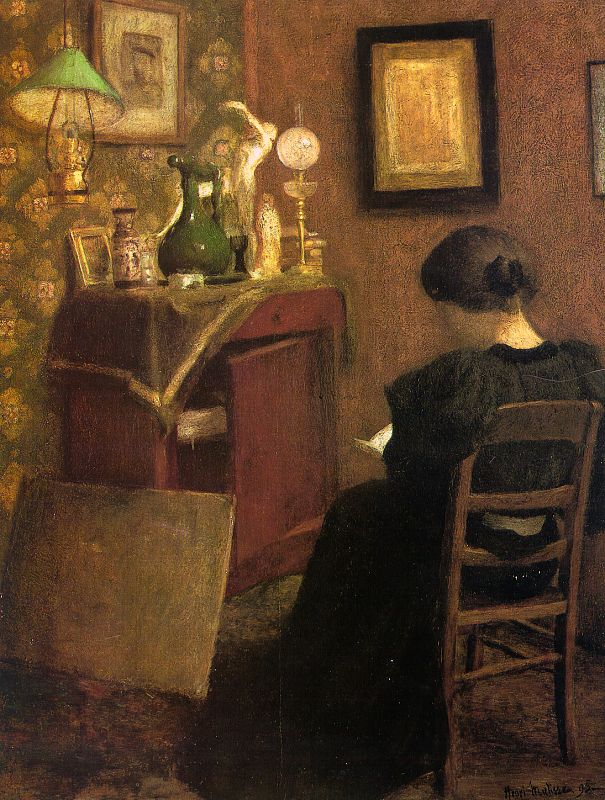
Woman
Reading, 1894
oil on canvas
Realistic, shaded, detailed
Musée National d'Arte Moderne
Centre Georges Pompidou, Paris
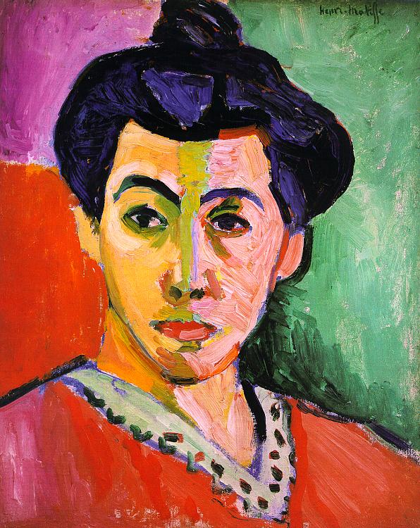
Portrait
of Madame Matisse (Green Stripe)
1905 oil on canvas
A little more simplified, color
Statens Museum Fur Kunst, Copenhagen
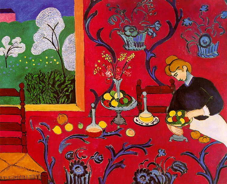
Harmony
in Red (The Red Room), 1908
oil on canvas
Shapes and colors
The Hermitage at St. Petersburg
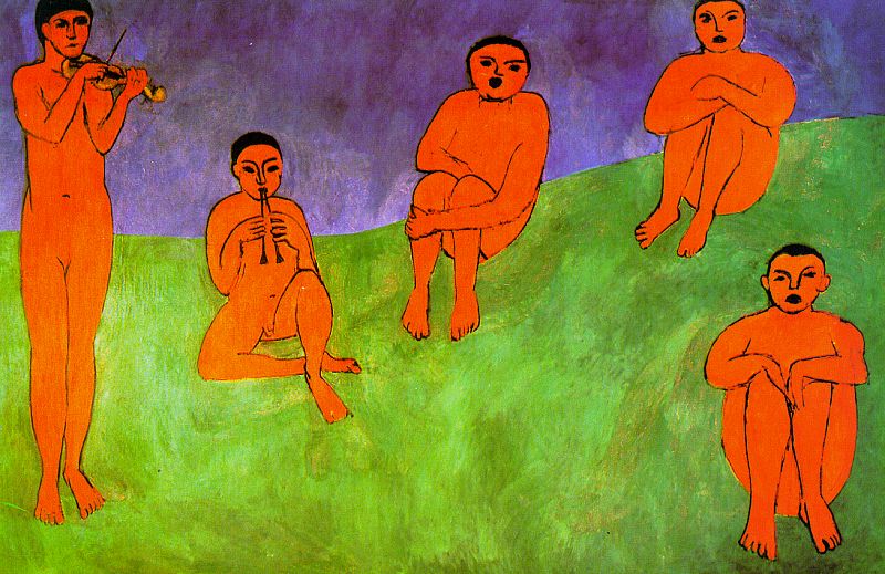
Music,
1910
oil on canvas
Flat color and shapes - no shading
The Hermitage at St. Petersburg
The
Knife Thrower
Le lanceur de couteaux
Paper cut outs - color and shape only
Plate XV from "Jazz"
Icarus
(Icare)
1943-44
Tell story of "Icarus" from mythology
From "Jazz"
Photo
of Henri Matisse in front of his artwork
Photo of Henri
Matisse working on paper cut outs
Contrast
 artist:
MC Escher
artist:
MC Escher
Students will take a look at the works of M.C. Escher, in particular,
the woodcuts and engravings using a high contrast format. They will
notice the balance of blacks and whites. Students will use scratchboard
to execute a design using high contrast of black and white,. This
will take more than one day, but can be overlapped with day 3 works.
Works:
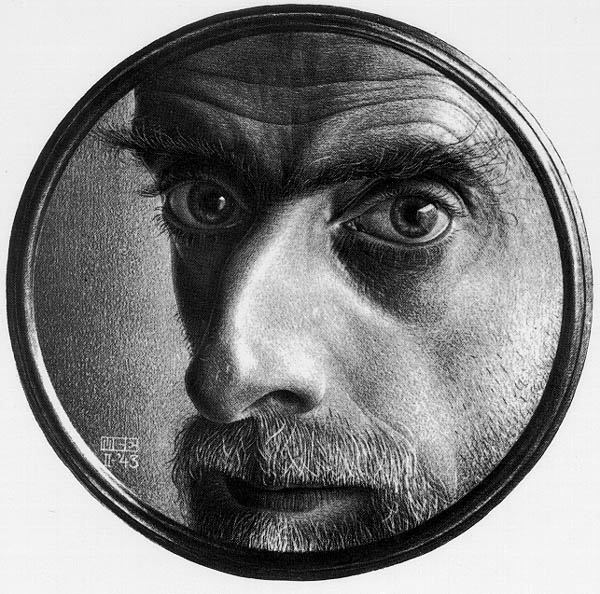
Self-Portrait,
detail, 1943
Lithographic Crayon
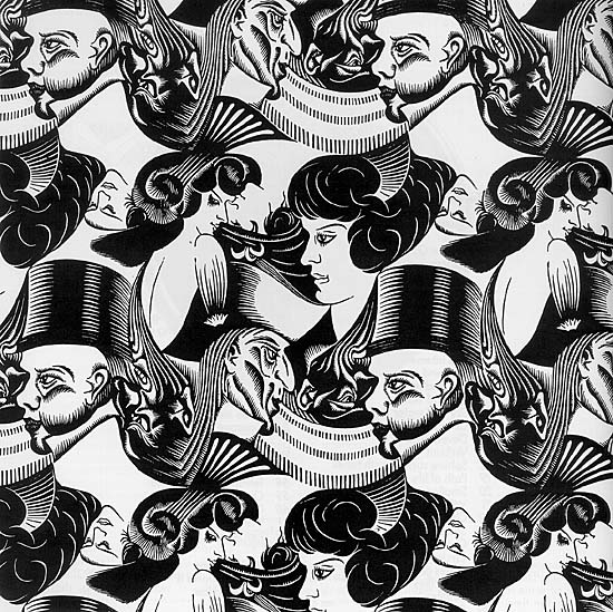
Eight Heads,
1922
Woodcut Stamped Print
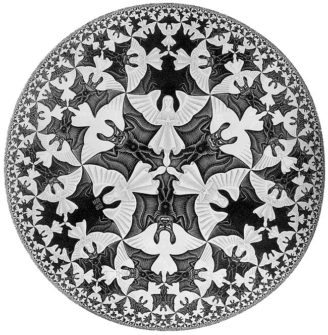
Circle Limit
IV (Heaven and Hell)
1960
Notice balance of Black & White
Woodcut Printed from Two Blocks
Liberation, 1955
lithograph
Use Art and Man Dec. 1991 for more hands on examples
Pattern
art form: paste paper, bookbinding
Students will watch a demonstration on paste paper creation,
using wetted paper, pastel markers, and colored paste, with combs used
to drag patterns. A brief overview of the history of decorated papers
used in bookbinding is explained, with the emphasis on creating an overall
pattern.
Paste Recipe:
3 cups water
1/2 cup fine flour dissolved in 1/2 cup water
2 tsp glycerine
paint - tempera or acyrlic
Bring the 3 cups of water to a boil in the microwave. Pour the
dissolved flour/water mixture into the boiling water, cook on high until
well-thickened (about 10 minutes), stirring about every 2 minutes.
Paste will continue to thicken as it cools. Add glycerine to promote
plasticity, you can substitute clear dish soap. Divide into containers
and stir in paints. Paint will mix in much better if you do this
while it's hot. Refrigerate - paste spoils rapidly and it smells
awful when it does. One class probably needs 2 batches, divided into
5 - 6 colors.
Value
 art
form: painting with tempera
art
form: painting with tempera
Students will execute a value study, using one color of tempera and
white paint, used to create tints of the hue, gaining the understanding
that one color, used in different tints, will advance and recede.
Students will look at the work of the artist Al Held to observe how one
artist uses a variety of values in his artwork.
Works:
PACHINKO,
1989
Color woodcut
MAGENTA,
1990
Color aquatint with spit bite aquatint
EMBARCADERO,
1994
Color aquatint with spit bite aquatint
FLY AWAY,
1992
Color spit bite aquatint
Rome
II
Oil on canvas
Piero's
Piazza
1982
Oil on canvas
The previous days are examples of how each element and principle of
design can be experienced. The artists and examples used are not
required, but the essential lessons are. For the remaining 8 elements
and principles, students should be shown examples through art history -
or through technique - showcasing each remaining prinicple or element.
The final part of the project is assembling a box from a pattern, and
choosing the six best parts to put on each side of the box. Slim strips
of paper (3/4" wide) are used to cover the seams of the box, and then each
side needs to be properly labeled. Labeling can be used as a test function,
to see if students can identify the element or principle that is illustrated.
Craftsmanship is a large part of the grade
on this project, and should be stressed all throughout the project.

 artist:
MC Escher
artist:
MC Escher
 art
form: painting with tempera
art
form: painting with tempera