
my sweetie and I decided to give each other tattoos for Winter Solstice 2001. we'll be travelling soon, so we don't need any more material things. the drawing below is a rough idea of what my tattoo was supposed to look like. the three black circles were going to be below my navel. the two outlined circles were going to be around the two scars left by my dearly departed navel piercing. the stuff above my navel will be about two inches high, and I guess that would be the same for the stuff below the navel. it's just a rough drawing, but we figured the artist would understand the idea.
I don't know where the inspiration came from. one night I asked Jason to draw some tattoos on me, for fun. this is what he drew on my navel and I loved it! plus, it sorta has a boy and girl sign thing going on, which I rather like. I was really excited to have a pretty belly again; it's been so bare since my navel piercing left me.
the tattoo is now done and it sucks. big time. this picture isn't that great, but here's the finished product:
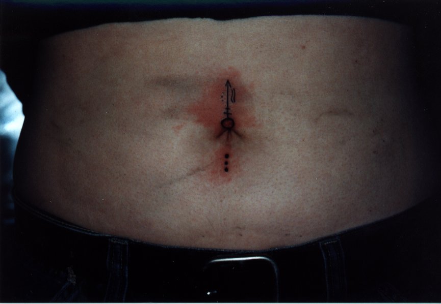
the artist couldn't do the lower circle because it would have been right inside my navel, so I don't mind that it's gone. it's too bad, but we discussed it at the time and we agreed that it would be too difficult. the rest is awful though. the three dots to the left are teeny and aren't in a straight line, the two curved lines aren't even close to identical, the three dots below my navel are misshapen, the parallel lines aren't parallel, and the arrow is longer on one side than the other. this is definitely NOT what I had in mind.... the actual tattoo looks a bit worse in real life because you can see where the ink didn't quite take. this photo was taken just after it was done, hence all of the ink smeared on my belly and the redness.
I console myself with the fact that this tattoo can be easily fixed. by a different artist of course.