|
www.surftrak.org |
| Information on SurfTrak and how to use it |
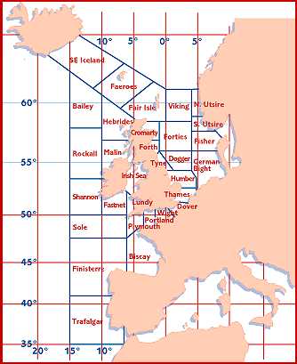
| Info on surface weather charts | Info on wave prediction charts | Info on directional spectra | Info on wavebuoys | Info on shipping bulletins |
Introduction SurfTrak is a way of quickly accessing a large range resources for predicting surf in Europe. These include weather charts, wave prediction charts, buoy reports, text bulletins and webcams. Each tool is accompanied by important information on how to interpret it and how to obtain the best results. The information is constantly updated, with current conditions as well as predictions for up to nine days ahead. The surface pressure, wind and wave charts are presented as a series of charts, the first one showing current observed conditions, followed by predictions calculated for the days ahead. The predictions are most accurate up to about three days ahead. The resources in SurfTrak are designed to be used in conjunction with each other. For example, the current conditions can be checked out using the webcams, wavebuoys and text bulletins. To predict whether a swell is going to arrive within the next few days, use the wave prediction charts. Then the wind and surface pressure charts can be used to check out what the coastal wind conditions will be like when the swell arrives. |
Surface Pressure Charts The surface pressure charts show variations in atmospheric pressure from just above sea level. They are most useful for showing the location of low pressure systems, which are essential for producing our surf. They are also just as useful for finding out what the local wind conditions will be like. These charts consist of lines of equal pressure, called isobars. The wind tends to blow along the isobars: the closer together the isobars, the stronger the wind. In the northern hemisphere, the wind blows anticlockwise around a low pressure. To produce surf, there must be a region where the wind blows over a large area of the ocean for a reasonable length of time. This is called the fetch or windfield. A deep low pressure slow-moving in mid-Atlantic, with a large fetch pointing towards the coast is what we hope for. Swell from this system would probably take between two and four days to arrive at the coasts of Ireland, UK, France, Spain and Portugal. The wave prediction charts can be used to confirm the arrival time and size of the swell, and then the surface pressure charts can be used to see what the local wind will be like when the waves arrive. Some charts (the nine day charts, for example) also give an indication of the flow of air 5km up, called the jet stream. This is useful for knowing how fast and in which direction the low pressure systems are likely to move. |
Wave prediction charts These charts show predictions of wave heights over the Atlantic Ocean, using different colour contours for each height. Their principal use is therefore to tell whether a swell is likely to arrive in the coming days, and obtain an idea of its size. Most maps also contain arrows showing the direction of wave propagation. This is useful if your surf spot is sensitive to different swell directions. Since they show the average direction, care must be taken in interpreting these arrows. For example, a northwest groundswell mixed with a southwest local wind might show up as a westerly swell. However, some charts (for example the short-term wave prediction ones), show different coloured arrows for groundswell and windsea. The wave period is also a very useful feature on some of these charts. For example, on the medium-term wave charts, a chart showing colour contours of wave period in seconds is shown alongside the wave height contour charts. The period can be used to distinguish whether you are getting real swell (long period) or just wind-chop (short period). Another useful feature of the period charts is that they show a 'swell-front' (usually a thick black line), which can be used to judge the arrival time of the swell. Some of the wave charts include local wind arrows, which appear as a line with a number of barbs on it according to the strength of the wind. Although sometimes a bit difficult to see, these are very useful for giving an indication of swell and wind in the same place. A clearer picture of the local wind can be obtained from the wind prediction charts, which give colour contours according to wind strength, or from the surface pressure charts. |
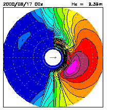
Directional Spectra The directional spectra predictions are probably best appreciated by the user who has some basic oceanographic or meteorological knowledge. They are combined plots of wave energy (which relates to height), wave frequency (the inverse of period) and direction, at a single point on the surface of the ocean. The directional spectra plots are available for the same locations as some of the wavebuoys around the UK. However, the data does not come from the buoy, instead it is generated from a mathematical model, and is a prediction, not an observation. The usefulness of these charts is to show the expected development of swell in energy level, direction, and frequency over the coming days. For example, a long period southwest swell might arrive followed by a northwest windsea. More information is available at a glance than the wave height contour maps, but the disadvantage is that the prediction is only for a single location. The wave energy level is represented by different colour contours, the direction of each particular energy level is whereabouts that contour is around the circle, and the frequency is radial distance from the centre of the circle. Concentric circles are at intervals of 0.025Hz starting with 0.025Hz in the middle. Therefore the second concentric circle would be 0.05Hz (= 20s period). An estimate of the significant wave height is also shown with each plot, together with a wind arrow. The example below shows a swell with energy levels corresponding to a significant wave height of 2.38m. The peak of the spectrum is at about 15s, and the swell is coming from the northwest. The wind is from the west. |
|
Wavebuoys The wavebuoy reports give a list of observations, normally every hour, of various parameters at a single location. The most important of these is wave height, but they may also give other information which varies according to the buoy itself. These reports are real-time measurements and not model forecasts like the wave prediction charts, for example. They are useful if you want to know exactly what the wave height has been doing up to the time of the last report. For example, if it is picking up rapidly at the buoy then you know that within a short time waves will arrive on the coast. Sometimes the wave height at the buoy does not correspond exactly to what you'll get on the coast, due to factors such as refraction effects from the continental shelf. However, the trend (whether it's going up or down) is more important than the height itself. The best buoys are the ones that measure wave direction as well as height. From these you can tell where the swell will come from when it arrives on the coast. Also, having the direction eliminates the potential problem of seeing huge wave heights at the buoy, but not realising they're propagating in totally the wrong direction. |
Shipping Bulletins These are text reports, derived from the traditional marine forecasts received by radio. Their most useful feature is that they give an accurate prediction of the local wind for the next 24 hours. The wind strength is normally given in the Beaufort scale, force 0 to 12, where 12 is about 64 knots (hurricane force). These reports also give other information including real-time observations (not predictions) of wind conditions at certain coastal locations. The Spanish bulletin also gives local wave observations. This is useful for seeing what the conditions where a short time ago, and for comparing one part of the coast with another. The UK shipping forecast is divided up into a number of areas which can be seen below. For the Bay of Biscay, for example, see the report for area Biscay.
|