

|
Okay, I really can see how potent that selection tool is.
NOW I know how to use the fill tool! (I never could understand why I was filling up my whole graphic box, instead of just the one color I clicked on (I never used a selection line at all). |

|
Ah, the Text tool is really easy to work with! I used the Tristan font for my lower name with the blue stroke (128,128,255) and the yellow fill (255,255,0).
The Text tool is the ONLY thing in Paint Shop Pro7 that I understand how to use without studying the manual! |

|
OOOOoooh! I like that drop shadow thing! Very, very nice! |

|
Whooooaaaa!! I really like the repeat-buttonizing! Such a simple chore with such dramatic results! Wish housework was this easy!!! Very lovely! |

|
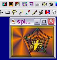
For my "extra credit", I made a Spider Sig Tag for Halloween. I used the Violet-orange gradient background (Radial, repeat=10, horizontal & vertical both set at 20). Choosing Webding font for both spider (size 48) and her web (size 72), I checked both floating and antialias.
For the text (the web), I used the Black stroke with Fading Spectrum (Linear, angle=131, repeat=1) gradient fill. The spider was italized, with black stroke and yellow fill (251,220,13). After cropping the graphic, I buttonized it with bright yellow background (height & width both at 7, and opacity at 55 with solid edge checked). I do like my spider! This one, I do NOT want to squash! Happy Halloween! |
 A gift from the teacher!
|
|
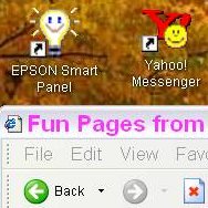
| For the "optional Saturday tutorial" on screen captures, I captured my spider graphic and some toolbars from my second PSP. | Here, I captured part of my browser and part of my desktop. |
![]()