This is the first ever graphic I ever made for a website. Isn’t it pretty? 2002
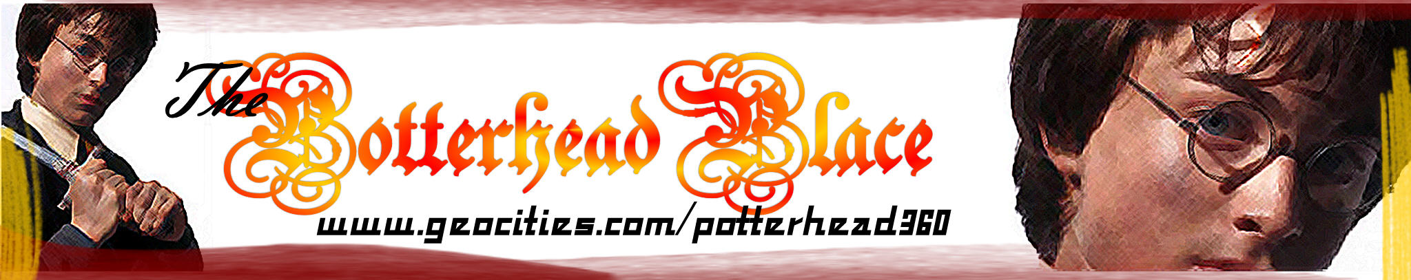
The second "theme" for her site was mostly red, inspired by the book cover of The Chamber of Secrets and Daniel Radcliffe’s pretty-ness. This was the header for her home page. We handed out copies of this graphic to people at the B&N Order of the Phoenix party. It probably wasn’t allowed, but we just love being subversive. Mwahaha. 2002-2003
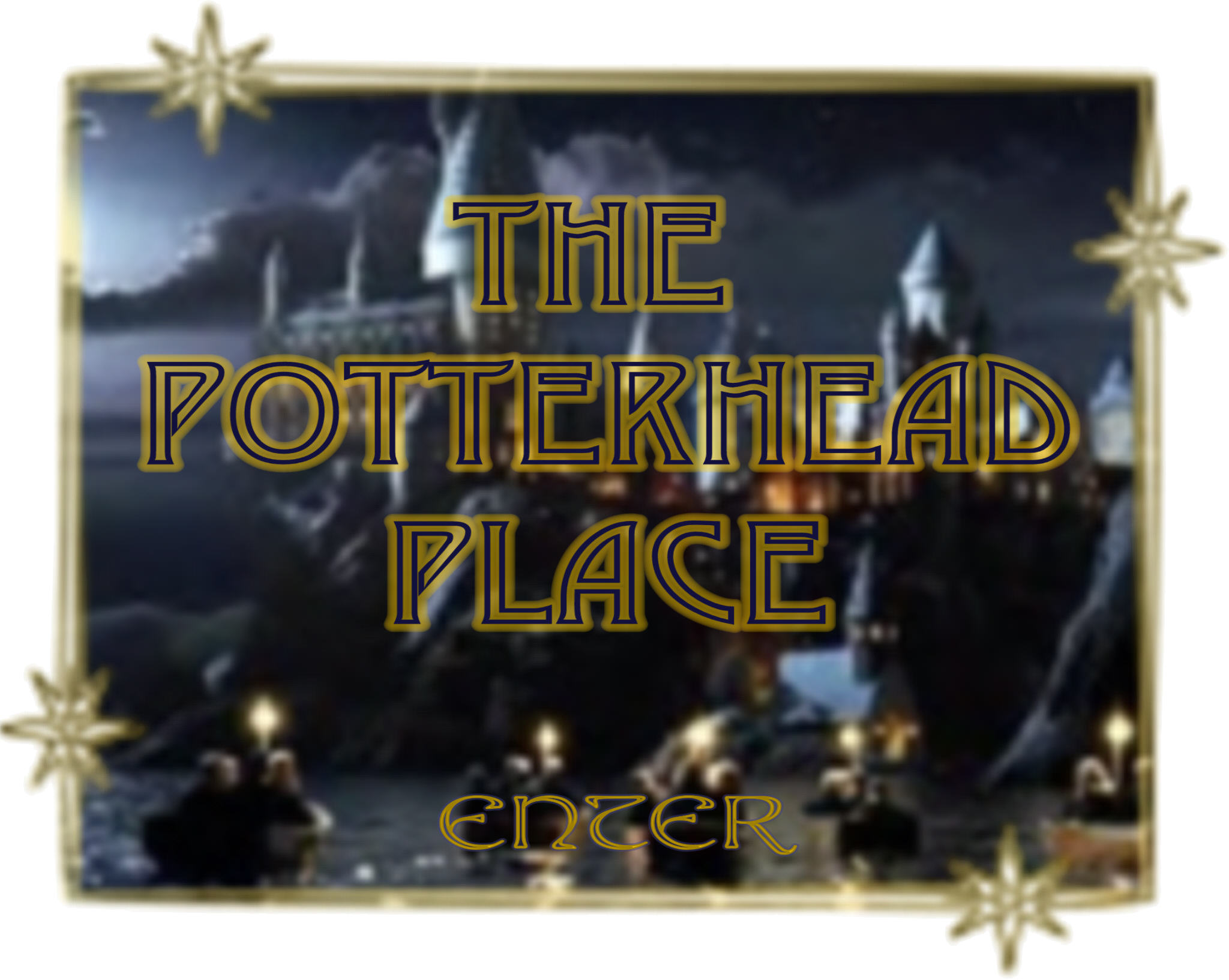
The main enter graphic, going along with the above banner. I am so proud of this. The paint brushes were a pain, though. PictureIt is not cool for web graphics, that’s for sure. 2002-2003

I made this banner right after OotP came out, for obvious reasons. Pretty simple. I like the purply-blue and all the shapes layering. 2003-2004
