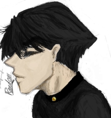
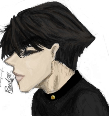
The first two suck ass. they are painful for me to look at. the only part I like is how the shirt came out. ^^;; and maybe the hair. I like the hair in the second one better, but nothing else. The face of the first one, I find not as painful to look upon.
Hehe, I have to admit, the icon looks a lot better than the other two. ^__^ first of all I am v. fond of the pattern that I used as the background.
I wish I could make something like that, but that would require coloring skills that I don't have. And second of all, when it's that small you have to kind of squint to look at it, and that makes a world of difference. ^__^ you can't see how hideous the coloring job is. yay. ^^ I may or may not use this icon for my lj sometime in the distant future.