|
THE OIL PAINTER'S BIBLE - CHAPTER 5 |
|||||||||||
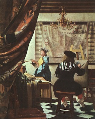
PRINCIPLES OF VISUAL REALITY The greatest art is that which moves the viewer in a positive way, which touches perhaps dormant sensibilities inherent in human nature, and awakens and/or fortifies man's better qualities in so doing. Great performances in all the arts accomplish this same goal. A well-written operatic aria, for example, sung brilliantly and with feeling by a virtuoso soprano, can move an audience profoundly, raising the hair on the neck and bringing tears to the eyes, leaving at least some of them gasping and choking back sobs of deeply felt emotion as they try to maintain their composure . Experiencing such profound appreciation for a masterly performance leaves one forever changed for the better. It cannot do otherwise. Great Literature provides many comparable experiences. In painting, it is possible to achieve the same thing.
In each of the examples presented above, the means by which the experience is made possible is virtuoso performance in an artistic endeavor by a Master of the discipline employed. Whereas the focus of the performance itself is to make the audience feel whatever the artist wants it to feel, it must be stressed that the objective can only be successfully attained through a thorough understanding of every aspect of the art form involved, including the psychological effects produced by each possibility. There is a language to be learned, and mastered, before any great performance is remotely possible. In literature, the language is verbal; in music, it is music theory. In visual art, it is a thorough understanding of the Principles of Visual Reality, coupled with heightened aesthetic sensibility and mastery of drawing and painting techniques. Why the Principles of Visual Reality? Because we live in a world of realistic images. We relate to realistic imagery. We even dream in realistic imagery. Of all the visual possibilities available to a painter, the only way to move our viewers to the utmost is to employ realistic imagery in our work. We may depict things which are not real, but if we render them in accordance with the Principles of Visual Reality, they will read as if they were real, and thus will be able to exert maximum impact on the viewer. It is the language by which we express whatever it is we wish to express, and which our viewers will be able to read and comprehend on the receiving end. Our messages cannot communicate if we speak in a language comprehensible only to ourselves. Thus we must use a language common to everyone who can see. Realistic imagery is that language. The Principles of Visual Reality are established by the way our vision works. The further one deviates from these principles, the less the work in question will resemble visual reality. In creating the illusion of reality, the artist depends heavily on the indication of the third dimension, which is depth, or spatial recession. Spatial recession is indicated by observing the principles of Geometric Perspective, Atmospheric Perspective and Selective Focus. GEOMETRIC PERSPECTIVE Geometric perspective, often referred to as simply perspective, may be defined as the natural law which says the further something is from our eyes, the smaller its image will be. Since there are two types of perspective, the other being atmospheric perspective, it is necessary to distinguish between them by referring to what is normally called perspective as geometric perspective, in reference to the fact that it is a geometric breakdown of a natural optical phenomenon. It is sometimes referred to as linear perspective, as it involves the use of lines in its construction. As simple as it sounds, the problem of how to convincingly render this visual phenomenon had baffled painters for centuries, until a mathematical approach was discovered in the early Renaissance. The painters Masaccio and Uccello, as well as the architect Bruneleschi have each been credited with its discovery. The Roman architect Vitruvius may actually have preceded all of the others named, and may in turn have been influenced in it by someone still earlier, but the discovery does not seem to have reached painters until the early Renaissance. Whichever of these attributions is correct is less important than the fact that the discovery was made, and that it constituted a major breakthrough in illusionistic painting. Once artists learned the system, they could indicate spatial recession more realistically than had previously been possible. The system involves the use of vanishing points; points at which lines intended to depict parallel lines converge. These vanishing points are on the horizon if the lines are level. It is important to note that the horizon is always at the viewer's eye level. When two or more vanishing points are necessary, as in all but the simplest perspective problems, their placement may be worked out following the mathematical system, or, if we are working from life, by simply copying the angles we see and extending them to the horizon. The points at which the extended lines cross the horizon are the Vanishing Points. All lines parallel to the one used to establish the Vanishing Point will converge at that Vanishing Point. If there is any question as to their accuracy, the mathematical system may then be employed to double-check. The mathematical approach must be learned first, and practiced until a point is reached whereby the artist is able to visualize the scene in correct perspective automatically, without the need of actually drawing in the vanishing points and guide lines. The subject is taught to students of architecture, but is not part of the curriculum of fine arts programs in most universities at the time of this writing. It may be that a Fine Arts major could take it as an elective. There are several books on the subject, the best of which are listed in the bibliography. However one chooses to study, whether alone, in an institution, or with a private instructor, the importance of mastering geometric perspective cannot be stressed too highly. It is imperative that any serious aspiring artist absorb this fundamental principle completely, if he or she is to ever create genuinely Great Art. It must become second nature, so thoroughly assimilated that virtually no effort is required to visualize it correctly. As the subject is so completely covered in Rex Vicat Cole's book, Perspective for Artists, there is little point in addressing it in full detail in this book.Errors in perspective are far too common in modern times. Such an error immediately destroys the illusion of spatial recession, and prevents the viewer from receiving the artist's message.
The system is not quite perfect, as it fails to take into account the curvature of the Earth. It works well because the Earth is so large that in most cases the curvature is not apparent. Its limitations are that it can become quite complicated, and artists are generally not mathematicians, nor are they likely to be interested in approaching the scene from such an analytical, as opposed to intuitive, standpoint. For this reason, many artists, or would-be artists, are weak in their understanding of this fundamental principle. It is imperative that the student, the aspiring artist, apply the discipline necessary to learn the mathematics of the system so well that all awkwardness with its application disappears and ceases to interfere with the creative, intuitive processes so essential to art. Once it is committed to second nature, it becomes a help rather than a hindrance. The artist should then be able to "eyeball" the scene accurately, without having to actually draw the vanishing points and guide lines. Its parallel in music would be the learning of music theory; perhaps no fun at first, but Great Music cannot be created without it. ATMOSPHERIC PERSPECTIVE As objects recede in space they not only appear to shrink in size, but tend to lose detail, contrast of values, intensity of color, and their edges appear less distinct the greater the distance from the viewer's eyes. This is the principle of Atmospheric Perspective. Some writers call it "aerial perspective," but this is misleading, as the term, "aerial" usually pertains to flying.
In painting, atmospheric perspective can be rendered directly, in one step, using opaque paint exclusively, at least in the distance and middle ground, following the principle, by adding white, and sometimes blue, increasing the white (and blue) to indicate greater distance, softening edges by working wet paint into wet paint, suppressing detail and diminishing contrast between light and shadow to indicate greater distance. The effect can also be gotten, perhaps slightly more convincingly, in a two-stage process whereby the same procedure is used as in the one-step method except that the area of greatest distance is rendered very slightly darker than the desired final effect. The illusion is completed in the second step by scumbling a thin film of white or light grey over the dried paint of the first step in the areas of the greatest distance. The illusion of depth can be further enhanced by painting the deepest foreground shadows, and only these foreground shadows, in transparent glazes over a relatively lighter underpainting or primer. This creates the highest degree of clarity, as would be the case when the least amount of atmosphere is present between the shadow and the viewer's eye, appropriate for the immediate foreground only. The combined, systematic use of glazing, scumbling, and opaque painting allows the painter to create the illusion of depth to the highest degree possible. However, the successful rendering of spatial recession depends even more heavily on observance of the principles of geometric and atmospheric perspective than it does on expert paint handling. SELECTIVE FOCUS There is a third principle to be observed when creating the illusion of reality, which is closely aligned with atmospheric perspective. This is the Principle of Selective Focus. It is the phenomenon whereby our eyes, directed by the brain, register the highest attention to detail on whatever we consider most important within our cone of vision. Please note that this process is unique to the natural viewing apparatus. A camera does not operate in the same way. The specific differences will be discussed at length in the chapter on photography. In designing our painting, we must simplify the shapes of lesser importance and render them in softer focus than the areas of primary importance. Hard edges should be used sparingly, and for specific reasons. The use of too many sharp edges destroys the illusion of reality, as it does not correspond to visual experience. Our eyes cannot focus on more than one small area at a time. Everything else appears duller and less distinct. By following this principle, the artist can assign greater importance to key elements in the picture by rendering them in sharper focus and adding more detail, and can arrange things in such a way as to lead the eye from point to point, including areas of secondary and tertiary interest, if desired, to hold the viewer's attention for as long as possible. Areas of secondary and tertiary importance may also be rendered in sharp focus, but must be made less noticeable than the primary subject by their positioning on the picture plane and by arranging things in such a way as to have less contrast of values, lower chroma colors, or whatever other means will render them less noticeable at a distance. Orchestrated in this way, they do not compete with the area of primary importance for the viewer's attention. The main focal point is emphasized not only by sharper focus, but by greater contrast of light and dark, by higher chroma color, perhaps by its juxtaposition with contrasting hue accents, and especially by its strategic placement on the canvas. Other elements in the picture may also point toward it. Thus are the elements of secondary and tertiary interest rendered subordinate, even though they may be rendered in sharp focus in certain instances. Their effectiveness, however, depends on softer focus being used over most of the picture. If one had to choose between painting everything sharp, or everything soft, the soft option would allow for a more convincing illusion of reality. We all, at times, see everything in soft focus, as it takes a certain amount of effort and direction from the brain to focus the eyes on anything. It is not possible, however, to see everything in sharp focus at once; thus, a view painted in such a way clashes with our experiences in viewing the real world. It is easy to fall into the trap of painting this way, for as we move our focus from what we have just painted to what we will paint next, each element appears to us in sharp focus. The temptation to paint it as sharply as we see it when focusing on it is very strong, but must be resisted, or we violate the Principle of Selective Focus, and the illusion of reality of the overall scene will be compromised for the sake of superfluous detail. It is helpful to squint when observing these elements, thereby throwing the eye somewhat out of focus, and then paint them as they appear when squinting. If the painting requires a sharper focus on certain parts of the scene, it is still advisable to begin by squinting, in order to read the larger, more general shapes, and then add whatever detail is desired after we are certain that the big shapes are correct.
As artists, we should not just paint what we see, we should paint what we want to show to our audience, selecting only that which is worthy of such special attention, and then presenting it as it appears at its most appealing, or making it more so if it will make a better picture. The viewer's attention is directed where we want it by the use of selective focus. If the visions we paint exist only in our imaginations, so much the better. THE NATURE OF LIGHT Of equal importance to the principles governing spatial recession is an understanding of the nature of light and shadow. Three-dimensional form is indicated by the distribution of light. Shadow is, in theory, the absence of light, but in reality there is light in shadow as well. Areas of light are generally illuminated by light rays which have traveled in a straight line from the strongest source, whereas shadows receive their light indirectly, as the rays ricochet off nearby surfaces and bounce in behind objects that block the direct rays, or from secondary light sources weaker and/or farther away than the primary light source. Without secondary light, shadows would read as black. The dark side of the moon is an example. Secondary light is what enables us to perceive form within the shadows.
The shadow is darkest at the just beyond the planes illuminated by the primary (strongest) light source. This area is called the shadow accent (sometimes referred to as the core shadow) of the body shadow. The phenomenon of the shadow accent is best understood in scientific terms. Whenever enough light is present to allow us to see at all, there are light rays coming from many directions, of varying strengths, both reflected and direct, often from more than one source. The strongest light creates what we consider light and middletone areas, whereas the weaker are only visible in shadow. Whatever is blocking the strongest light also blocks a certain amount of secondary light, and the closer the shadow is to the blocking obstacle, the more of the secondary light rays are blocked.
The shadow accent is a most useful device for describing interior planes, that is, planes within the edges of the object being depicted, by its shape and by how sharply it makes the transition from middletone to shadow. A sharp change in angle will have a sharp transition; a more rounded form would have a softer transition from middletone to shadow. Once the artist understands this principle, he or she will look for the shadow accent, and will use it to good advantage. The highlight is the point at which the light from the primary light source bounces off the object and to our eyes the most directly. It will contain more of the color of the light source than any other area in the light. The highlight will describe the surface texture of the object being viewed, by the degree of sharpness at its edge, and by the contrast between its value and the value of the middletone. There will be a transition zone between highlight and middletone. The extent of this transition zone, again, depends on the texture and shape of the surface, and on the intensity of the light from the source, striking at the highlight. It is necessary at this point to address the way in which color is affected in the shadow areas. Shadows are areas where the direct light rays from the strongest source cannot reach. If there were but one source of light, and no surfaces nearby to reflect light back into those areas, the shadows would be totally dark, and we could not read shapes within them. However, situations such as that are rare, except in outer space. In reality, there is usually more than one light source, and/or nearby surfaces which reflect light into shadow areas. The color of the secondary light source affects the color of the shadows. The color of nearby surfaces, which reflect light into shadows, is also cast into the shadows as an inseparable component of the reflected light. The body color of the shadowed surface is also an influence; however, its chroma will be lower (duller) than in the middletone for the same reason that its value is lower (darker). The reason is that there is not enough light in the shadow to reveal the body color at its full intensity. The strongest influence on the color in shadow is usually the color of a secondary light source. The best example is an outdoor scene on a sunny day. The main light source is direct sun, which is slightly yellowish. The secondary light source is the sky, which is blue. The color of the sky will be the strongest color influence, other than the body color of each surface, in all areas facing it not lit by direct sunlight. The sun's rays, striking directly, are so much stronger than the light of the secondary source (the sky) as to effectively overcome the color influence of the sky in those areas, replacing it in the highlights with its own color plus white. In other words, direct sunlight "eats" the blue. When a cloud obscures the sun, the sky becomes the primary light source, and its color, blue, becomes an influence in the lighted areas, until the cloud moves away and allows the direct rays of the sun to again eat the blue. All areas then in shadow retain the blue influence of the sky, except where the light from the sky cannot reach. In those areas, reflected color will have a stronger influence. For example, the underside of an object surrounded by a green lawn will register a certain amount of green in the shadow areas, whereas the upward-facing areas in shadow will register the blue of the sky. The green is carried with the light from the sun as it bounces off the lawn, reflecting into nearby surfaces. If the object has no color of its own, such as a white or grey statue, this will be more apparent. If the object has its own body color, it will be influenced by the color of the secondary light, but not replaced by it.
After the student has been exposed to these principles, they will become more obvious, as he or she will be on the lookout for them. This is an important step toward becoming an artist. Once the Principles of Visual Reality are completely understood, the artist is freed from dependence on external sources. Nothing the imagination can conjure up will be beyond the artist's ability to depict on canvas. This in itself is still no guarantee, however, that an artist so equipped will be a Master, as he or she must also have something of interest to say. Inspiration is an individual thing that cannot be taught. One finds inspiration on one's own. However, all the inspiration in the world will not help, if the inspired person lacks the vocabulary to express it. An understanding of the Principles of Visual Reality is an extremely important part of that vocabulary.
|