|
|
||||
| As opposed to projected, television and computer images, painters use the subtractive color principle. If a chemical that
absorbs red and blue light rays is painted on to a surface, that surface
will reflect what is left, the yellow rays ( it will appear to the viewer
as yellow). If the surface absorbs red only, then it will reflect the other
two and will appear green. If the surface absorbs all hues then it will
reflect no colors and appear black. White is the sum of all hues while
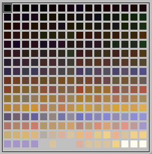
black is the absence of them. Different types of chemicals trap light rays of differing lengths when painted on surfaces.. If the chemical absorbs all red light and a little of the blue and a little of her yellow it will appear a darker green. If the chemical covered surface absorbs all the red light and only the red it will appear the green of the highest 'saturation'. The more light reflected of all types the higher the value. The more light absorbed the lower(darker) the value. This is the subtractive principle. So would you expect a value five blue mixed in equal amounts with a value five yellow to produce a value five green? I must add here the chemical is to be considered non-transparent and if you squint hard at the colors below you will almost be able to see their 'value'.
So you race out and buy a cadmium yellow medium instead of the cadmium yellow light you used! Now the value is correct, the saturation right but it is not the hue you had in mind. Another trip to the paint supplier? This type of treadmill is to be avoided. Painters are great realists in matters of economy; they must be. Most know how to minimise outlays for maximum return. They learn quickly their color theory and know what suits them, and they tend to support it come what may. Often the introduction of a new color into their palette can approximate a birth in the family. With white red blue and yellow all values are obtainable, thousands of hues and values are also available. Saturation is usually bought in small tubes and lasts forever. I advise, rather than buying black to mix it with your red, blue and yellow.
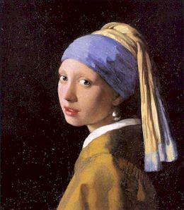
To make color your serf rather than you master you first subdue (use a limited palette), train (understand what makes the harmonies) and most of all get your values exact. All the great masters did as you see above in Vermeer's painting. (yellow ochre, light red, cobalt and cerulean). Finally listed below are some flawed psychological generalisations regarding color. Temperature - sometimes we speak of hues as being warm or cold. The reds and yellow look warm and the blues and greens look cool. A warm colored room will make you actually feel warmer than a cold colored room by as much as 5 or 10 degrees. A high saturated warm color will seem to expand beyond its borders and come forward. Cold colors are by their nature recessive and shrinking. Emotion - Very lively and vital people tend to like bright colors were as a mentally disturbed person may prefer greyed warm colors. It is said healers like green, and this is reflected in the green colored robes that are worn in the operating rooms of hospitals. It is also said that spiritual people like blue, though mystics may prefer purple. Intellectuals are supposedly inclined toward bright yellow, and yellow is said to be the color of the intellect. A strong ego wears brighter colored clothes while the weaker ego goes for more muted tones. Peoples choice of clothing often duplicates the color of their auras. Green is the color of healing and blue promotes peace and quiet. Red should stimulate vital activities and yellow promote intellectual serenity. On the average the way people tune their television is quite bad. They hardly see color at all and seem to think that almost any color at all in an image is quite all right. Many people tune heavily into green, which is a sign of immature color vision. |