|
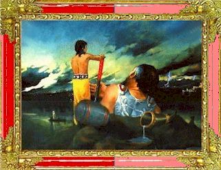
3. SATURATION Thirdly: saturation level would you pick? |
||||||
In summary ... in your mind you should have pictured the value, the hue and now the saturation. Combine them and what do you get? Is is anything like my choice? Low value (3), red hue and medium saturation.
But if this were to be hung on a blue or green wall my choice would alter considerably. Now you should understand color is about value, hue and saturation ... and how they should be considered separate elements when describing and choosing 'color'. Theoretically this should all be obvious but whenever I am teaching apprentice painters most of their difficulties arise when they grasp a brush. Then they tend to forget completely about color theory and worry about everything else. If this happens the student should be made to work out a separate color design before the painting is begun. |