|
||||
|
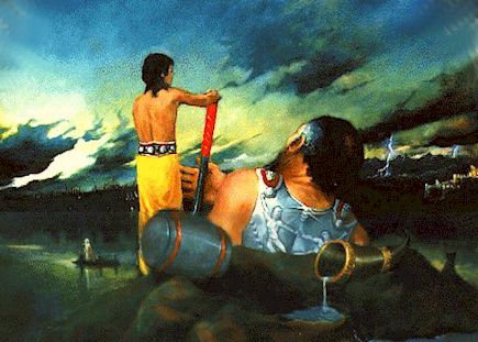
The basic palette I used for this painting was very simple light red, raw umber and yellow ochre, cobalt blue and prussian blue - one red two yellows and two blues. The overall cast of this painting is blue green. My concern to this stage (above) was to keep everything subdued and to make sure the lights and darks (values) looked correct. I knew I would be adding touches of highly saturated red and yellow hues at a later stage. How did I know this? I remembered a painting by Rembrant that had a similar color scheme, all I needed were roughly the same percentage of hues - although the values I wanted would be slightly higher. Why did I use this scheme? The narrative involving an ageing Thor demanded clouds and sunset. Since I also knew I would be showing areas of suntanned flesh I therefore resisted using red in the sky and distant landscape. I wanted instead the blue grey of the storm.
When the painting was almost finished I added my toutches of cadmium red and cadmium yellow for the highlights, specifically the handle of the hammer and the apprentice's toga. These highly saturated colors have the effect of echoing and unifying all the other reds and yellows. Drawing a parallel to music I could say they act like a pure single high major note, played an octave its harmonic chord. Suddenly you then see all the reds and yellows unified and reverberating about the canvas.
Next we shall embark on a little practical exercise where I hope you will more fully understand some of these terms and principles. I have found a frame for this painting but I will need to color the timber part. What color will I use and why? STUDENT ACTIVITY:For this page and the following - use two of your own paintings and decide on your choice of their optimum frame . Allow 40min.
|