|
The classic tradition of museum display is
that of the Uffizi - deep gold frames on a salmon red background wall.
This is a formula often repeated for many renaissance paintings. It is
also one I sometimes use in internet gallerys - but mostly without the frames. For
landscape paintings of high contrast and dark greens the salmon red works
well particularly if separated by a neutral (off-white, black) or transit (gold)
color.
This is a handy hint for painting as well as framing. When dealing with
complementary or opposite colors red-green or blue-orange try and separate
them with a transit or neutral color. Even modern minimalist paintings
of clashing compliments are often framed to separate them from a colorful
wall. Fierce agressive paintings and color schemes are often impressive
and eye catching - but difficult to live with. As with most art the understated
is usually more powerful in the long run (less is more - again!)
Below we examine three overall elements and
their relationships - the wall, the frame and the painting.

Example 1. Complementary red wall green
painting. Frame echoes the painting in color(darks and green-gold) and
swirling shapes.

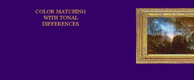
Example 2. Complementary colors of wall and
painting with transition light gold between. 1800's style rococo style
frame matches swirling wave. The important feature here is the 'value'
differences between the frame and the wall and the frame and the painting.

Example 3. Complementary again. Here the frame
and the picture provide a unified package where the rust color of the painting
is made even more dominant with the matched frame. This allows the wall
green to work.
Example 4. Wall and painting colors are the
same and the light gold frame is the complement. Echoes of light and dark
from painting to frame.

Example 5. Wall frame and painting colors are
the same which allows the small blue and yellow accents. This arrangement
gives the painting great depth.
|