I wrote this lesson in response to a number of letters - to quote but one;
'Some people have difficulty mixing what are called "skin colours." I have seen portraits where no flesh tones were used at all (somewhat like the dutch painter example in your lesson). How do you actually decide what values and hues you will use for a certain person's skin tones? Do you think "cool" and "warm" colours? Do you decide the hue based on the shadowed colours or the colours in the light, or perhaps you use some other method?'
My Reply; The meat of a cooked crab is a delicacy but the environment of the crab itself, and its food, are quite too revolting to contemplate ... which brings me to the skin color or flesh tones of the pale-skinned European and the pallet most suitable for their rendition.
My guide is this: 'find the nearest color matches to the bodily fluids, add the hues of arterial and congealed blood, and the blue of a good deep bruise, line them up carefully and you will have a pallet suitable for the finest of skins'.
Without being too specific yellow ochre, raw and burnt umber, light red, rose madder, cobalt blue and white seem to work well enough. Sometimes a transparent yellow and naples yellow can also be useful. Strangely, this pallet also seems sufficient for African and Asian skin colors.
Painting skin color, throughout history, has been more an exercise in fashion rather than anything else. Today the brown suntanned flesh is attractive to the northern races while the pallid sun-shy color seems desirable among darker skinned people. This may derive as much from envy or our fashion industry as from anything else. For sexual allure the rounded shapes that denote health and vitality are probably far more powerful than the hue - and if they come in pairs even more so.
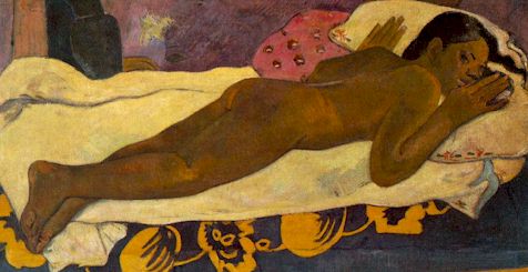
I learned a lot by trying to paint people of various races, and by discerning the similarities as well as the differences. The first thing I learned was that there is no such thing as a formula for skin color. Skin has texture and this can alter if it is wet or dry, male or female, old or young. Skin, glistening under an oily sweat - as say with a 'black' body-builder - could create a totally different look than the skin of a 'white' Scottish damsel reclining under an umbrella in a summer country garden. How do we discriminate? Texture is a product of edge definition and sharpness of the reflected light (see lesson on texture).
Whereas the body-builder may create forms like polished ebony the skin on the damsel may well be bone colored - but we know they both have the same flesh; the same muscle and tissue structure underneath!
We often use warm and cool tones when painting flesh. The artist's general rule is warm light - cool shadows and cool light - warm shadows. This is an artificial rule often used by professionals to give vibrancy to a painting. Note the cool bluish greys in the facial shadows below.

Goya
OK, let's get specific for the anglo-saxon or white european. Forgetting the light source rose madder was the color the masters used for the cheeks of their feminine subjects. Yellow ochre, the siennas and the umbers were the base and ultramarine was usually the blue. The rest is just modulated tone. These were all mostly all inexpensive pigments. Today rose madder is often repalced by a colorfast alternative. This same formula can be applied to the darker skinned - but with the absence of most of the red hues - a little blue added to the highlights will also assist.
Blood is red.
Hold your hand before a powerful light and what do you see? You see a deep glowing cadmium red. A bruise is blue. It is the rupture of blood vessels that turn the captured un-oxygenated blood blue. Both effects are beneath the epidermis which in pale skin is more transparent in the European than in the African. Technically the red 'blush' of the cheeks or elsewhere is the red of oxygenated blood under a semi-transparent layer of skin (epidermis). Very rarely does the artist have an opportunity to use this effect. I did once. I painted a picture where the hand of the subject was directly in the way of the sun. I made the outline white, the secondary outline a bright red and quietly darkened the center (much like a sunset). It created a powerful effect and became the focal point of the painting. So much so I was enticed to forget about everything else. Dear oh dear! One for me and not the client. I must admit the client liked it also and kept it - and I agreed! Professional stupidity in many ways but at the time I needed the money.
The blue of the bruise should not be so powerful
as to denote the bruise but rather the shadow shadow of flesh. The same blue you might
use for the jaw of a close-shaved jaw. This is the warm and cold. With an alabaster
skin tone the hint of the grey-blue is sufficient to make the shadow. See
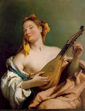
Boucher and other French artists of the 1700's.
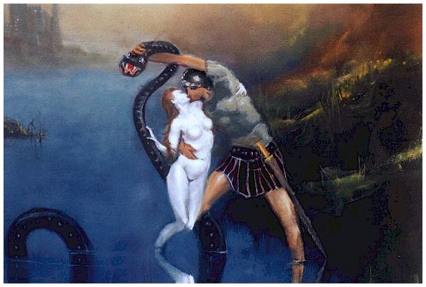
Above is an example of my deliberate abandonment of any warm flesh tints. The addicted girl is raised from the mire .... As a student I was once given white, payne's grey, raw umber
and burnt sienna and told to paint a cup and saucer on a white table cloth.
Since then flesh colors became less of a problem. Anyone familiar with make-up (scumbling for artists) should have no problems.
STUDENT ACTIVITY: Television has come to make most people believe flesh color is more red/orange that it really is. Why is that? Explain in 200 words.
|