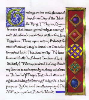
Here is the finished piece.
Here is the finished piece.
Unlike some of the other examples presented in this gallery, this particular piece was not based on a specific manuscript, but rather on a technique: the Italian gem troempe l'oiel, a renaissance style.
Materials used in this work:
Tools used:
This will be an unusually detailed explanation of methods. I just did this piece, and so it is all quite fresh in my mind. I believe it will be quite helpful for someone trying to learn.

First, I did the layout. Under most circumstances, I draw the layout on a piece of separate, thin paper. This allows me to make whatever corrections I need to make on a piece of disposable paper. This time, however, I did the layout right on the Pergamenta paper. This layout required no drawing; all I did was block out the general area and trace the needed shapes with pencil, ruler, and templates. Although it is not apparent in these scans, I used a margin of 1.25-1.25-1.25-2.5 (that is, 1.25 inches of space around the sides and top, and 2.5 inches of space at the bottom).

Next, I pounced the paper--that is, I sprinkled some pounce on the paper and then rubbed it in with a piece of felt. Pounce is a product that eases the use of ink on particularly hard papers. Pergamenta does not really need to be pounced, but I find that my pen moves along more quickly when I do pounce. I used the boar bristle brush to remove the excess pounce. I then put in the calligraphy ruling lines with the Ames lettering guide and the drafting board. The drafting board comes with an arm that locks down; it's a neat little device. If you don't have a drafting board, any T-square and table will do. The lettering device is a neat little tool that slides along a straight edge. There are variably spaced holes in it; you insert your pencil through the hole and move the guide along the straight edge to make a line; you then move your pencil to the next hole and make another line, and so forth. One continues this process until the writing area is covered with lines. That done, I went back and marked the lines that would actually be used to write--never trust your counting skills, you are sure to make mistakes. You should be able to see my tick marks. This particular scroll is set up on what I call a three-line system: write on three lines, skip one, write on three lines, skip one. The three lines for writing are divided thus: top line-space for ascenders, center line--x height, bottom line, descenders. Makes sense, yes?

click here to see double size image.
Upon finishing that set up, I wrote the text of the scroll. I didn't plan it out, I just made it up as I was writing it. Others will callig the text several times on scratch paper and put much planning into it before lettering the final work. Both have advantages; you must use the method that is comfortable for you. I wrote the text with a Mitchell #6 nib (with a reservoir) inserted into a pen holder. I loaded the pen with an eyedropper from the bottle of ink. I usually keep the ink bottle in an old plastic container--like an old frozen dairy container or something--to be certain that I don't accidentally spill any ink. I kept one blotter sheet beside the writing area to make practice strokes and one blotter sheet under my hand to protect the paper. Some scribes use white photographer's gloves for this purpose, but I prefer the paper. This particular work is lettered in a "humanist" hand. Once the ink was dried, I inked the lines for the illumination with a technical pen and whatever tool--ruler or template--was appropriate. Even the "g" was done with the circular template for the outside dimension. The only freehand drawing on this scroll, then, was the line that turned the circle into a "G." After all the ink dried, I erased everything with the plastic eraser. I like plastic (or vinyl) erasers because they don't tear up the paper like peal or pencil erasers, and they don't pick up gunk and oils like art-gum erasers. Of course, plastic erasers leave a lot of scraps behind: those were brushed away with the boar bristle brush.
Once everything was clear, I laid the gesso. I had first mixed regular acrylic gesso with Venetian red pigment. I applied the gesso with a beat up brush. I applied several layers of gesso, allowing it to dry between applications. The last application was put on quite heavily; I've found that, when one applies a rather thick layer last, it cuts down on the amount of sanding that needs to be done, once the gesso has dried, to make a smooth surface for the gold. This must be done carefully, though, as a last layer applied too thickly will dry with an indentation running down the middle, defeating the purpose. I let this dry overnight.
I then applied the gold. First, I cut away a section of leaf gold (approximately 1.5 inches wide and 3 inches long) and, with a beat up brush that I had run along my hairline to pick up a slight amount of oil, I maneuvered the cut section to an empty piece of glassine setting upon my table. The oil assists the gold in adhering to the brush long enough to be transferred to the glassine. Once on the glassine, I gently blew out any wrinkles in the gold sheet. I then used the acetate sheet to pick up the gold.
Now, truths be told, I'm not precisely sure what the acetate sheet really is. It's a "paper" of a plastic-like substance that is extremely smooth on one side and rough..like frosted glass . . . on the other. The smooth side will take a static charge. So I rub the smooth side on my shirt, creating a small static charge, and quickly place it upon the gold. The gold then adheres to the acetate. This lets me use leaf gold like transfer gold. Once the gold is on the acetate, I blew upon the gesso to moisten it. While acrylic gesso technically does not remoisten--it is a waterproof substance, after all--I have found that if I lean quite close to the area, open my mouth wide, and exhale upon the gold for 15-20 seconds, the gold will stick to the acrylic gesso without any problem. So I blew upon the gesso base, pressed the gold to the gesso through the acetate, and then used the burnisher to burnish the gold into place. Once all the gold was laid, I let the project rest a while, and then burnished it again, using the burnisher and a sheet of glassine. The double-sized image, indicated above, has had the gold applied, while the inline image above simply has the gesso applied.

click here to see double size image.
Once the gold was burnished, I painted. The first layer of paint is flat color, usually applied with larger round brushes. In order to protect the gem areas from the carmine background, I first applied and allowed to dry liquid friskit. This is a gummy substance that protects areas while another color is washed into the area. To prepare the wash, I used my eye dropper to put water-ox gall solution (i.e., a bottle of water with a drop of oxgall added. Oxgall, a surfactant, aides in the application of paint) into the paint. As gouache is a watercolor type of paint, one can keep colors in a palette and rehydrate them at any time. I usually let the water dissolve a sufficient amount of paint and then pick up paint with an already wet brush. Load a nice big brush with paint, and swish the background in. Once the background was completely dry, I removed the friskit by peeling up a side with the exacto knife, and then rolling the rest off.
Next, I painted the brown mixture into the gems and the yellow background into the heraldic badge. Last, I painted the gem colors (light grey, reddish violet, alizarin crimson, green lake, myosis blue) and the violet for the heraldic badge. Notice a pattern here? I paint background to foreground. It's much easier to get good coverage this way. I then painted in the ultramarine blue background for the initial.
click here to see double size image.
click here to see the image the way it was scanned, no attempt to correct colors, et cetera
Lastly, using the smaller brushes, I just played with the paints until I got the troempe l'oiel effect. This is a technique that is mighty easy to show but a bit of a pill to describe. Basically, you choose your light source and apply darker shades of colors to shadow areas and lighter shades to highlighted areas, and play with it until it pops off the page at you. Finished with that, I applied the white to the initial background and re-outlined everything with the technical pen, using ruler or template if needed.
 Use your browser's back function or
 Top Index Bibliography
Articles Gallery 1
Gallery 2
Gallery 3
Links
Top Index Bibliography
Articles Gallery 1
Gallery 2
Gallery 3
Links
![]()
This page hosted by Geocities.
Copyright 1998, Elise (Elyse) C. Boucher