The above does not necessarily reflect my values.


| |
|
So you've gone to Image: Effects: Drop Shadow. Great! Now how do you know the "right" settings for using the drop shadow, or cut out, or chisel or the buttonizing effect? Well, for one thing, you need to relax and stop looking for one right answer. :)
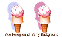
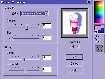 As far as the settings for drop shadow, for example, there's no one "rule." Let's look at that Drop Shadow dialog box. The box for "color" lets you choose among your background color, your foreground color, and a few basic colors for the color the shadow will be. This means that you can use any color you want...as long as you put it in either your foreground or background box on the color palette, then select it as "foreground" or "background" in the dialog.
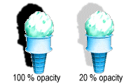
 Next in the dialog box comes the "opacity" level. The higher the "opacity" number (it is shown as a percentage of the solid color), the deeper your shadow will be. The lower the opacity number, the more transparent the shadow will be. You may occasionally want to use it as high as 100 percent, but there would be little reason to use it at 0. :)
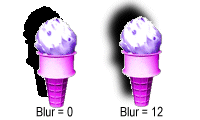
 The higher the "blur" number, the wider the blurred edges of the shadow will be. This means that an added amount of area beyond your basic shadow will gradually fade into the background. (If you want a sharp edge on your shadow, the blur number should be 0.)
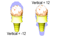
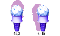
 Now for those important shadow height and width dimensions! These show up in the Drop Shadow dialog as the Offset: "Vertical" and "Horizontal" boxes. NOTE: In showing pairs of numbers, I always put "vertical" (height) first, then "horizontal" (width) since that's the way PSP lists them. The number in the "vertical" box should be a negative number if you want the shadow to be on the top of your image; it should be a positive number if you want the shadow to be on the bottom.
 The number in the "horizontal" box should be a positive number (like 3) if you want the shadow on the right side of your image; it should be a negative number (like -3) if you want the shadow to be on the left side of your image.
 The higher the numbers in either the "vertical" or "horizontal" box, the broader your shadow will be. 1,1 will make a narrow shadow; 15,15 will make a broad shadow; and 100,100...well, I haven't had much occasion to make any THAT broad, but bigger numbers can be useful in large and/or high resolution images.
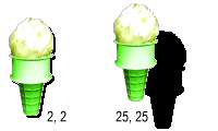 You can have the same numerals (positive, negative, or a combination: like 2,2 or -2,-2, or -2,2 or 2,-2) in both the vertical and horizontal boxes for a balanced shadow that comes from a 45 degree angle. The images in the above example have balanced drop shadows. Or you can have one number small and one large to give a stronger vertical (like 10,2) or horizontal (like 1,5) effect. If you want a completely vertical or horizontal shadow, use 0 as one of the numbers (like 5,0 or 0,-3). (See the "Horizontal" and "Vertical" images above as examples using 0.)
 What's the best thing to do to understand these changes? Experiment! Make several copies of a simple image. See what happens when you change one setting or a combination of settings in the Drop Shadow dialog box. Try this same process with the other functions (cut-out, chisel, etc.) using different settings to see how they are affected. Once you've used them for a while, you'll get an idea what happens when you make the numbers higher or lower in different boxes. Have fun!
If you have comments, questions, or would like further information, please sign my guestbook or contact me at my e-mail address.

|
|
|
|
|
5acreart@usa.net |

All original graphics on this site
Copyright 1999
by Diane at
Five Acre Graphics
This page hosted by
GeoCities