should learn. Composition helps to make your images more interesting, and your subject matter more
appealing. When taking a picture, you should always be thinking about composition, where the subject fits
in the view finder, what part of the picture you want to emphasize, and where to cut out pieces of the photo
that may later be obtrusive to viewing. Composing with your camera will save you from having to crop with
your enlarger in the darkroom. It will also save you from realizing that after you have cropped out information
that is unappealing, you don't have as interesting an image as you had hoped for.
Rule # 1: Less is More.
Let
simplicity be a though foremost in your mind when photographing any subject.
Make sure that what you
are
photographing has a "subject of interest" that is clearly conveyed to the
viewer. Do not try to fit in every
bit
of information nearby. These things may not always be of relevance
to the picture, and can easily distract
one's
eyes from the main purpose of the photo. Remember, you are trying
to convey a feeling, or message to
your
viewer, so you do not want to confuse them! If you have ever been
to art school, you are well familiar with
the
"less is more" principal. A few good ways to simplify your pictures
are: 1) get up close to your subject,
and
fill the frame with it 2) Avoid backgrounds that are confusing or
complicated, as they can detract from your
subject
3) Do not have more than one or two points of interest, because the subjects
will begin to "compete" for
your
viewer's attention
Rule # 2: The Rule of Thirds
The
rule of thirds is another way to compose your picture. The rule of
thirds simply states that one should think
of
their picture in segments of 3's...and place their subject matter accordingly,
therefore avoiding a perfectly center-
ed,
and mostly boring composition. For example, note this chart:
Say you are photographing
a landscape, with a waterfall, rocks and water in the foreground, and sky/trees
in the
background. Now, you
could do what the average person would do, and try to fit the waterfall
right in the center
of the image. That
can't be too interesting at all. Or, you could follow the rule of
thirds, and try placing the waterfall
in spaces 2 & 3, leaving
1 to be sky and trees. You could conversly place the sky in spaces
1 & 2, leaving the water-
fall in space 3. The
idea is to break up symmetry in your picture, thus creating a more interesting
image. Look at
the image below, and note
it is a good example of the rule of thirds.
(click here to enlarge and see divisions of thirds)

See what I mean?? Much more interesting, and more to look at.
Rule # 3: Avoid Mergers
What
is a merger, you ask? A merger is when two separate objects become
one in a photo. Have you ever
had
a picture taken by a friend, or taken one yourself where you have an object
growing out of your head??
Take
for example, picture #1 that my husband took of me at Longwood Gardens.
Notice I have this great big
OAK
tree growing out of my head. Now, I hardly think anyone wants this
to happen on purpose in their photos,
so
be on the lookout for it when you are composing. It will save you
a lot of post-photo heartache. Avoid this
problem
by moving your subject (if possible) or yourself to a different spot or
angle. Make a habit of looking at
your
subject's immediate surroundings as you frame your photo. Though
mergers are generally bad, they can
also
be fun, too. Note picture # 2, an example of a merger I did for fun
when I was in high school. (Be kind, this
photo
is over 10 years old!!) I had my friend stand in front of a church steeple
and raise her hand out with it cupped
upwards.
I moved her around until her hand fit right under the steeple, and took
the photo. You can see the results
below.
This could be done with much more interesting objects, like theWhite House,
in D.C., or other large,
prominent,
heavy objects. But the key is to have a PURPOSE and EXPLANATION if
you use a merger other
than
by accident. "I liked the tree coming out of my head" is not a likely
purpose or explanation, and if you try
to
tell your photography teacher this (as I have in the past), they probably
won't fall for it.
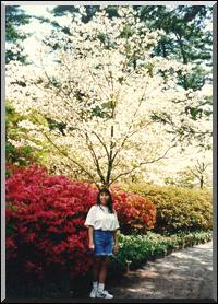
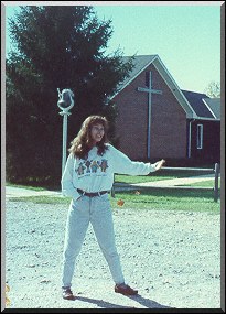
(picture # 1) (picture # 2)
Rule # 4: Framing and Edges
First,
I want to go over edges. "Edges" refers to just that, the edges of
your photo, or more accurately, the four
corners
of your composition. Make sure to check all of your corners, before
composing a photo. You will be
looking
for corners that are 1) too light or too dark (this can be disruptive,
and lead the viewer's eye off of your
picture)
2) objects veering directly through an edge (you don't want to have a tree
jutting through the picture and
out
to a corner - - avoid this by moving your composition so that the tree
is lower, higher, left, or right of the corner)
3)
cut off subject matter in the corners, like someone who is exiting your
picture frame just as you click your camera
Edges
are most important in your composition, because these are essentially four
possible exit points. You don't
want
to help your viewer right off the page, you want to captivate their eye,
and keep them circling your print.
Make
it hard for your viewer to want to look away.
Next,
let me go over framing. Framing is essentially a way to solve the
"edges" problem. Basically, framing is
using
objects in the picture to "frame" the photo. Like a tree and limb
running across the top and side of a picture,
and
maybe a hill framing the other side, or a person. Framing closes
in your picture, keeping the viewer occupied.
You
can frame with anything that makes your picture necessary, but don't go
overboard.
Here
is an example of a picture where I could have paid better attention to
my edges,most notably the upper
right
hand corner (refer to pic #1. Notice how light it is, and how it
leads your eye off of the page. This corner
is
really the only offender, note the other edges and how they do not lead
your eye off the page. Picture # 2
is
a good example of using an object to "frame" a picture. Here, I have
used the frame of the car to frame the
picture.

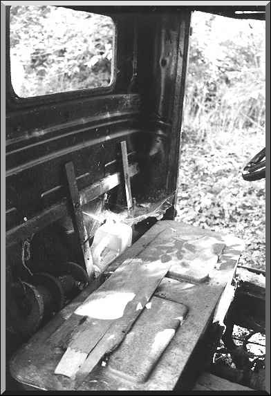
picture 1 picture 2
Rule # 5: Balance and Practice
Balance
is also important. By balance, I mean things like highlights and
shadows, contrast and brightness, color,
texture,
and geometry of your image. The above image is also a good example
of a well balanced photo.
Practice
should be self explanatory, but some people don't realize, that the more
rolls of film you take, the better
you
get at all of these rules. Take a piece of paper with you that has
written on it the rules of composition. If you
are
particularly good and certain ones, only write down those that are harder
for you to remember. Look at the
paper
each time before you take a picture, and eventually it will become habit.
The best advice I can give, is take
lots
of pictures. Take insane amounts of pictures. Pictures of everything
and anything. Take your camera with
you
anywhere you go. Practice these rules until they are habit.
This will save you large amounts of time developing
pictures
in the darkroom, as it is much cheaper to waste film due to bad pictures,
then to waste paper due to bad
negatives.
Good negatives are the key to good prints. Your pictures will be the reward!
but alas, RULES WERE MADE TO BE BROKEN...just remember you have to learn them first!!!!
Hope
these tips help out the beginner, and maybe even act as a refresher for
the advanced.
Happy
Photographing!