
©
MGM/UA
|
At
last! The US teaser poster has been released via the TWINE
Official Site. After months of speculating, we now have the chance
to bring you the real thing, left. Initial reactions to the teaser poster
were mixed, but generally positive.
-
"It's
a huge change from the GoldenEye and Tomorrow Never Dies advance posters
and one of the coolest in quite a while, In my opinion.
-
Similar
in design to the teaser trailer shots we've seen online, and very creative."
-
-
--Nick
-
-
"Simple,
sexy, striking. Much more satisfying than TND's gun-barrel clichés
(built around Brosnan's smirking phizog), and refreshing to see a teaser
poster that actually lives up to its name; Godard once said all you need
for a great movie is a girl with a gun, and I love the way the leggy nymphet
has been fetishised in flame.
Like
the teaser trailer (with which it meshes well), more modern and stylized
than anything seen previously, right down to the streamlined 007 logo and
funky font; pared-down typefaces are this year's Big Thing (apparently).
Minus
points: The silhouette layering is not as slick as it thinks it is, with
Bond suffering the indignity of a melting hand and worrying side protrusion
to accommodate the blazing beauty. Perhaps a little derivative of Goldeneye's
title sequence, or even the fire goddesses of A View To A Kill's.
Overall
though, elemental and gloriously statuesque."
--Anon
-
The teaser
trailer shots are available at BondIsBack.
 RETURN TO MAIN INDEX PAGE
|
Unofficial
Film Artwork

|
The
first piece of official artwork for The World Is Not Enough appeared
in trade magazines in the Summer of '98. This can be seen to the left.
Even at that early stage, the release date had already been decided upon.
This image caused quite a stir when it was released. |
Following
this, there was little heard from the official outlet for months, at least
in terms of artwork. People's interests were stirred up, keen fans produced
their own version of what they imagined the official poster would look
like, and then in December '98, the next piece of official artwork appeared.
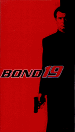
|
This
image shows that at the time, the title for the film was still not finalized.
This is quite an unusual image, and is without doubt a departure from previous
efforts. |
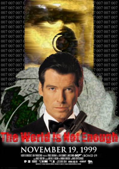 |
Then,
rumours were confirmed, and title was officially confirmed as The World
Is Not Enough.
The confirmation was not made via any particular event
or outlet, but instead people associated with the production, such as Pierce
Brosnan himself, let slip the title to interviewers. The title was
eventually confirmed in January '99. |
Recently,
in the light of the new title, an excellent unofficial quad poster was
produced, which can be seen below. This is based on the obligatory "production"
poster, informing everyone that The World Is Not Enough is now shooting
around the world. The official quad will soon make it's appearance, first
in the US, and then in Europe. You can be sure to find it here.
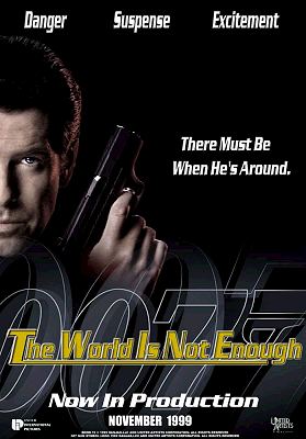
|
This
poster, which was not designed by an official outlet, first appeared in
February, and uses a typeface similar to that of the official TWINE
site (Tomorrow Never Dies had it's own font too, which is downloadable
on the Internet).
We
are now awaiting the official final version of the quad (poster, US Version),
which is due to be unveiled late March, or April. The The World Is Not
Enough Official
Site is offering lucky readers in the US a chance to win a copy of
the poster (International version to follow). It will be interesting to
see which style the artist goes for. Recent efforts have tended to use
a Brosnan mugshot and a gun, and not a lot else, as demonstrated by the
GoldenEye US advance quad, below left, and the Tomorrow Never
Dies poster, below right.
 ......................... ......................... In the
past, artists have been employed to create elaborate images combining the
various highlights from the film.
 |
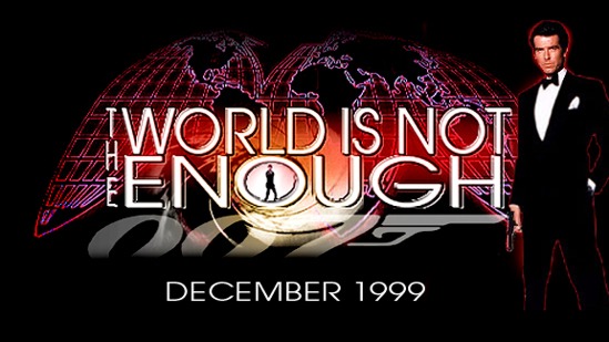
The image
below gives us some indication of what the title of the film will look
like when the official poster is released. It's the image from the Official
Website. The font used here will surely be the one used for the film itself.
..

...
.
 |
Jason
Munday, a very talented Bond fan, has produced this excellent piece of
media which looks absolutely stunning. A good example of how impressive
fan-produced artwork can actually be. |

|
Joe
Lopes has also been busy designing his own unique Bond 19 poster, left. |
|
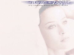
In
the meantime you can download a copy of this excellent unofficial artwork
(left), perhaps to use as a desktop background. It was designed by Bond
connoisseur Ben Zimmerman, and can be also downloaded from his Site, here. |
|


