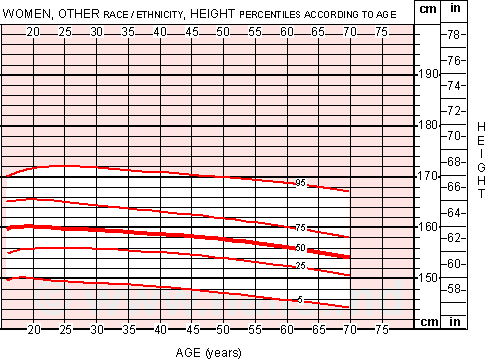
Men's Height Chart
for men of "Other" race/ethnicity*, showing height changes with age.
The red lines show "percentiles". The thick red line in the middle is the 50th percentile, which indicates that 50% of the population of Men have Height (or stature) taller than the line, and 50% are shorter. Similarly, the lowest red line, the 5th percentile line, indicates the Height where only 5% of the male population is shorter.