
End of Week 1
This trade was checked on a daily basis and updated weekly until it finished in December '07. It was done in real time with no knowledge of the outcome. No money was committed to it, as it is simply a few indicators and technical tools thrown together to demonstrate how technical analysis works. This is not the system MSMI teaches, but one I quickly threw together. As it turns out, it was a profitable trade!
MSMI contains a trading system that is much more thorough and detailed than the one used in this trade. It is the system Nik Halik uses himself and has been exhaustively back-tested and proven in the market by him, as well as many students of his course.
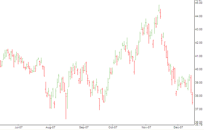
Before we see some technical analysis, let's look at a chart. How would you commit thousands of dollars to a trade by looking at this?
This is what you get when you open your charting software program. All it displays is the price action, nothing more. It is up to you to interpret this chart, using technical analysis. In this sample trade, I'll introduce you to a few different techniques commonly used in T/A.
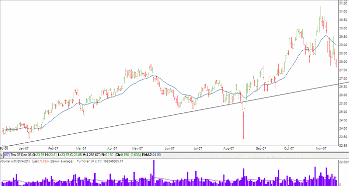
Now let's take a look at the chart below, which I've done a little bit of analysis on.
The purple bars at the bottom show how many shares were traded on each day. This section of the chart is the "volume" indicator.
The blue wavy line on the main chart is called a "moving average". A moving average is a calculation of average prices over a defined period of time. We can use this to see if the stock is trading above or below it's average price.
Another thing you'll see on the chart is the trend line (the straight black line). This is used to anticipate where the stock may retreat to and possibly change direction, presenting an optimum trade with maximum profit.
At this stage, I won't enter the trade as the stock is trading below it's average price and is in a short-term downward movement (trend). In other words, my view is that it is going to go lower, possibly back to the trend line at around $27. I will wait until next week to see.
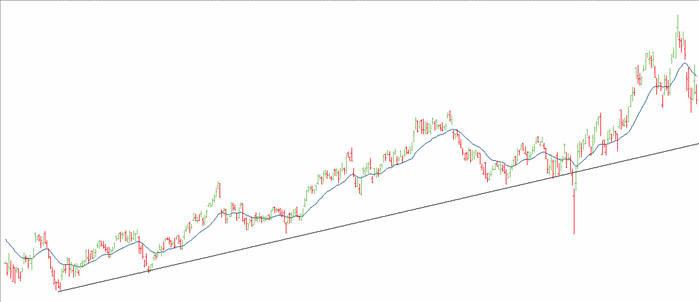
The Trend Line
In the chart above, it shows the last year of data. When I drew the trend line I used an 18 month view as below. You can see where the stock has retreated and bounced off the line each time. The basic theory is that it will keep doing it, so we can use this to anticipate the best entry point. The trendline shows us the current "tradjectory" of the stock.
Week 2
|