| The Word de - first major artwork
|
 |
 |
 |
- Briefing
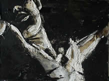
- The Word of de series was the culmination of my artistic peak. From focusing on fine-arts, where the medium is basically very traditional, I harnessed all my skills and joys to produce an artwork that reflected both an visual appeal and, mainly, expressed my inner philosophical child in its wholeness.
Meanings and esotorical symbolisations are packed in this artwork, which reverberates one of my most distinct modus operandi.
Everything from the media to the method of application has meaning:
A thin layer of hardboard is used for the canvas. On the canvas I glued a layer of textured board where I drew, using a compressed charcoal stick, a gestural drawing of the form.
On top of the textured board I glued a layer of tissue paper where I drafted the same form, but using a different technique and media. This is where the fun began.
I added layers of tissue paper. Using different drawing techniques and media. In places, I ripped the layers back to exposed hidden layers. Other times, I added varying coloured papers in certain areas to add depth and movement.
The result was an artwork with incredible depth and history. The ancient Greeks boasted of being able to say much in little, "to give a sea of matter in a drop of language". I believe I accomplished the visual equivalent in these artworks - well, that was my purpose anyway.
Once I had finished the above steps I began to add the final, and most crucial touches upon the artwork. For the final touches I used plaster, bitumen, shellac, fire and china ink to give the stark contrast of the final piece.
In the rendering of The Word de, I steered away from the traditional rendering of his features (for example, I made Christ bald). My aim was to capture the depth of the words Christ uttered on the cross and allow them to impact the onlooker.
In this, you decide whether I succeeded or not. For me, the beauty of these artworks is that I know about the layers of artworks below the surface. I know that there is more to the artworks than what everyone sees.
In this I have expressed a universal principle in which I believe. "Seek and ye shall find". If we but look deeper than the surface, this are wonderful universal truths the gods have in store for us.
Last, but not least, I would like to add that the texture and organic aspect of these artworks was inspired by nature. In one of my landscape contemplations I realised that nature is beautiful no matter where you stand to behold it. The landscape, the trees, the shrubs, the flower and so on, as you draw closer and closer, even to the atomistical level, there is beauty. So I tried to do the same in these artworks. From a distance you can appreciate it. And even when you stand as close as possible, you can still appreciate the texture and composition.
- Titles
- From left to right:
- • The Word de Suffering
- • The Word de Forgiveness
- • The Word de Anguish
- Year
- 1999
- Media
- • Charcoal (compressed and willow)
- • Wood
- • 6inch Nails
- • Plaster
- • Bitumen
- • Shellac
- • Crayons
- • Conte Pastels
- • China Ink
- • Fire
- • Oil Paints
- • Water Paints
- • Graphite
- Lessons Learnt
- I'm wondering if I should add the lessons learnt here... it would take quite a bit of space. Once I've decided I'll add the lessons here, or add a link to a page with the lessons learnt.
|
| Mr Collis - first oil painting
|
 |
|
- Briefing
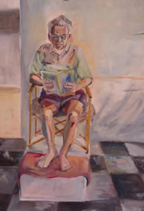
- Mr Collis is the father of one of my most astounding art teachers, Andy Collis. I regret not giving him the credit in this artwork that father of my art Rabbi deserved. Hehe.
The Mr Collis artworks happens to be my very first oil painting I had done in my life. Close examination will reveal plenty of unwanted mistakes (in contrast to wanted mistakes that I believe add life to art). Live and learn! If you really want to become an accomplished artist you need to just get into it. You need to harden up when you are offended by harsh criticism - no matter how close that critic is. Joseph Chilton Pearce expresses one the creative principles I try and uphold, "To live a creative life, we must lose our fear of being wrong."
- Title
- Mr Collis
- Year
- 1996
- Media
- Oil Paints
- Lessons Learnt
- The major lessons I learnt from painting this artwork are:
- Exaggerated Perspective. The legs, below the knee, in Mr Collis are in its true perspective smaller. If I had painted the legs in its true perspective they wouldn't have looked right. Mr Collis would have looked "flat". By painting the legs slightly larger I have increased the perspective to add that extra bit of depth.
- Facial Concentration. I made the mistake as so many students do, to add too much focus and detail on the face.
An artwork must flow. It needs to have the same "language" throughout the artwork. For example, in Mr Collis I used my personal technique of using the largest brush possible to paint. But on the face, I started to use really small brushes, trying to get all the detail. The result? The face looks out of place to the rest of the artwork.
We tend to focus and add too much detail on faces because we are so intensely familiar with facial features.
What I should have done, instead, was to capture the essence of the face and expression with the style of painting I used throughout the rest of the painting.
|
| Bones - first oil paint still life
|
 |
|
- Briefing
- Bones was my second effort at oil painting. I created a little still-life set up. I was attempting to create a setup that would suit my particular style of painting/drawing.
I prefer high contrast artworks. Dramatic. Lavishing the artwork with various artistic techniques to achieve a desired feel and meaningful objective. Also, specially in painting, I prefer to use the biggest brush possible to cover the surface.
Compared to Mr Collis, Bones concentrates in the lighting much more.
- Title
- Bones
- Year
- 1996
- Media
- Oil Paints
- Lessons Learnt
- The major lessons I learnt from painting this artwork are:
- Warm and Cool Colours. As a general rule, cool colours such as, blue and green, create depth. Warm colours such as, orange and red, create height. Cool colours recede back, warm colours jump out at you. Deliberately using cool and warm colours, you can create a much more dramatic sense of perspective.
- No Black. I find that one can achieve a much more objective rendition of a still-life setup by avoiding to use pure black.
This is a good place to add that an artist needs to learn to interpret what they see, instead of what they think they see. For example, we can be well conditioned to believe that shadows are a range from grey to black. In fact, if you look closely at shadows, you will find that they are dark shades of various colours. Therefore, you will find that all the shadows in Bones are dark colours, instead of black tones.
This brings me to my next point....
- Reflected Shadows. Talking about shadows, here is a little exercise you can try. Stand outside with the sun above you. Place your arm in horizontally across your front. The sunlight should be landing on the top side (hairy part) of your forearm, and there should be a shadow underneath it.
The shadow should be a dark tone of your arm. But notice this, however. Place a coloured surface underneath your forearm (could be a sweater, paper or whatever) and notice the colour of the shadow changing.
Many people can pick this up because they have developed their seeing eye. Much of an artists skill comes not from their fine-motor skills, but by learning to truly see. These reflected shadows are crucial to create an objective still-life painting. Can you see these reflected shadows in Bones?
|
| Self Portrait '99 - first self portrait
|
 |
|
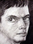
- Briefing
- After standing in front of a mirror for about 30 mins, I wasn't too pleased at all. Hence, the frown. Self Portrait '99 was a little project where I just wanted to do my first self portrait and get it over and done with. I used one of my favourite media, charcoal, and I got stuck into it. One of my artistic philosophies is that - why draw or paint something so that it looks realistic? If you want to achieve a totally objective look, take a photograph. Instead, an artist to let loose and try and express their "inner child". My "inner child" saw my big eyes, and made them big. It saw the defined lips and made them so... etc, etc. (Oh yeah, I don't object in objective artworks... they have their place).
Post Script: Read more about the "inner child" from Elizabeth's Artist's Way book. This book I HIGHLY recommend! For your benefit, here's a link to a list of basic spiritual principles for creative expression.
- Title
- Self Portrait '99
- Year
- 1997
- Media
- Charcoal (willow, compressed and pencils)
- Lessons Learnt
- The major lessons I learnt from painting this artwork are:
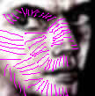 Sculpture Crosshatching. I used this technique in this drawing. The technique is hard to describe, so I've added the example on the right.... When crosshatching, you direct the lines as though you were sculpting the figure. As though the figure was 3D and you were chiselling it away. You can see the direction of the "chiselling" in the example.
When I come up with a better description of this technique, I'll add it. My brain's are fried at the moment.
- Negative Lines. Lines don't necessarily have to be made out of pencil. Especially where there are light areas, I use a hard eraser with an edge and cut into the drawing, using the above Sculpture Crosshatching technique.
|
| Nightmare in the Dreaming - first conte portrait
|
 |
|
- Briefing
- Nightmare in the Dreaming started as a quick gestural drawing sketch but I got into it. It's one of those artworks that just happen. Started to add more and more onto it. Then I focused on trying to capture the Elder's (Aboriginal tribe leader) expression.
A point worth making is that the orange around the sides of the face are what made the face stand out. The background and face were melting into each other, and I couldn't figure out how to separate them. Then, eureka!, I added the orange, which was my final touch.
- Title
- Nightmare in the Dreaming
- Year
- 1997
- Media
- • Conte Pastels
- • Charcoal
- • China Ink
- • Water Paints
- Lessons Learnt
- The major lessons I learnt from drawing this artwork are:
- Damned if I know! lol... I just drew it and it was.
|