Personal Website of R.Kannan
Learning Circle - Pricing of Options
Black and Scholes' Model
|
Personal Website of R.Kannan |
| Home | Table of Contents | Feedback |
Back to Module first page & view Table of Contents |
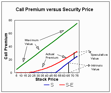
Graphs of the Black and Scholes Model [Source: From Article titled A Study of Option Pricing Models published by Kevin Rubash, Faculty, Foster College of Business Administration URL:http://bradley.bradley.edu/%7Earr/bsm/model.html] This following graphs show the relationship between a call's premium and the underlying stock's price. The first graph identifies the Intrinsic Value, Speculative Value, Maximum Value, and the Actual premium for a call.
The following 5 graphs show the impact of deminishing time remaining on a call with: S = $48 Graph # 1, t = 3 months Graph #1
Graph #2
Graph #3
Graph #4
Graph #5
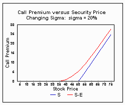
Graphs # 6 - 9, show the effects of a changing Sigma on the relationship between Call premium and Security Price. S = $48 Graph # 6, sigma = 80% Graph #6
Graph #7
Graph #8
Graph #9
After the Black and Scholes Model: Since 1973, the original Black and Scholes Option Pricing Model has been the subject of much attention. Many financial scholars have expanded upon the original work. In 1973, Robert Merton relaxed the assumption of no dividends. In 1976, Jonathan Ingerson went one step further and relaxed the assumption of no taxes or transaction costs. In 1976, Merton responded by removing the restriction of constant interest rates. The results of all of this attention, that originated in the autumn of 1969, are alarmingly accurate valuation models for stock options. |
|