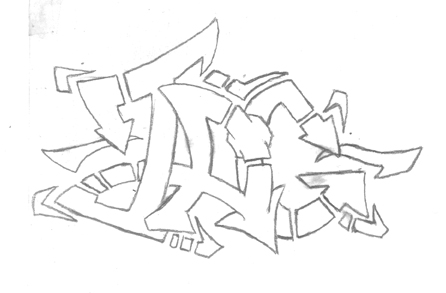
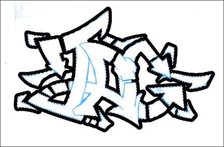
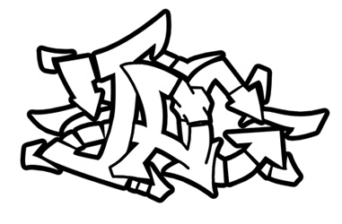
Here's my scanned piece. Notice that I still have some eraser smudges and "dirty" lines. Since we'll only be using this to as a layout guide, the cleanliness of your piece is not imperative.
Phase
2: From the Paper to the Pixels
After doing a few pieces you'll make one that's exceptionally
noteworthy. It looks great as line art, but color would make it
really "clean." I'll be going through the steps rather
quickly as I'm assuming that you at least have a basic knowledge
of Photoshop and it's tools. If you don't have Photoshop, just
hang tight and I'll make a nondigital method as soon as my cousin
'fesses up to stealing my Prismacolors.
Scanning and Prepping: 1st Things 1st.
I usually scan my pieces as a 144 DPI grayscale image. Since you'll only be using your drawing as a "map" to set your paths for the outline, you don't need to worry about having an ultra-clean scan.
Here's my scanned
piece. Notice that I still have some eraser smudges and
"dirty" lines. Since we'll only be using this to as a
layout guide, the cleanliness of your piece is not imperative.
Now that you have your piece in the computer, it's time to do a little prep work. If your image is still set to grayscale mode, then set it to RGB mode (Image > Mode > RGB Color). Open up the Hue/Saturation tool (Image > Adjust > Hue/Saturation or Ctrl+U) and apply the following settings.
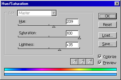
Applying these
settings to your scanned art will make the lines powder/light/sky
blue and thus easier to see your paths. You can choose to make
your line art a different color by adjusting the "Hue"
slider.
Making the Lineart: The Pen is Mightier
Here's where the real work begins. This step will be the most tedious and boring part of the entire process, so go out and get a Red Bull to artificially motivate you... You'll need it!
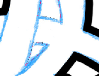
Select the Pen tool and begin placing anchor points on the apexes and corners of the OUTSIDE/CONTOUR of your piece.
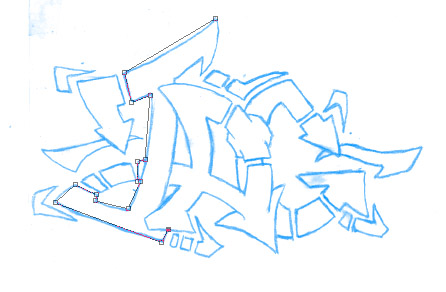
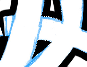
Here's my piece
after it's been prepped. Notice when I apply the anchor points
I'm not concerned with the "interior" lines. By
focusing only on the contour of piece, we can make heavy lines
for the contour shape and thinner lines for the interior lineart.
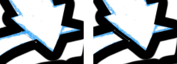
Using the Convert Point tool go around the piece and skew your paths to match your lineart by manipulating the anchor points.
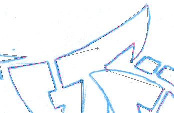
By clicking and dragging an
anchor point with the Convert Point tool you can adjust your
paths to match your scan's lines.
When you're finished fitting your path to the contour of your piece, create a new layer and select the Airbrush tool. Create a new brush that's diameter twice the desired thickness of your outline.

Here's the setting
for the brush that I'm going to do my outline with. Since I want
my outline to be 12 pixels thick I'm using a 24 pixel brush
(it'll make sense to you in a second, hang tight). Also keep the
spacing of your brush less than 10%, so the lines don't become
jagged.
Reselect the Pen tool and right-click the mouse. Choose the Stroke Path function and select the Airbrush to stroke. Right-click the mouse again and select the Make Selection function. Click OK and delete what's in the selection.
See, I'm not
insane... "Inking" this way lets you get a nice quality
line plus it makes "inking" the interior lineart a lot
easier.
We got our piece outlined with a nice heavy line... But what about the negative space between the "T" and the "A?" For the edges of the piece that are touching the negative space, but are "landlocked" you should try the following. Create a new layer and select the pen tool. Just like with the contour of your piece, begin placing anchor points on the apexes and corners of the negative space.
Here's what I'm
talking about (I started to confuse myself). Just like before,
manipulate the anchor points to match the curves of the negative
space.
Once you've got your paths setup, right-click the mouse and select the Stroke Path function using the Airbrush to stroke your paths. Right-click the mouse and select the Make Selection function. Click OK, but this time around invert the selection (Select > Inverse or Ctrl+Shift+I) before you clear/delete the selected area.
Here are our
"inner" outline lines inked and cleaned. Notice by
stroking the path with a brush that's 2 times as thick and
deleting half of stroke, the corners and edges come out very
clean and sharp.
Your piece should now look something like this. We still have
some more "inking" to do, but right now the only lines
that should be stroked are the ones touching the negative space.
Make a new layer and select the pen tool again. Go around and make small subpaths along the unstroked outline of your piece. When you're all done go select the airbrush tool and select a brush size that's smaller than the exterior brush's size. Reselect the pen tool and right click the mouse. Use the Stroke Path function and select the airbrush as your stroking tool.
Match your paths to
the lines of your piece and stroke the path with a smaller brush
than your outline. Continue to do this with the rest of the lines
of your piece.
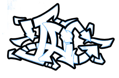
Here's the piece with the "inked" lineart. Link the 3
layers of lineart together and use the Merge Linked tool (Layer
> Merge Linked or Ctrl+E). We're just about ready to color the
piece, so onward to Phase 3.